Disney World Forums

RickM

Well-known member
Hi all,

I launched my new site this week, WDWFans.com - its a Walt Disney World Trip Planning site and runs on PyroCMS (Codeigniter framework) with XenForo (Zend framework) integrated into it.

The forums are located HERE. I've done a basic style integration into the sites main layout. I'm not 100% sure on the colourscheme if I'm honest. I forsee a colour change happening within a few months if I'm not the only person who feels it could be improved.

I'm looking for feedback if possible - both good and bad :)
 
There are parts of this I like and parts I don't. Overall I like the simplicity of the design, it looks professional and easy on the eye. Things I would change... replace the forum icons (speech bubbles) with something WD related, or at least change the colour of the bubbles to fit in with the theme. Then, in the forums themselves, the avatars appear to be just a long line of ? question marks - I would change the default "no gender" avatar and probably the default male and female ones too. I did this on my site to something themed with the forum, it means when people post who can't be bothered adding a user image, their default avatars still look nice. But at least change the ? one, since your posts lists are confusing with ? next to all of them eg: http://wdwfans.com/forums/forums/wdw-news-rumors.2/

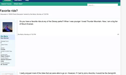
I am not a big fan of putting loads of stats under the avatar. This adds so much empty space in threads, but I do know this is a favoured layout for many. In this image for example, look at the empty dead space between post 1 and the start of post 2:

Screen shot 2012-04-04 at 10.23.35.webp


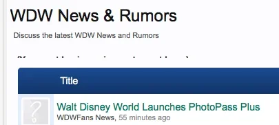
On the threads listing I think there is a problem because "You must log in or sign up" or whatever it should say, is mostly hidden:

Screen shot 2012-04-04 at 10.18.02.webp

On the subject of the colour scheme, I found it quite cool and minty. There is nothing wrong with it, but Disney to me is cartoons and colour.

But overall, and nit-picking aside, a nice, clean professional job, well done.
 
Thanks Ingenious - your feedback is greatly appreciated :)

I know what you mean about the '?' avatars. I've been playing around with a couple and will probably create one out of some photos I've got. I'd not noticed the issue with the login text being hidden so will make sure that gets fixed asap!

Glad you didnt find the colour scheme to be bad. I'd had feedback from a couple of friends (who by their own admission are certainly not designers, not am I!) that they werent keen on the colours. I just didnt want to end up with another all-blue design again, I've had far too many of those! :LOL:
 
I really like the looks of it, my only criticism would be that your postbit really takes up a lot of area. Maybe make use of the javascript template mod that let it expand on mouseover? Or something like that.

Nicely done though!
 
I really like the looks of it, my only criticism would be that your postbit really takes up a lot of area. Maybe make use of the javascript template mod that let it expand on mouseover? Or something like that.

Nicely done though!
Just seen it and will most certainly install it as I do agree that the postbit was too big - thanks for the feedback :)

Edit: Done! Works really well!!
 
Just one other comment, I really like how you used the CMS header in the forum area and just have the forum below it. Really makes it fit in nicely.
 
Thanks Arny! I guess you wont want to sell me any of the adspots on your forums? :ROFLMAO: :p

LOL, unfortunately not. But, in the future maybe we can work together to help promote your site. I've had WDBoards open for a few years (moving from vB to xF in the next couple of months) and DisFriends is being transitioned from Ning over to xF in the next 30-45 days if all goes as planned. So, we can talk about something in a couple of months if you need help in getting the word out :)
 
The style is elegant, but I would have expected something cartoonish. Come on, it's DISNEY. I can barely see a character in the header. I'd go crazy with the design over this, making it a background that's suitable, a big 'juicy' header, with the characters framing the forums etc. You can go nuts with this topic, don't keep it so elegant and sober. It's not a business forum :)
 
The style is elegant, but I would have expected something cartoonish. Come on, it's DISNEY. I can barely see a character in the header. I'd go crazy with the design over this, making it a background that's suitable, a big 'juicy' header, with the characters framing the forums etc. You can go nuts with this topic, don't keep it so elegant and sober. It's not a business forum :)

I was going to say the same at first, but looking for longer at the forum it has a very good theme going for it that does look more Pro like, but don't see that as an issue and think it would appeal much better to families thinking of going on holiday there (it looks that type of site with the style). Rather than it being plastered with Disney images and looking very child like, not as appealing to older people for using like it does now. I really like it, think it looks just right and not over the top and header logo is good to set the theme.

What it does lack for me is a body background image though, something repeated (tiled) maybe. Like a Micky Mouse image, but greatly faded out into the background so it can only just be seen, nothing that shouts out loud at you. Or whatever else looks in keeping? That's about the only place I'd improve upon on it.

There is one issue though, your tweet button is being cut-off by the G+ one.

screenshot.webp
 
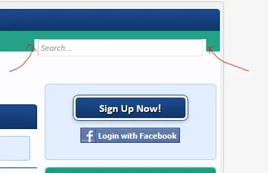
If you look at your search area the search looks a little crammed.

search-part1.webp


I think if you make the following adjustments adding the following to extra css it'll be an improvement and make it a little more neater.

Code:
.formPopup {
    border-radius: 5px 5px 0  0;
    padding-top: 5px;
}

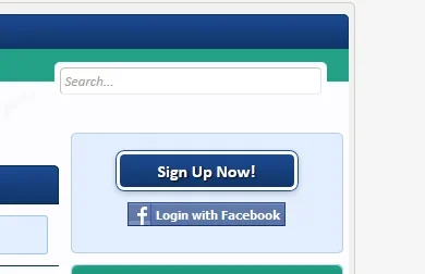
Below is the result.

search-part2.webp


Alternatively, I did the following through firebug (sorry I didn't save the css) but you'll be able to manage it if you think it looks or feels it'll suit your nav area and search.

nav-area.webp
 
Thanks for the feedback guys - really do appreciate it :)

Shelly, that looks pretty tidy like that - I'll give it ago! Thanks for the tip :)
 
Thanks for the feedback guys - really do appreciate it :)

Shelly, that looks pretty tidy like that - I'll give it ago! Thanks for the tip :)

Your welcome.

If your wanting to fix your twitter count box which is getting cut off in the nav area you might want to try the following either by modifying them directly or pasting the following into the extra css template.

Code:
.container_12 .grid_9 {
    width: 735px;
}

Code:
.container_12 .grid_3 {
    width: 245px;
}

Code:
.subnav ul.socials li.twit {
    max-width: 80px;
}
 
I spotted looking at you source code for the social icons displayed inline near the header (on a single line), that your using this.

Code:
<div class="grid_3 alpha omega">
<ul class="socials">
<li class="gplus"><div class="g-plusone" data-size="medium"></div></li>
<li class="twit"><a href="https://twitter.com/share" class="twitter-share-button" data-via="wdwfanscom" data-hashtags="wdwfans">Tweet</a></li>
<li class="fbook"><fb:like href="http://www.facebook.com/pages/WDWFanscom/167172956714401" send="false" layout="button_count" show_faces="false" font="arial"></fb:like></li>
</ul>
</div>

Seeing as they are displayed on a single line, there's no need to be using.

<ul>
<li>XXXXXX</li>
</ul>

If you've taken it from the sidebar panel to use there, keep in mind they are displayed one below the other there on a new line, hence why it's used to do it without needing a <br /> throwing in. You do something like this instead of the top of my head using &nbsp; (a none line breaking spacing code) to create gap on the same line between each social icon as an example, do away with the "<ul><li>'s". They are used to display an ordered list on a new line below each other.

Just a quick example using the source code:
<div class="grid_3 alpha omega">
<div class="g-plusone" data-size="medium"></div>&nbsp;<a href="https://twitter.com/share" class="twitter-share-button" data-via="wdwfanscom" data-hashtags="wdwfans">Tweet</a>&nbsp;<fb:like href="http://www.facebook.com/pages/WDWFanscom/167172956714401" send="false" layout="button_count" show_faces="false" font="arial"></fb:like>
</div>
 
I spotted looking at you source code for the social icons displayed inline near the header (on a single line), that your using this.
The main reason for it was that the boxes can expand with little to no warning as you go into double and tripple digits on the likes. When testing/developing I did originally have just a space between them but the lineup was all wrong, they would be a pixel or two out of line and it ended up being messy. So I put them in the list allowing me to give each of them their own css class to modify their individual positioning.

I *think* I've got the twitter one fixed now. I couldnt replicate it from my end on Firefox, Safari or Chrome on the Mac. Could you let me know which browser it was happening on? I've also had adobe browser lab open but cant replicate it on that either :(

I've given the twitter box a bit more space and added an overflow to drop the facebook button if it gets too big (thought it would be a better option than letting it overlap and break the layout).

The biggest problem is that there is litterally 2-3 pixels of space to play with before it hits the breadcrumb box, which cant be made any smaller as the space is needed. Hopefully the changes I've made have fixed it tho!

Thanks again for all the feedback and assistance to both mrGTB and of course Shelley - I ended up using Shelley's example for the forum search - it looks much cleaner now! :D

It looks great man, I love the integration, everything seems to be simple and tasteful.

Thanks John!

Really pleased that people like the colourscheme - it was my biggest worry that people wouldnt like the blue/mintgreen combo. I must admit I'm probably the worst person when it comes to matching up colourchemes so glad I finally got one right!

It originally started out as purple and green in the first few mockups...it looked...interesting to say the least :sick:
 
Top Bottom