DeveloperBarn.com - The Developer Resource

I like the previous login button with all the shadowing.
I probably have trashy taste.
I did, too, but I can see how it would look a little out of place seeing as everything else is so flat.
Oh my eyes are no where near as "eagley" as Shelleys lol she will probably find a thing or two :p
haha, well I've seen her make some great suggestions for other styles, so I'll gladly welcome anymore that she may have for mine :)

Also, border should be gone now.
 
I did, too, but I can see how it would look a little out of place seeing as everything else is so flat.

haha, well I've seen her make some great suggestions for other styles, so I'll gladly welcome anymore that she may have for mine :)

Also, border should be gone now.

Yes, much better now, can you see what I meant now that it is removed? The border being a lighter colour actually creates visual blurr - it used to be how we softened edges on .gif files back before drop shadows were everywhere lol.

This looks far crisper and sharper now
 
Yes, much better now, can you see what I meant now that it is removed? The border being a lighter colour actually creates visual blurr - it used to be how we softened edges on .gif files back before drop shadows were everywhere lol.

This looks far crisper and sharper now
Indeed, it was small but I can see the difference now that it's gone. Let me know if you see anything else that could use some love!:cautious::D
 
Indeed, it was small but I can see the difference now that it's gone. Let me know if you see anything else that could use some love!:cautious::D


LOL, I love the cautious face :p

pssssst, you know how I said the last thing, was the last thing... well... I lied :whistle:

One little thing is now bugging me.. and that is the use of the gradient on the back end of the breadcrumb... I would remove it to keep the flatness myself.
 
LOL, I love the cautious face :p

pssssst, you know how I said the last thing, was the last thing... well... I lied :whistle:

One little thing is now bugging me.. and that is the use of the gradient on the back end of the breadcrumb... I would remove it to keep the flatness myself.
Gone. I think it does look better without it.
 
If you're going to put border-radius on the categories, I think you need to do the same to the section headers in the sidebar, too. ;)
 
If you're going to put border-radius on the categories, I think you need to do the same to the section headers in the sidebar, too. ;)
I'm not sure if I like it...it almost seems to be a bit too much. What does everyone else think?
Scratch that...I tried to upload screen shots and I get, "There was a problem uploading your file".
 
Much much better imho :)


One tiny tiny thing though, (last thing.. promise!!!) the button has a border which is lighter than the button colour, which gives a rather distorting feel about it, perhaps make that border either slightly darker than the button colour, or remove the border.

Good catch Kim. (y)

Do you have eagle eyes installed in your skull? :p Maybe my eyes are just going bad on me. Let me check what CSS is generated :D

The border I'm sure kim is referring to and why it's not showing is because the background-color is the same as the border color. Here's what you have as your css. Not sure if you did this intentionally or it was an oversight.

Code:
#SignupButton {
    background-color: #93BB3A !important;
    border: 1px solid #93BB3A !important; }
 
Good catch Kim. (y)


The border I'm sure kim is referring to and why it's not showing is because the background-color is the same as the border color. Here's what you have as your css. Not sure if you did this intentionally or it was an oversight.

Code:
#SignupButton {
    background-color: #93BB3A !important;
    border: 1px solid #93BB3A !important; }


I think that is the correction Jason made, it was initially a lighter colour than the background, before he changed it to be the same colour, which made the button look blurry.

Looks fine to me now, nice and sharp, but it could go with a darker green if he wanted the border to stand out.
 
Yeap, I just made them the same color on purpose. :)

ah right that explains it then. I just realised that you made the update to it before i got the chance to see the lighter colour kim was referring to which would explain the blurry adverse affect. :)

Did i mention great job on the style? And that I am a fan of that green? :D
 
ah right that explains it then. I just realised that you made the update to it before i got the chance to see the lighter colour kim was referring to which would explain the blurry adverse affect. :)
Yeap, I made most of the changes almost instantly after they were suggested to try them out

Did i mention great job on the style? And that I am a fan of that green? :D
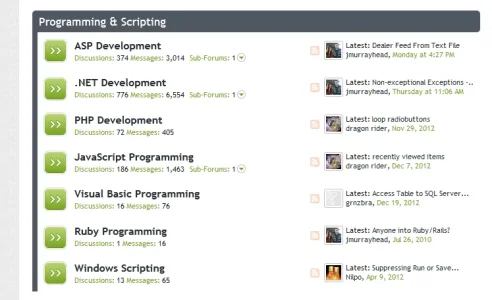
mmm...possibly. Did I mention that I would replace the node icons if some were provided? :P
 
Yeap, I made most of the changes almost instantly after they were suggested to try them out

mmm...possibly. Did I mention that I would replace the node icons if some were provided? :p


Did I mention I discretely, quite intentionally overlook your comment about that? Why am I saying this? Good god not only did i intentionally & discretely overlook that, I logged out of xenforo when I read it and jumped on steam for a game of l4d2 hopeful you would forget about the nodes (stop typing shelley, Stop Now!). :cry:

:D

I might have something for you on my harddrive that might look consistent with the theme, and inline with the design but I'm in the middle of styling a dark theme (tinymce is being a <insert profanity in here> and it's driving me nutty. :p I'll find some time tomorrow (sunday) and post some nodes that might work well. :)
 
Yeap, I made most of the changes almost instantly after they were suggested to try them out

mmm...possibly. Did I mention that I would replace the node icons if some were provided? :p

Just curious how you feel about the following adjustment to the signup button.

Code:
#SignupButton {
    background-color: #93BB3A !important;
    border: 1px solid #7A9B30 !important;
    border-radius: 3px  !important;
    box-shadow: 0 0 1px #FFFFFF inset !important;
}
output >> jmurrays_signup_button.webp
 
yeah I use it a lot too.. I Think I am pathalogically incapable of doing a flat design LOL hehehe

I will have to challenge myself to do one, just to see if I can stop my fingers from typing those fateful box-shadow: words :p
 
Just curious how you feel about the following adjustment to the signup button.

Code:
#SignupButton {
    background-color: #93BB3A !important;
    border: 1px solid #7A9B30 !important;
    border-radius: 3px  !important;
    box-shadow: 0 0 1px #FFFFFF inset !important;
}
output >> View attachment 39395
Like this - implemented!

I think i use the inset too much myself :p

@jmurray (below) quick design mind.

View attachment 39399
mmm...I think those would pop out too much in a flat design. Maybe something less square?
 
Top Bottom