DeveloperBarn.com - The Developer Resource

jmurrayhead

Well-known member
Just realized I never put my site up here. So here it is: http://www.developerbarn.com

I opened the site back in 2008 in response to a site I was a member and moderator of being acquired by a large company. At first it was ok, but they neglected the site and the community and made it into an ad farm for financial gain. We had a slow start and activity eventually picked up after a couple years...however, with many core members moving on due to lost interest in the topic and other obligations of higher priority, activity has dropped.

Anyway, I'd love to hear some feedback. Most of you know the person who did the custom style ;)
 
Nice site and excellent style (we don't see enough green styles) really like the header area. Excellent work. (y)

A minor tweak suggestion: maybe add the following radius to the category?

Code:
.nodeList .categoryStrip {
 
    border-bottom-right-radius: 5px;
    border-top-left-radius: 5px;
    border-top-right-radius: 5px; }
jmurray_radius.webp
 
Nice site and excellent style (we don't see enough green styles) really like the header area. Excellent work. (y)

A minor tweak suggestion: maybe add the following radius to the category?

Code:
.nodeList .categoryStrip {
 
    border-bottom-right-radius: 5px;
    border-top-left-radius: 5px;
    border-top-right-radius: 5px; }
View attachment 39335
I like it. Initially I requested for border radius to be removed for the most part - because everything has a border radius now - but I might change my mind on it now that I've seen your screen shot.
 
I like it. Initially I requested for border radius to be removed for the most part - because everything has a border radius now - but I might change my mind on it now that I've seen your screen shot.

Yeah, I was in that way of thinking but I think some designs/areas just look better with a radius. It depends if the design warrants it being put in and I could see you have removed a bit of the radius on your style (not that it's a bad thing) The variation of green really does look good (liking the green).

Another suggestion: I really think you should change the node icons. something a little more eyecandy but i sense your going for minimalistic? I think you can juggle that though with a nice balance with nice looking node icons and keeping it to a minimalistic look and feel. :)
 
Yeah, I was in that way of thinking but I think some designs/areas just look better with a radius. It depends if the design warrants it being put in and I could see you have removed a bit of the radius on your style (not that it's a bad thing) The variation of green really does look good (liking the green).
Yes. I LOVE the green. It's my favorite color and figured it would fit well with my site. I sent my ideas to John and he did the rest :D Anyway, I agree about the radius. I do like it some areas...but I think in some designs it's a bit overloaded because it's like a new toy for some.

Another suggestion: I really think you should change the node icons. something a little more eyecandy but i sense your going for minimalistic? I think you can juggle that though with a nice balance with nice looking node icons and keeping it to a minimalistic look and feel. :)
Indeed, I'm going for minimalistic...but I'm open to suggestions. I'm not saying that you should take time out of your busy schedule to make me some...but if you have a spare moment...:barefoot:

Green can be so hard to get right sometimes but I think all the colors work great on that style. It's one of my most favorite designs. Love it when a plan comes together. :)
It's a beautiful green. I love it when a plan comes together, too :D
 
Green can be so hard to get right sometimes but I think all the colors work great on that style. It's one of my most favorite designs. Love it when a plan comes together. :)

I agree. And to think when I was at <insert other forum software> I loathed green but back then they were mainly the horrid saturated green styles and the infamous black background with bright green. excellent work with this one though. :thumbsup:
 
I like the colours very much :) nice shade of green, and it works well with the charcoal header, I do think the charcoal category bars are smidge too harsh against the white background (I really don't like white backgrounds at all though, so probably biased there). The border radius has improved the "blocky" feel a lot, Shelley was right with that call I think.

Little on the minimalist/simplistic side for my taste, but I have no doubt that is the look you were going for, so it succeeds in that regard! :)

Nice work John, and congrats Jason, may your Xenforo thrive! :D

*edit - forgot to add, I do think the standard "Log in Now" button with the heavy drop shadow is out of place in a flat design, I would lose the shadow and "flatten" that a little myself.
 
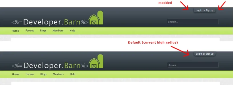
I agree with kim about the heaviness of the drop-shadow (box-shadow) I'd either (as kim suggested) remove that or lower the heaviness of it. I would also suggest lowering the radius a little to about 3px it's currentlyly 10px far to high and would compliment the design better i feel.

Code:
#loginBar #loginBarHandle {
    border-bottom-left-radius: 3px;
    border-bottom-right-radius: 3px; }
devbarn_login.webp
 
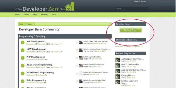
Good call Shelley, the loginbar needs it as well, I was actually talking about this one though (got my terminology wrong) ...

register.webp
 
I would also suggest lowering the radius a little to about 3px it's currentlyly 10px far to high and would compliment the design better i feel.
Done.

*edit - forgot to add, I do think the standard "Log in Now" button with the heavy drop shadow is out of place in a flat design, I would lose the shadow and "flatten" that a little myself.
Done. Let me know what you think :)
 
hmm... I still think it looks a little out of place with the box-shadow being so obvious, nothing else on the page has a shadow, nor 3D feel, it is a very flat design, and one element having shadow is a just not quite what I would expect to see.

:)
 
hmm... I still think it looks a little out of place with the box-shadow being so obvious, nothing else on the page has a shadow, nor 3D feel, it is a very flat design, and one element having shadow is a just not quite what I would expect to see.

:)
All gone! :)
 
Much much better imho :)


One tiny tiny thing though, (last thing.. promise!!!) the button has a border which is lighter than the button colour, which gives a rather distorting feel about it, perhaps make that border either slightly darker than the button colour, or remove the border.
 
Much much better imho :)


One tiny tiny thing though, (last thing.. promise!!!) the button has a border which is lighter than the button colour, which gives a rather distorting feel about it, perhaps make that border either slightly darker than the button colour, or remove the border.
Do you have eagle eyes installed in your skull? :P Maybe my eyes are just going bad on me. Let me check what CSS is generated :D
 
Back
Top Bottom