You are using an out of date browser. It may not display this or other websites correctly.
You should upgrade or use an alternative browser.
You should upgrade or use an alternative browser.
Default Max Responsive Width (Narrow) set to 540px
- Thread starter NeoCHI
- Start date
Considering the rise in popularity of phablets and the new iPhone 6 plus having 1080x1920 resolution. Shouldn't Xenforo's default Max Responsive Width (Narrow) be set to 540px?
I don't think it will make a difference from 480px on that device. I am not sure what the effective resolution works out to on that at 5.5 inches. But a slightly smaller device the Nexus 5 at 4.95" with a 1920x1080 screen is 640x360, 598x360 usable with the on screen controls. So 480 or 540 the site will still be narrow vertical (portrait) and still be medium horizontal (landscape). I don't think the iPhone 6 Plus will be much different. Give or take 100 pixels its still going to be in the narrow on vertical unless they are running a really weird scale.
No. Firstly there are still many phones that aren't phablets, these still have to be catered for. Secondly, how websites render on phones doesn't correspond to their screen resolution. For example my Sony Xperia Z1 has a screen resolution of 1280 x 720 px but it resolves XenForo sites at 480px width in portrait. It doesn't display it at 610px Max Responsive Width (Medium) which I have set. That is down to how the browser works on phones.Shouldn't Xenforo's default Max Responsive Width (Narrow) be set to 540px?
By increasing it to 540px it won't effect the phones with 480px but will also make it so that phones with 540px will also be displayed with the mobile responsive look.
For example my Sony Xperia Z1 has a screen resolution of 1280 x 720 px but it resolves XenForo sites at 480px width in portrait. It doesn't display it at 610px Max Responsive Width (Medium) which I have set. That is down to how the browser works on phones.
Default setting is easy to change yourself anyway.
The discussion is sort of a moot point because the 6+ doesn't have a CSS pixel width of 540 since it doesn't use 2 CSS pixels per screen pixel. It actually uses a higher resolution internally and downsamples to 1920x1080.
From tests, it's actual CSS width is 414px: http://stackoverflow.com/questions/...ewport-sizes-of-the-iphone6-and-iphone-6-plus
From tests, it's actual CSS width is 414px: http://stackoverflow.com/questions/...ewport-sizes-of-the-iphone6-and-iphone-6-plus
So how do we adjust/ fix this on our Xenforo sites to respond properly.
So is there an adjustment to make on the back end of the site via responsive or what ever? At this point my main issue on landscape via the iPhone is the forum description I need to go responsive.
So is there an adjustment to make on the back end of the site via responsive or what ever? At this point my main issue on landscape via the iPhone is the forum description I need to go responsive.
You can set the width in your theme. It is up to you. In landscape the phone is over 700 pixels in css width and should be the same settings as a tablet. If you adjust for the 6+ then you may end up screwing up people with 7 inch tablets with low resolutions.
When you say "theme" aside from setting it up as I did above?You can set the width in your theme. It is up to you. In landscape the phone is over 700 pixels in css width and should be the same settings as a tablet. If you adjust for the 6+ then you may end up screwing up people with 7 inch tablets with low resolutions.
When you say "theme" aside from setting it up as I did above?
Theme, Style. Synonyms to each other I believe. It's a per style setting.
Hopefully @Russ will be able to help me then, it is his style.Theme, Style. Synonyms to each other I believe. It's a per style setting.
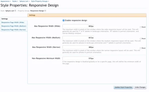
I left it at 667px and iPad 2, iPad mini work fine, as well as iPhone 6 (not 6 +) don't have one to test on. Not sure what else won't work with this change from 610px to 667px...I changed Max Responsive Width (medium) to 667px and it seemed to work, hope it didn't effect anything else...
View attachment 96888
Similar threads
- Replies
- 4
- Views
- 939

