[cXF] Membership Page

[cXF] Membership Page [Paid] 2.0.1

No permission to buy (€25.00)
I can add one more for XF version 2.3 later.

You can add custom text, edit phrases already...

As a temporary solution, you can add more options with the DIY principle (editing the template). If you need help, contact me at customizexf.com.
Two would be great...
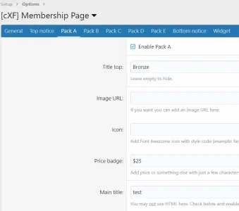
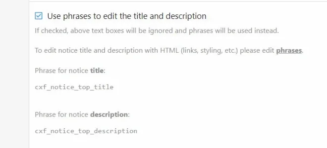
I have made my edits and added two options and I did find a slight error in your hints area. The phrases that are referenced are incorrect.
mp1.webp
Should be cxf_mp_notice_top_title and cxf_mp_notice_top_description and so on...
 
Last edited:
Phrase error?
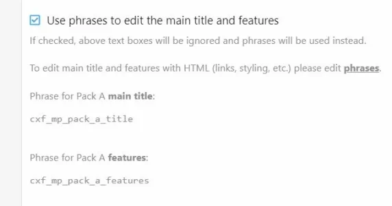
cxf_mp_pack_a_title (a, b, c, d, e) does not exist
Template uses cxf_mp_pack_a_main_title (a, b, c, d, e)
Output uses options > [cXF] Membership Page > Main title: even with Use phrases checked.
Feature phrases = ok
cxf_mp_pack_a (a, b, c, d, e) also?

pe1.webp

pe2.webp
 
Last edited:
Update -
By editing template: cxf_membership_page
<xf:if is="$xf.options.mp_pack_a_title_description_phrases"> to <xf:if is="$xf.options.mp_pack_a_title_features_phrases"> (a, b, c, d, e) cxf_mp_pack_a_main_title (a, b, c, d, e) functions.
 
🤦‍♂️😊

I need to slow down... Thank you for reporting this. I'll try to update those descriptions (again) over the weekend.
 
@Bass Can you explain what behavior this controls? I've tried 0px to 400px with multiple packs enabled and I'm not sure of the intended logic.. Thanks,

wid1.webp
 
XF 2.2.15 new install - Chrome - only addon [cXF] Membership Page 1.4.4 - Pack A 20px (testing a small #)
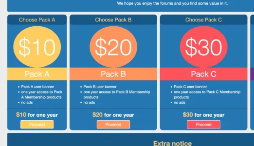
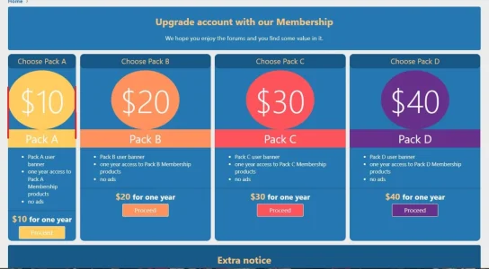
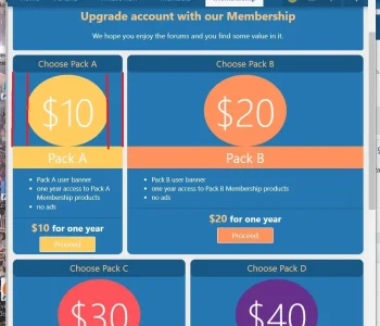
Is this expected (icon to border distance)?
Different browser widths:

packa2px1.webp

packa2px2.webp

packa2px3.webp
 
Yes, this is expected. The width is for the "pack" block (from edge to edge). The price is always centered.
 
Thanks for the help in understanding this... The pack block is "Choose Pack A"? If so, why is the width so large on image two if px=20?
 
Back
Top Bottom