You are using an out of date browser. It may not display this or other websites correctly.
You should upgrade or use an alternative browser.
You should upgrade or use an alternative browser.
Current design needs some work...
- Thread starter wii
- Start date
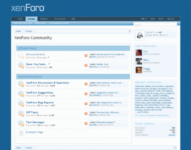
current design is absolutely perfect.
I suggest a larger logo and get rid of the current header forum color, what about something like this?
I really disagree... Much prefer the current version to your... Though you will have full template control when it comes to you so you can do what you want with it

Well, design is always a matter of preference, but I really do think the current logo is too small, but yes, it will be no problem in changing it I'm sure.....
The size of the logo would only really matter the first visit really, because after the first visit, most people will ignore the header (Unless they're purposely looking at it for something).
Its also unlikely someone is going to keep the default logo on a live board (That is meant for traffic), and they easily have the choice to increase the text size or to do whatever.
The way it looks now is much better than your mockup.
=
=
I agree with others...the way it is now is better.
Sorry wii, but your design suggestion would, in my opinion, be a downgrade and revert back to the vBulletin look.
Having the background color jump from blue to grey is a subtle but important delineation of navigation vs. content. Also, having a smaller logo again emphasizes the content and de-emphasizes the company logo. Content is king.
Having the background color jump from blue to grey is a subtle but important delineation of navigation vs. content. Also, having a smaller logo again emphasizes the content and de-emphasizes the company logo. Content is king.
Honestly I have to agree with the others and say that what we have currently is better. There is too much whitespace (in this case blue) in your mockup. It looks odd and restricts the content. I prefer the lightweight, fluid-width design we have now. It emphasizes the content and lets everything else just kind of stay out of your way. ")
This.Also, having a smaller logo again emphasizes the content and de-emphasizes the company logo. Content is king.
Brandon_R
Guest
I would prefer this design:

But the current design is fine too.")
Adds an undeeded block to the bottom of the page which creates more. We need to keep the design simple and sleek.
@brandon
yes I know. But I like it at the bottom. But I don`t expect a change, so I will do that by myself
It doesn't look too bad at the bottom your implementation of it isn't actually that bad..
...I personally prefer it on the side as it breaks the width of the page up slightly which currently on a high resolution PC is a great thing...
Each to their own though
Similar threads
- Replies
- 4
- Views
- 1K
- Replies
- 22
- Views
- 2K
- Question
- Replies
- 26
- Views
- 2K
- Question
- Replies
- 10
- Views
- 1K
- Replies
- 1
- Views
- 1K