When you tick to create the user, the box changes value. Mine does...
You are using an out of date browser. It may not display this or other websites correctly.
You should upgrade or use an alternative browser.
You should upgrade or use an alternative browser.
Core - PixelExit.com [Deleted]
- Thread starter Russ
- Start date
D
Deleted member 77670
Guest
NevermindOk my apologies, I'm an idiot somehow.
Revert this template on xenbase:
login_bar_form
and it will fix it.
")
I need to learn how to read. I was modifying another template. Thanks a lot!
It works now :3
When you tick to create the user, the box changes value. Mine does...
Can you elaborate on this Anthony?
What I mean is... is this question about the submit button saying Login, instead of Signup now...
When you check the box to signup, the button text changes.


When you check the box to signup, the button text changes.
What I mean is... is this question about the submit button saying Login, instead of Signup now...
When you check the box to signup, the button text changes.
View attachment 78497
View attachment 78498
Gotcha no it was referencing a really dumb mistake on my part which took out that conditional to even show the registration part.
Oh... by the way Russ... the latest update rocks. This framework just keeps getting better and better. Users are seriously happy with the outcome.
Oh... by the way Russ... the latest update rocks. This framework just keeps getting better and better. Users are seriously happy with the outcome.
Appreciate it Anthony, lots of love has gone into it, and more to come
.Russ... an off-beat question here... but I'm using *******s pre-defined reply add-on which adds an icon to redactor. Now having your font awesome setting enabled, how do I use font awesome for that icon, exactly?
You can see it returns an empty space for me... clickable nonetheless, but empty...

You can see it returns an empty space for me... clickable nonetheless, but empty...
Russ... an off-beat question here... but I'm using *******s pre-defined reply add-on which adds an icon to redactor. Now having your font awesome setting enabled, how do I use font awesome for that icon, exactly?
You can see it returns an empty space for me... clickable nonetheless, but empty...
View attachment 78532
You'll need to define an icon for it, using the inspect tool you need to grab the class of the link class:

In this case it's redactor_btn_undo
Then add a css snippet for it:
Code:
html .redactor_toolbar li a.redactor_btn_undo:before {
content: "\f0f7";
}
Of course replacing: redactor_btn_undo with the add-on class.
You can find the codes here: http://fontawesome.io/cheatsheet/
Worked like a charm... thanks.
Russ updated Core - pixelExit.com with a new update entry:
URGENT Minor Update
Read the rest of this update entry...
URGENT Minor Update
This fixes a bug which was pushed out in our last update so please update immediately(broke registration to an extent)
- Added text as logo with css properties
- Fixed registration issue
- Fixed sticky sidebar in mobile spacing
All customers can find the new download in the "MY DOWNLOADS" link on pixelexit.com
Read the rest of this update entry...


Great theme but the only thing that I see that doesn't really match are these white buttons:
View attachment 78813
View attachment 78814
View attachment 78816
They just don't really blend with the rest of the theme. Just a suggestion but a button setup like you have on your flat awesome style would blend more:
View attachment 78817
They haven't changed really since I launched it to be honest, but I agree the flatter looks better.
My plan next between the 1.4 release is to go back and really improve the styles themselves instead of primarily focusing on the framework(which is nice too of course
).To change those just in case
Style Properties -> Buttons -> Call to Action button and Button
Hey @Russ just wondering if is it possible to transfer my Core license to someone else since I wont be able to mantain the website anymore
Just shoot me a PM with the details we can discuss it there.
Russ updated Core - pixelExit.com with a new update entry:
1.4.0 Beta 1 Fixes
Read the rest of this update entry...
1.4.0 Beta 1 Fixes
Primarily a XenBase update which brings all of the out of date templates up to date.
Existing customers can find it in the "My Downloads" link on pixelexit.com.
To upgrade simply first make backups of your styles by exporting them.
Next import XenBase 1.4.0 Beta 1 overwriting your current XenBase, then import the style you've purchased and overwrite it. All updates should trickle down to your child style.
Last note:
This is possibly the last release we'll do for the 1.4 Beta series,...
Read the rest of this update entry...
Russ updated Core - pixelExit.com with a new update entry:
1.4.1 Update
Read the rest of this update entry...
1.4.1 Update
The style has been updated to our 1.4.1 version of the Framework. The update was pushed out on site this past week so some of you may already have the download. It brings new functionality, bug fixes and optimization. All customers can download the update in our new store. We recently upgraded our site and store so if you have any trouble at all please don't hesitate to start a support ticket with us. You can read about our upgrade and the new store...
Read the rest of this update entry...
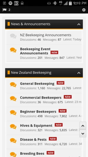
Just got a slight issue with 1.4 on mobile.
Discussions, messages, latest scrolls off the page.
Go to Style Properties -> Forum / Node List -> Node Stats, remove the overflow: visible
from the misc box, it was a mistake we put that in there.