You are using an out of date browser. It may not display this or other websites correctly.
You should upgrade or use an alternative browser.
You should upgrade or use an alternative browser.
Conditional Statements for XenForo 2
- Thread starter eTiKeT™
- Start date
Unless I misunderstand you'd just uncheck the widget to be in the widget control.Anyone know how to hide a widget if someone is viewing XFMG (Xenforo media gallery)? I don;t want the widget to show when in the gallery, just the forums.
What widget are you trying to hide?
Attachments
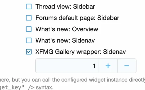
It's a custom widget which contains a banner. I have hidden it with js but wanted to know if there was some sort of conditional like if xfmgUnless I misunderstand you'd just uncheck the widget to be in the widget control.
What widget are you trying to hide?
")
@Paul B and others.
Instead of creating a new thread, I thought it's better to ask here.
Is there a Xenforo date/time conditional that I can use only for the d-m php date format?
I need this for a "On This Day" feature, so e.g. on every 31st of May, the conditional would show the content. Similarly for other selected dates that I'd choose to display content.
E.g. on every 04.07 it shows a message for Independence Day
For every 24.12 it shows a message for Xmas eve etc....
Last edited:
Found it !
I remembered to have set another setting based on other conditions.
So basically you just need to declare a new variable $OnThisDay that calls the time function with the format you wish; and then just create the simple conditional to check.
I hope someone finds this useful.
I remembered to have set another setting based on other conditions.
So basically you just need to declare a new variable $OnThisDay that calls the time function with the format you wish; and then just create the simple conditional to check.
Code:
<xf:set var="$OnThisDay" value="{{ date($xf.time, 'd m') }}" />

<xf:if is="$OnThisDay == '30 05'">
    On 30 May this event happened......
</xf:if>
I hope someone finds this useful.
Last edited:
Is there a way to detect javascript? So if Javascript is disabled, we can show a message or something?
You don't need a template condition for this, just use theIs there a way to detect javascript? So if Javascript is disabled, we can show a message or something?
<noscript> html tag ")
<noscript> HTML noscript element - HTML | MDN
The <noscript> HTML element defines a section of HTML to be inserted if a script type on the page is unsupported or if scripting is currently turned off in the browser.
You don't need a template condition for this, just use the<noscript>html tag
<noscript> HTML noscript element - HTML | MDN
The <noscript> HTML element defines a section of HTML to be inserted if a script type on the page is unsupported or if scripting is currently turned off in the browser.developer.mozilla.org
Hm, would be ideal if it was possible with conditionals too so we can disable some functions until they turn it on.
AFAIK, Unfortunately you cannot know how a browser renders a page until it does so. Template conditions are basically PHP Code, so they don't know much about the browser. You can bypass that limitation e.g. if you set a cookie via javascript and check for it's existence. But you cannot do that on the 1st page load: First PHP has to build the page, then the browser has to render it (and execute javascript) and then you can do something with it.Hm, would be ideal if it was possible with conditionals too so we can disable some functions until they turn it on.
You can useI mess with templates so infrequently - how do I display all the variables available in a template? Globally?
dump(). A lot of output you will get if you insert this in your template: {{ dump($xf) }}.You can do the same with other variables that are used in your template. But I am not aware of a way to display a list of all available variables..
Is there a way to hide something only from mobile devices?
You can use this:
Resource icon
X
A light-weight shim around[Mobile_detect for XenForo
- Xon
- browser mobile phone
- Add-ons [2.x]
D
Deleted member 184953
Guest
Use media queries...Is there a way to hide something only from mobile devices?
Less:
@media (max-width: @xf-responsiveWide)
{
    // your stuff displayed only in wide screens, so hidden in narrow and medium screens
}

@media (min-width: @xf-responsiveMedium)
{
    //your stuff displayed only above medium screen, so hidden in narrow screens
}

@media (max-width: @xf-responsiveNarrow)
{
    //your stuff displayed only on narrow screens
}

etc...
Last edited by a moderator:
@media (max-width: @xf-responsiveWide) { // your stuff displayed only in wide screens, so hidden in narrow and medium screens }
I created a widget with html and css code called in extra.less ... I should only show it to fixed devices, since it can't be seen well on smartphones and is enlarged. so I need a way to either hide it or adjust the width in mobile browsers@media (max-width: @xf-responsiveWide) { // your stuff displayed only in wide screens, so hidden in narrow and medium screens }
D
Deleted member 184953
Guest
Try this:so I need a way to either hide it or adjust the width in mobile browsers
Less:
.block [data-widget-key="youo_widget_key"]
{
    @media (max-width: @xf-responsiveNarrow)
    {
        display: none;
    }
}hello,
im trying to hide a group of buttons from non registered/unconfirmed users...
which ive done, thank you.
oh wait no no now there are errors hmm....im not surprised really lol. what i tried was to make a custom template modification and just wrap the whole template that inserts them in the conditional, which i used:
then im getting these errors from various places the buttons are located:
regards
im trying to hide a group of buttons from non registered/unconfirmed users...
which ive done, thank you.
oh wait no no now there are errors hmm....im not surprised really lol. what i tried was to make a custom template modification and just wrap the whole template that inserts them in the conditional, which i used:
<xf:if is="{{!$xf.visitor.isMemberOf(1)}}">then im getting these errors from various places the buttons are located:
- ErrorException: Template error: [E_USER_WARNING] Cannot call method isMemberOf on a non-object (NULL)
- src/XF/Template/Templater.php:1268
$xf.visitor.user_id && $xf.visitor.user_state == 'valid'in extra.less template? etc etc i tried putting the conditional in there and it only hides it for everyone and ignores the thing. or how can i put the only that element in the conditional etc....regards
Similar threads
- Solved
- Replies
- 2
- Views
- 163
- Replies
- 2
- Views
- 419
- Replies
- 0
- Views
- 284
- Replies
- 2
- Views
- 334