You are using an out of date browser. It may not display this or other websites correctly.
You should upgrade or use an alternative browser.
You should upgrade or use an alternative browser.
Lack of interest Change the hover color of the account navtabs
- Thread starter Matthew Hawley
- Start date
This suggestion has been closed automatically because it did not receive enough votes over an extended period of time. If you wish to see this, please search for an open suggestion and, if you don't find any, post a new one.
This suggestion has been closed. Votes are no longer accepted.
View attachment 50844
I really don't think the white looks good on the blue background. If your going to keep it like this at least add some text-shadow.
Judging by the screenshot it does have text-shadow.
Matthew Hawley
Well-known member
Judging by the screenshot it does have text-shadow.
I should put, "at least add a text-shadow that looks more appealing."
Matthew Hawley
Well-known member
Where exactly are you seeing it like that? My screen looks fine on all states
Umm...the account, inbox and alerts tab. >.<
Where exactly are you seeing it like that? My screen looks fine on all states
In some cases (I find it hard to get it to show this btw) for a split second between the transition of hovering over the account and the menu dropdown it kind of flashes to that state. But I've hovered and opened the menu for 10 minutes (i'm bored)
I should put, "at least add a text-shadow that looks more appealing."
Reason I ask on mine:
Attachments
Matthew Hawley
Well-known member
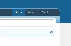
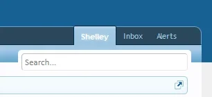
Still confused then as these are the hovers I can replicate:
View attachment 50846 View attachment 50847
If you click on the tab Russ and then you'll be brought into the profile page then go and click on the tab and hover. This is what I think Matthew is referring to.
Matthew Hawley
Well-known member
If you click on the tab Russ and then you'll be brought into the profile page then go and click on the tab and hover. This is what I think Matthew is referring to.
Yes thats what I mean.
Yes thats what I mean.
I'm almost sure this is As designed. Off the bat I can't see a reason why you would click the tab if your present within that area and the additional links you can access are in the side navigation within this area. I mean, I could be mistaken this is As designed but it's certainly not something I worry about since it's styled and removed out.
I'm sure @Mike and @Brogan can and will confirm/dismiss this.
To be honest, looking at the original image in the post and the one I've just taken from a default install (once @Shelley explained where to find it lol) it looks like the original image isn't default anyway, pretty sure you have a css change on there, which is making it look worse @Matthew Hawley


Matthew Hawley
Well-known member
To be honest, looking at the original image in the post and the one I've just taken from a default install (once @Shelley explained where to find it lol) it looks like the original image isn't default anyway, pretty sure you have a css change on there, which is making it look worse @Matthew Hawley
View attachment 50848
Yea I put in the non hover css so i could take a picture.
Wouldn't it have made more sense to take a screenshot of the actual thing, instead of editing it? Yours isn't displaying it correctly so makes it look far worse than it actually is.Yea I put in the non hover css so i could take a picture.
Matthew Hawley
Well-known member
Wouldn't it have made more sense to take a screenshot of the actual thing, instead of editing it? Yours isn't displaying it correctly so makes it look far worse than it actually is.
Well I cant take a pic of a hover effect...
Why not? I managed to and by editing the css, you're not necessarily showing the correct image because it could be pulling in extras from the actual default page you're editing.Well I cant take a pic of a hover effect...
Similar threads
- Question
- Replies
- 1
- Views
- 268
- Solved
- Replies
- 2
- Views
- 322
- Question
- Replies
- 13
- Views
- 2K


