Not a bug Carousel.less width increases, losing control, when Carousel container is being used inside an element of a Flexbox container.

ShikiSuen

Well-known member
Affected version
2.2.2
If the Carousel container of XFRM gets placed in an element (.p-body-content) of a flexbox (div.p-body-main .p-body-main--withSideNav), then the width of the Carousel container increases drastically. At least, I have no way to stop this.

This issue can be repeatable in XF official forum (this forum). See the screenshot indicating that the Carousel container width becomes "3.35544e+07px" as soon as the type of body-main--withSideNav changed from table to flex.
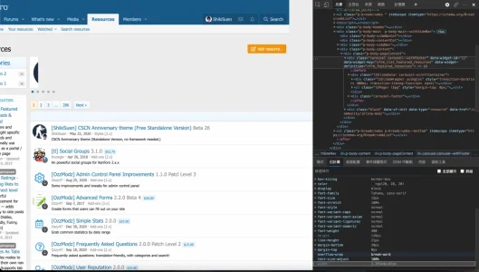
1624196722475.png
 
Last edited:
P.S.: Flexbox is important for making the feature of flipping the place of sidebar / sidenav and the p-body-main.
CSCN Anniversary issue introduced this feature, but it must be turned off for XFRM users due to this Carousel issue.
Should I also send this bug report to the Carousel library maker?
 
It's very likely that you need to make further style changes to account for all necessary cases if you change the page layout to use flex box. (Notably, the min-width difference for flex items: https://makandracards.com/makandra/66994-css-flex-and-min-width)

This is going to be something that you need to account for/handle in your custom style. We can't easily account for a display system we aren't using out of the box.
I tried min-width: 0 to div.p-body-pageContent and it doesn't work.
Could you please tell me the URL of the GitHub repo of the Carousel library you are using?
 
I tried min-width: 0 to div.p-body-pageContent and it doesn't work.
I don't know whether you made further structural changes, but if p-body-main is the flex container, p-body-content is the flex item (not pageContent). You can test your styles by just adding a long, unbreakable string of text (a long "MMMMM..." is a good test). If that stretches the page, you need to make changes to fix that.
 
I don't know whether you made further structural changes, but if p-body-main is the flex container, p-body-content is the flex item (not pageContent). You can test your styles by just adding a long, unbreakable string of text (a long "MMMMM..." is a good test). If that stretches the page, you need to make changes to fix that.
Thanks, Mike. Your suggestion actually works. I finally figure out that I need to add this:

Code:
div.p-body-main--withSideNav .p-body-content, div.p-body-main--withSidebar .p-body-content {
    min-width: 0;
}

Sometimes hot modification tests in browser inspector may fail if only applied to a single element without specifying its relationship with contextual-related elements.
 
Back
Top Bottom