Yes, that suggestion was already madeWould there be a way to import topics into a blog, with each post in this topic being a new entry in that blog?
http://xfaddons.com/threads/thread-importer.190/
Yes, that suggestion was already madeWould there be a way to import topics into a blog, with each post in this topic being a new entry in that blog?

.bottomLink a:before {
  background: url("@imagePath/xenforo/xenforo-ui-sprite.png") no-repeat scroll transparent !important;
  background-position: -144px -16px !important;
  height: 16px;
  width: 16px;
  padding-left: 20px;
content: ""; }Yes, the phrases are the same, so they will stay along. Same with the content, you will be able to keep all blogs, entries and commentsQuestion here: Can I start translating phrases with the free versjion and will they move over to the paid one then? Also, everything created will be upgraded, right?
I plan to buy the paid version within two weeks, but would be nice to have a headstart.
The reason is that the blogs were originally designed to be used without the forum frameJust noticed in guest view (I personally think it's not needed myself) but could we see the removal of the login button in the .visitorPanel? Or place the login outside the <div> container? I'll post this at your site too so you can keep track of the suggestion also.
The reason is that the blogs were originally designed to be used without the forum frame
For example, see
https://maxpower.cemzoo.net
This product was originally designed to create a "Network of Blogs", and the idea is that though they were linked to the forum, I wouldn't go and impose a giant header on the users, the frame would be as minimalistic as possible and the users would be able to customize their color scheme.
In that scenario, the Log In button was necessary because without the regular Log In header, there was no other way to logging into the forum. The header was practically non-existent.
Then I had a huge backslash of people that didn't agree with my idea of designing a blog to be a blog and absolutely wanted to have the default XenForo header. That is when I stepped back and re-added the default XenForo chrome, though I don't really personally use it
And some design elements, like that "Log in" button are there for that reason.
Anyway. I'll take your suggestion. Actually I can remove it if the default XenForo style is being used (what I call "normal" mode). Which I think makes complete sense. I'll leave it there in the fullscreen mode only.
.visitorPanel .loginContainer {display: none;}Thanks for the feedback. I appreciate it.It's no biggie but thought I'd mention it. It's easy enough to remove it from the visitorPanel anyway.For anyone that wishes to remove the login button from inside the visitorpanel paste the following in the EXTRA.CSS template.
Code:.visitorPanel .loginContainer {display: none;}
Thanks for the feedback. I appreciate it.


@Shelley with the example CSS you posted, was that meant to be just for the blog homepage? I assume that I need additional CSS for the "my blog" page, etc?
This is a basic CSS question but if i have two classes can I set the CSS on both at the same time?
e.g. (.bloghome and .blogindex) .a { stuff; }
What's the correct syntax to do the above?
I think its basically just do what you did but apply it to the blog index page as well.
Is there a way to apply it to both at once rather than having a block of CSS for the index and the same block again for the home page?
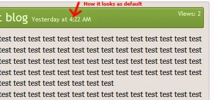
There's two instance of the code but you only have to move one. In the xfa_blog_entry_bit template move the bottom instance of
Code:<span class="datetime muted"><xen:datetime time="{$entry.post_date}" /></span>
and add that after the following code in the same template.
Code:<div class="postControls"> {xen:raw $entryInlineModControls}
Then in EXTRA.CSS add the following the colours may need adjusting to your preference but you will need the margin-right & font-size
Code:.blogEntry .DateTime { color: #494949; font-size: 10px; margin-right: 10px; }

/* Better Blogs remove double Create Entry */
.titleBar .topCtrl {
display:none;
}@DRE , who created the importer for you? any chance they might be willing to distribute it? it is EXACTLY what i need.Yes, that suggestion was already made
http://xfaddons.com/threads/thread-importer.190/
Any idea of why (or is this normal) I'm getting this (the two create entry tabs)? I'm pretty sure it's due to the style I'm using.
View attachment 57768
Any idea how to get rid of the one to the left? I know it'll involve a template edit, but just not sure which one.
EDIT: haven't found the template yet, but have found something that works in EXTRA.css
Code:/* Better Blogs remove double Create Entry */ .titleBar .topCtrl { display:none; }
Still trying to get it so that it looks better. Waiting on the author of the style to also get back with me to try and eliminate the right one instead as it looks better overall on the left.
Yep.. if I comment out the topCtrl in that template they BOTH go bye-bye.I'm quite sure the template you want to be looking at is xfa_blog_home but I think your hunch is correct that it is more likely to be a style issue.
We use essential cookies to make this site work, and optional cookies to enhance your experience.