erich37
Well-known member
1)
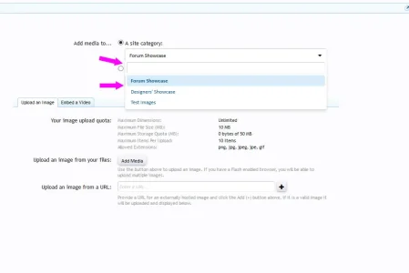
the Autofill at the "Add Media" is looking quite confusing.
I think it would be better to remove the "autofill" from these boxes.
It shows the "radio button" of the second box just infront of the autofill-field of the first box..
2)
Box-design also looks strange when you have selected a category, and then click into the selected box again.
screenshot below:

Upvote
0