• This forum has been archived. New threads and replies may not be made. All add-ons/resources that are active should be migrated to the Resource Manager. See this thread for more information.

Aurora

Status
Not open for further replies.
Will take a look later today.


I think what he is saying... is this. Why is the "Start Date" listed there, when it is actually displayed here in the thread:

ZBE0PY.png


It isn't listed to the right, under "Start Date", it is listed after the author's name, under "Title" with all other information.
 
Exactly. And also the redundancy of writing "replies" and "views" twice.

I was just wondering if it was all a design feature or only I'm just seeing those and the misalignments.
 
I think what he is saying... is this. Why is the "Start Date" listed there, when it is actually displayed here in the thread:

ZBE0PY.png


It isn't listed to the right, under "Start Date", it is listed after the author's name, under "Title" with all other information.
Exactly. And also the redundancy of writing "replies" and "views" twice.

I was just wondering if it was all a design feature or only I'm just seeing those and the misalignments.

Good points ... will take both into consideration for 1.1.0.3
 
Ok ... the easiest fix is the following:

Find this (using Search template for example):
Code:
.node .forumNodeInfo.unread .nodeIcon, .node .categoryForumNodeInfo.unread .nodeIcon {
background-image: url('styles/aurora/xenforo/node-sprite.png');
background-repeat: no-repeat;
background-position: -36px 0;
}

and change it to:
Code:
.node .forumNodeInfo.unread .nodeIcon, .node .categoryForumNodeInfo.unread .nodeIcon {
}

On a quick look this should fix it :D

Thanks, that seems to have sorted out the position problem, but I'm still unable to change the default read and unread forum icon, is there a work around for this?
 
Exactly. And also the redundancy of writing "replies" and "views" twice.

I was just wondering if it was all a design feature or only I'm just seeing those and the misalignments.

Ok the Replies and Views @ the top are there for the sorting functionality. I have fixed the alignment and it will be in 1.1.0.3
 
Hi guys,

Sorry if this has been asked already. I had a quick search of the thread but didnt find anything.

I assume this little style issue is because I changed the width of my page controller to 1100px? But not sure. Any help would be appreciated, thanks.

pagenav.webp
 
Hi guys,

Sorry if this has been asked already. I had a quick search of the thread but didnt find anything.

I assume this little style issue is because I changed the width of my page controller to 1100px? But not sure. Any help would be appreciated, thanks.

View attachment 22185

Change the width of the BreadCrumb ... You can simply open the Fluid theme and see how it is done there ... the only diff is that there the breadcrumb width is set to auto and there is a margin: 0 20px.
 
Change the width of the BreadCrumb ... You can simply open the Fluid theme and see how it is done there ... the only diff is that there the breadcrumb width is set to auto and there is a margin: 0 20px.
I set breadcrumb to auto and it went all full size basically but the page controller stayed at 1100px. So what I did was set the breadcrumb to 1100px also and now it looks perfect. Thanks for the quick reply. Amazing theme!
 
Is anyone using this Style with XenPorta I'm having some weird issues and it doesn't "break out of container" properly (a XenPortal option)
 
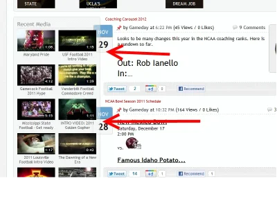
Stewart1champ thanks for the reply (and I like your website) But, I actually see several errors with your layout. I just quickly visited and their is some overlapping issues (see the red arrows below) Also the background is all white and not "broken out" as I was asking see http://xenforo.com/community/threads/xenporta-user-guide-and-faqs.24241/ for example of broken out or not


View attachment 22215


From what I understand, with that "RecentNews2" portal block I added, the date is supposed to be set to the side, kinda half in and half out of the block. As far as the break out, which I thought you were speaking about, it worked on mine (hiding/removing the board title).
 
I was thinking of the Breakout as to being able to see the background in between the boxes basically breaking out each box as a seperate item and not part of one main box. Which it isn't doing. :~(
 
I was thinking of the Breakout as to being able to see the background in between the boxes basically breaking out each box as a seperate item and not part of one main box. Which it isn't doing. :~(

Oh. That I am not sure about. I may be wrong, but I thought I read somewhere Jaxel had posted that checking that box removed the Forum Name at the top. Didn't notice anything else about what it may do.
 
Really loving this theme. So much so that I think im going to switch from Flexile Dark(another great theme btw)

The only small issue I have is the white background. I know this can be changed. But finding something nice to blend in has been very hard! Just wondering if anyone has some tiled backgrounds or a place to search for them?

Preferably something gray or darkish would be good, cheers.

Not that you mentioned "darkish" ... I was wondering if there will be any interest for a Dark variation of the Aurora (with a black/very dark background etc.)?
 
Status
Not open for further replies.
Back
Top Bottom