You are using an out of date browser. It may not display this or other websites correctly.
You should upgrade or use an alternative browser.
You should upgrade or use an alternative browser.
Article Forum Symmetrical Grid Layout
- Thread starter Paul B
- Start date
is it possible to make it 1:1:1:1?In the default style, an article forum in preview mode has a layout of 1:2:2:4:4
D
Deleted member 184953
Guest
This is exactly what the code in this resource does...is it possible to make it 1:1:1:1?
Not at all..This is exactly what the code in this resource does...

that is 4:4
D
Deleted member 184953
Guest
Oh... ok.
You would use separate code for narrow viewports.Is it possible to rewrite this code so it also applies to mobile display? I think 2 columns for mobile viewport are better.
However, I think two columns wouldn't work well - everything would be cramped.
Doesn't it already adjust itself for narrower viewports? Seems to do that on my devices here.
Do you think it would be possible to use this grid layout on a custom page node and display your own content, or is it tied to the article system only?
Thanks very much, I will give that a tryIt's just CSS/Less.
You can inspect the templates and re-use it for your own purposes.
You will just need to change the class names, or use the same structure on your page node.
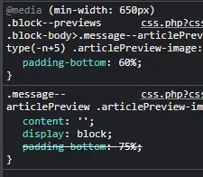
If I read it all correct, then the below code should get me a 2 grid row: - but it do the opposite, it shows 4 smaller grids in a row.
What am I doing wrong here?
What am I doing wrong here?
Code:
.p-body-main:not(.p-body-main--withSidebar) .block--previews .block-body
{
    grid-template-columns: repeat(2, 1fr);
    grid-template-areas: "a a" "b_1 b_2" "b_3 b_4";
}


@media (min-width: @xf-responsiveMedium)
{
    @__ctaArticleFooter: 40px;

    .block.block--articles.block--previews .block-body .message--articlePreview
    {
        margin-top: 0;

        &:nth-of-type(n)
        {
            grid-area: unset;

            & .articlePreview
            {
                &-main
                {
                    flex-direction: column;
                    min-height: 100%;
                    padding-bottom: @__ctaArticleFooter;
                }

                &-image
                {
                    width: 100%;
                }

                &-title
                {
                    font-size: @xf-fontSizeLarger;
                }

                &-content
                {
                    margin-bottom: -@__ctaArticleFooter;
                }

                &-footer
                {
                    position: relative;
                    bottom: @__ctaArticleFooter;
                }

                &-meta
                {
                    border-top: solid 1px @xf-borderColor;

                    & .articlePreview-by
                    {
                        display: none;
                    }
                }
            }
        }
    }
}

.message--articlePreview .articlePreview-image+.articlePreview-text .bbWrapper:after
{
    background: none;
}One of my threads has an image. The image screws up the layout. How do I hide images on the symmetrical layout?
Is it possible to do that for the main forum? I mean having like 2 or 3 columns


