You are using an out of date browser. It may not display this or other websites correctly.
You should upgrade or use an alternative browser.
You should upgrade or use an alternative browser.
Soft Responsive [Deleted]
- Thread starter Arty
- Start date
I can save you some time, I was doing some testing and it seems to be Jakes fantastic 'Nodes as tabs' add-on is causing the issuesOk, I see that bug. For some reason part of HTML code is missing, which prevents script from copying navigation.
I'll test it.
Disabling the add-on while I was on a page, I refreshed the page and the bug dissapears, I enabled the add-on, refreshed the page and the bug was back, I did this a few times so I think this is the issue
That add-on is fine, bug is in style. I've made a mistake of assuming that current tab will have menu.
Open style.js, find
and replace with
Open style.js, find
Code:
			var tabs = $('#navigation .mobileExtraTabs');
			if (!tabs.length)
			{
				return;
			}
			tabs.before('<div class="mobileMainTabs" style="display: none;"><ul></ul></div>');
Code:
			var tabs = $('#navigation .mobileExtraTabs');
			if (!tabs.length)
			{
				tabs = $('#navigation .navTabs > ul:last-child');
				if (!tabs.length)
				{
					return;
				}
				tabs.after('<div class="mobileMainTabs" style="display: none;"><ul></ul></div>');
				tabs = $('#navigation .mobileMainTabs');
			}
			else
			{
				tabs.before('<div class="mobileMainTabs" style="display: none;"><ul></ul></div>');
}Add-on is finally ready. You can now apply responsive design to any style. You can find it here: http://xenforo.com/community/resources/responsive-design.1189/
It requires TMS.
It requires TMS.
I have a question with this style, placing a 1000px header to display it on a device mobile it looks bad.
Done, thanks Arty 
Arty, quick question. I've moved the visitorTabs up to the moderator bar... not the issue. The issue is getting your nice inbox and alerts notice to fire on the mobile nav menu.
I set a simple media query that at 701px the visitor tabs show in the moderator bar, and within your existing mobile media query, under 700px it is hidden and uses the existing navigation visitorTabs, so it shows within the mobile navigation.
How are those mobile alert notification firing when in the mobile template? Specifically, what code in the navigation template, so I know what I need to focus on not screwing with, or shifting out to another area of the code.
Why the shift of the visitorTabs you may wonder? Well... with a full navigation and fixed width, your design pushes the visitor tabs underneath the menu, and if using the second level of the nav, under that as well, thus rendering them useless on navigations with a lot of options.
The visitorTabs are falling into the top of the menu... is that the issue?
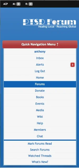

Thanks. Yer, I did that. I added a media query to cater, trying visibility and display, though neither allowed it to show.
Knowing that, I might try an additional template, removing .navTabs from the moderator bar inclusion, then delivering the normal visitor_tabs one to the navigation template. I think it's putting them at the top of that menu, even though the normal one is available, is because you're using a script and its just pulling the first batch it reaches, being the moderator bar.
I will play around with it now knowing that. Thanks.
Worked like a treat doing it that way Arty... thanks. A simple duplication of the template and changing out .visitorTabs to .modTabs for the mod bar and leaving the other in place, hidden away. Allowed them both to function correctly above and below 700px.
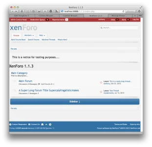
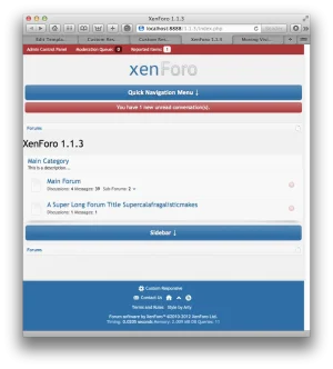
A little additional styling, and it will be complete.


A little additional styling, and it will be complete.
I must say Arty... a little playing around with your latest and greatest, and this really is an exceptional buy for anyone... especially those looking for something already configured for full responsiveness. Far superior than the add-on. Keep up the great work.
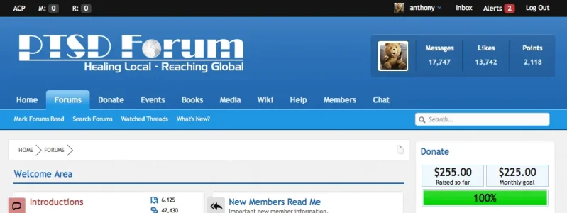
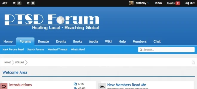
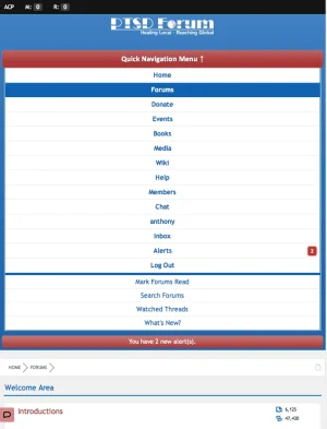
Got it hitting all the right trigger points respectively, dropping search and so forth at the right times for the style changes.


Got it hitting all the right trigger points respectively, dropping search and so forth at the right times for the style changes.
Add this to extra.css template:Code:.widget-tabs h3 { margin: 0 !important; padding: 0 !important; font: inherit !important; color: inherit !important; line-height: 25px; } .widget-tabs h3:after { display: none !important; }
Perfect! Thank you
Arty, one thing you missed in this is the WYSIWYG editor. It is using a fixed width at present, thus when a person decreases their browser size on a desktop below the width of the editor, they get a scroll bar.
A change you may want to make Arty... fixed the issue.
In editor_ui.css change:
.xenForoSkin table.mceLayout {border:0; border-left:1px solid #CCC; border-right:1px solid #CCC}
To
.xenForoSkin table.mceLayout {border:0; border-left:1px solid #CCC; border-right:1px solid #CCC; width: 100% !important;}
That fixes the issue and forces the WYSIWYG to size with the window, and not have to reload the page.
