Anthony Parsons
Well-known member
This refining is sounding extremely promising Arty. Really impressive work...
Does this mean you will use this instead of going forward with your responsive addon project?Just checked out the changes with this on your site Arty. Muchhhhhh better. Now this is heading towards usable for modification and use. Look forward to this updated version.
Version 2.0 is available!
Changes from version 1.0:
Additionally there were changes to color variations:
- Block wrappers, navigation, buttons, login bar handle have all been rebuilt using CSS3 instead of images.
- Header and navigation were completely rebuilt.
- More than 100 new style properties were added, making it easier to customize most parts of style.
- New navigation for mobile devices.
- Many bug fixes.
- Better support for third party add-ons.
- Green...
Check readme.txt for version number. If its "2.0 BETA" instead of "2.0", you've downloaded yesterday's beta version.I hope this is the same I downloaded less than 15 minutes ago...
At this point in time, I cannot answer that 100%. The issue with the proposed addon discussion is that dev feedback has said it is quite complicated to pull real-time browser width at the PHP level. This is usually something built at the core level of a CMS / software product, as that is the level required for it to function correctly.Does this mean you will use this instead of going forward with your responsive addon project?

Hi Arty,
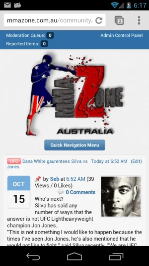
Just upgraded to 2.0. I only overwrote the Soft Responsive style. For some reason my quick nav bar is a lot smaller then it should be. I purchased the branding free option and use XenPorta support you offer as well.
site is @ http://www.mmazone.com.au
Any ideas? thanks
View attachment 35630
Yep, I got no problem adding links to the navbar thanks to Jakes add-on nodes as tabs, but, is there a way to show a different navbar in soft responsive theme only( I only use soft responsive for mobile devices, main style is XenFracture )Navbar in XenForo has functionality to add custom links, it is fully supported by this style in all layouts. Where exactly do you want to add that block and how does it look?


.recentNews .primaryContent, .sectionMain.mediaList { background: transparent none !important; box-shadow: none !important; border-width: 0 !important; padding: 0 !important; }
.sectionMain.mediaList .subHeading { display: none !important; }
@media only screen and (max-width: 700px), only screen and (max-device-width: 700px)
{
  .mediaList li { display: block; width: auto; }
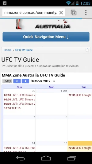
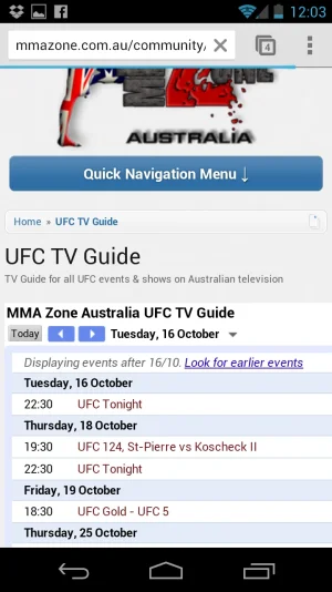
}Thanks for looking into it Arty.I've checked your website on phone and I can see that issue. Unfortunately nothing can be done about it. Calendar is created using multiple tables, some are absolutely positioned on top of each other.
Some adjustments for other pages (add this to extra.css):
Code:.recentNews .primaryContent, .sectionMain.mediaList { background: transparent none !important; box-shadow: none !important; border-width: 0 !important; padding: 0 !important; } .sectionMain.mediaList .subHeading { display: none !important; } @media only screen and (max-width: 700px), only screen and (max-device-width: 700px) { .mediaList li { display: block; width: auto; } }
Wow thats amazing! thank you. That looks so much better!It was supposed to, but extra.css was included before that add-on's css, so original rules overwrote it.
ChangetoCode:.mediaList li { display: block; width: auto; }Code:.mediaList li { display: block !important; width: auto !important; }
Thought so. Im not sure how familiar you are with Jaxels add-on's, but there is a settings page for this kind of thing in the add-on itself. This is something id need to ask Jaxel but theres no point because hes lacking in the support department.No, those videos are embedded via iframe. Style can't scale down contents of iframe.

We use essential cookies to make this site work, and optional cookies to enhance your experience.