Responsive Design for XenForo 1.1 [Paid] [Deleted]

Quote going out of post block caused by error in that add-on. It sets width of quote block to 95% and also adds 55px left margin. To not go outside of post boundaries, 55px should be smaller than 5% of post block, so post block should be at least 1100px wide. Add poster's profile width, left/right side of post and total minimum width becomes something like 1300px.

Percentages and pixels should never be mixed together.

Anyway, to fix it add this to responsive_extra.css
Code:
body .messageText .bbCodeQuote.hasAvatar { margin-left: 0 !important; width: auto !important; }

Buttons in dropdown menu: that might be a good idea. I don't know if its possible to implement, but I'll try.
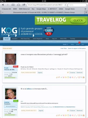
 
I've set the Show responsive layout at: and Change navigation layout at: 700 pixels but I've noticed that the iPad retina users see the standard layout and not the responsive one. How can I force the iPad users to use the responsive layout?
 
If I'm not mistaken, browser window width on iPad is 768px. Increase that value from 700 to 770.

I suggest not to do it. Sidebar is already hidden on iPad because its not wide enough to show full page. Content area can be shown without hiding anything.
 
Look at this ipad screenshot... The thread title is missed for example and the banner on the right, that is hidden in the smartphone view, here it's shown and mess up the layout... Also take a look at the big triangle in the forum menu bar... What do you think?

mtR0tsl.webp
 
Admin control panel -> styles -> style properties -> responsive design -> "change navigation layout at" -> change it from 700px to 900px
 
No way. This is the reduced screenshot taken now from my iPad Retina. Original was at 1536x2048. As you can see the menu is invisible but the triangles remains and the thread title (modified from the original) is overlapped. I can try to reduce the width of the logo to see if the banner fits...

1536x2048.webp
 
Its caused by your logo + ad in header, not menu. At 1000px or lower there is no space in header for both, so ad pushes down logo. You'll need to hide that ad at 1000px instead of 700. Add this to extra.css (not responsive_extra.css):
Code:
@media only screen and (max-width: 1000px), only screen and (max-device-width: 1000px)
{
 #ad_leaderboard { display: none !important; }
}
 
Very interesting and thank you. I've reset the parameter to 700 and this is the result.

1536x2048.2.webp

Now I'll try your extra.css code to see if it help...
 
Is it possible to change something so that the sidebar content is always visible? Bacically remove the sidebar toggle button and always show the content.

The hiding feature of the sidebar is very nice, but my problem is that I show ads in the sidebar, and I am charging by impression, and the adcode is loaded and count for an impression even if the user dont click show sidebar button.
 
Another problem regarding the sidebar is that in the Inbox, using the ipad for example, the conversation participants are not shown. Just asking if maybe it's possible to show them elsewhere...
 
Is it possible to change something so that the sidebar content is always visible? Bacically remove the sidebar toggle button and always show the content.

The hiding feature of the sidebar is very nice, but my problem is that I show ads in the sidebar, and I am charging by impression, and the adcode is loaded and count for an impression even if the user dont click show sidebar button.

Or even better, move the ads out of the sidebar and just above the sidebar button, when responsive is active :love: Not sure if its possibe, but since you can move the sidebar below contens you could also move ands someplace else. Mabye if you wrap the ads in some div, and the place it someware else in the responsive css? Anyone would this be possible?
 
Hey is it possible to make the sidebar stuff always show instead of hiding it?

That's really the only thing keeping me from buying this so far.
 
Hey is it possible to make the sidebar stuff always show instead of hiding it?

That's really the only thing keeping me from buying this so far.
Isn't hiding all that the point of the responsive design, so it keeps the focus on the content, and not all the extra stuff on the side?
 
Isn't hiding all that the point of the responsive design, so it keeps the focus on the content, and not all the extra stuff on the side?
The responsive design moves the side bar to the very bottom. Having it displayed all the time wouldn't hurt anything.
 
  • Like
Reactions: DRE
Isn't hiding all that the point of the responsive design, so it keeps the focus on the content, and not all the extra stuff on the side?
For you maybe.

I would want responsive design to respond to a mobile theme and shift it so that it's easier to read.

Ex: The wider a page, the smaller the font, the harder to read.

Shift stuff around, put sidebar stuff below or above the forum list, etc.
 
Its possible to do by adding few lines of code to responsive_extra.css:
Code:
.sidebar { float: right !important; display: block !important; }
.Sidebar .mainContainer { float: left !important; margin-right: -260px !important; }
.Sidebar .mainContent { margin-right: 260px !important; }
.responsiveSidebarToggle { display: none !important; }
.Sidebar body { min-width: 600px !important; }

I have tried this, but unfortunately it dosent seem to work corectly for me. The sidebar is no longer hidden on a mobile, but the sidebartoggle button is displayed where the sidebar used to be and takes up the sidebar place there. Also on an Ipad the sidebar menu is still hidden.

For anyone using adsense or other ads in the side bar, it would be extremly important that those ads are not hidden away, since this behavior is aginst adsense terms and will get you banned! And the same would probably be the case for other ad networks. If the ad is loaded then it must be displayed, hiding it with css is a no go. So mabye you would be interested in creating an option so we can select if the side bar should be hidden or just be moved below content?
 
Top Bottom