You are using an out of date browser. It may not display this or other websites correctly.
You should upgrade or use an alternative browser.
You should upgrade or use an alternative browser.
Responsive Design for XenForo 1.1 [Paid] [Deleted]
- Thread starter Arty
- Start date
Arty
Well-known member
You need to click Buy Now before being able to review, even though you have already purchased it. Click it, then click back button in browser.
I don't think anything can be done about reply box. iPhone's browser and most other mobile browsers automatically resize textarea when you click it and focus on it, showing textarea on top part of page and keyboard on bottom part - its how those browsers work.
I'll test it anyway. Next version of this add-on will be released in next 48 hours. If I'll figure out solution for iPhone, it will be included in update.
Sheldon
Well-known member
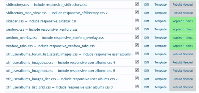
What is the sfdirectory.css and sfdirectory_map_view.css used for. In TMS it is showing both need a rebuild, rebuild templates and they still show it. When looking in TMS they don't show anything in the Original Template field.
It is automatically added by the add-on, if you don't have some certain add-ons, it will show that.
TPerry
Well-known member
I was "ass"uming that, but I've done that a few times to many and ended up being the quoted portion of the word.It is automatically added by the add-on, if you don't have some certain add-ons, it will show that.
Thanks!
iTuN3r
Well-known member
Already working on it
Awesome looking forward to this update . Been keeping an eye on this add-on will be purchasing it later today .
Thanks
Look forward to seeing it.Already working on it
Thanks Arty
Arty
Well-known member
Arty updated Responsive Design with a new update entry:
Update for XenForo 1.1.4 and Resource Manager
Read the rest of this update entry...
Update for XenForo 1.1.4 and Resource Manager
Responsive Design add-on version 1.1.1 is now available!
Changes from version 1.1.0:
To update add-on replace js/responsive/responsive.js with new file, go to admin control panel -> add-ons, click "Controls" button for this add-on, select Upgrade Add-on and upload addon-responsive.xml
- Support for XenForo 1.1.4
- Support for XenForo Resource Manager
Read the rest of this update entry...
MattW
Well-known member
http://www.artodia.com/xenforo-add-ons/responsive-design/I forgot where to download the update from?
MattW
Well-known member
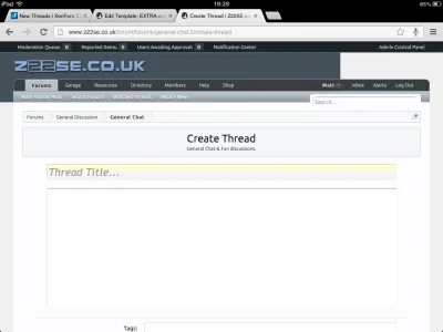
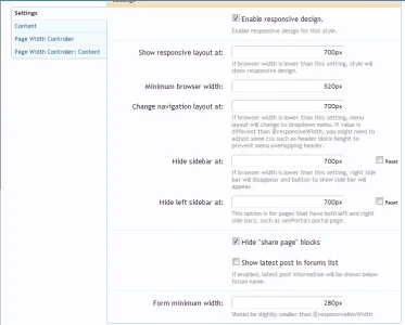
I still can't get the style to look how I want on the iPad2, so I've tried to set it so that it will only remove the side bar when the browser is below 700px.
It's sorted most of the problems I was having with the mce section spilling over. But now, I'm getting an area of white along the right edge where the header background should fill in.
These are the settings I've got for responsive
Thanks
It's sorted most of the problems I was having with the mce section spilling over. But now, I'm getting an area of white along the right edge where the header background should fill in.

These are the settings I've got for responsive

Thanks
MattW
Well-known member
Thanks for the explanation. Unfortunately, I'm not sure where I'm supposed to make the above changesRemove min-width from@pageWidth property, set min-width to body instead.
Arty
Well-known member
Search function is available in navigation menu.How about a very simple search function for phone browsers?
Similar threads
- Replies
- 5
- Views
- 555
- Replies
- 15
- Views
- 4K