Responsive Design for XenForo 1.1 [Paid] [Deleted]

admin control panel -> styles -> style properties -> responsive design: navigation -> navigation tab -> set color and/or background color. I recommend changing background color.

Spacing issue: try adding this to responsive_extra.css
Code:
body { margin: 0 !important; }
 
Usernames and Titles are centered at the top of a post. Can I get them back under the avatar?
 
admin control panel -> styles -> style properties -> responsive design: message layout -> user text block -> add "text-align: left;" to miscellaneous block.
 
So now that I finally tweaked (99%) of my default theme to be responsive, I'm getting questions from members about how they can switch back to the 'Full" version from their device.

Is there a way to add a button for 'View Full Site' which defeats the Responsive design?
 
So now that I finally tweaked (99%) of my default theme to be responsive, I'm getting questions from members about how they can switch back to the 'Full" version from their device.

Is there a way to add a button for 'View Full Site' which defeats the Responsive design?

Not really...

Just make a child theme of your original (it will have all the edits), make it selectable. Users can choose between Mobile and Full view. Just don't add responsiveness to the child.

I think that would work.
 
Not really...

Just make a child theme of your original (it will have all the edits), make it selectable. Users can choose between Mobile and Full view. Just don't add responsiveness to the child.

I think that would work.
Thanks. I also added a Full Site link in my footer that only displays in Responsive mode.
Seems to work well
 
Not really...

Just make a child theme of your original (it will have all the edits), make it selectable. Users can choose between Mobile and Full view. Just don't add responsiveness to the child.

I think that would work.
That's exactly what I did on my site
 
Arty updated Responsive Design with a new update entry:

Bug fixes, support for IE Mobile, Aurora and Quark styles, XenMoods add-on and more...

Version 1.1.0 is now available.

Changes from version 1.0.4:
  • Forum and topic rows are now clickable on devices running IE Mobile.
  • New option to set custom width when navigation menu changes from default layout to mobile layout. This should be useful for forums with wide menus.
  • Built-in support for popular Aurora and Quark styles. Support for Quark style is disabled by default, you need to enable it in style properties -> responsive design: add-ons and styles.
  • Spacing between...

Read the rest of this update entry...
 
Will this work with Refresh?
It should. That style is almost the same as default style.

edit: tested that style, it works fine. The only minor issue is default logo on mobile devices goes over background for navigation. That's because navigation background in that style is actually a header background, navigation is just placed on top of it. That can be changed by adding this to responsive_extra.css
Code:
#header { background-image: none; }
 
That's because navigation positioning is now handled differently. Go to admin control panel -> styles -> style properties -> responsive design: navigation, change navigation height from 30px to 50px
 
That's because navigation positioning is now handled differently. Go to admin control panel -> styles -> style properties -> responsive design: navigation, change navigation height from 30px to 50px
Thank you. I'll let you know if something else comes up.
 
Latest post above Navigation isn't showing for either of my styles. It also breaks the style when enabled (display behaves like a table or ad is present with a large space on the right side).
 
Hi Arty,

I noticed when I updated that now on the ipad the menu tabs display as normal instead of having the responsive drop down menu. (See attached) The menu tabs didn't used to appear when viewing on an ipad.

I still have my setting to show responsive layout set.

How can I fix this?
 

Attachments

  • image.webp
    image.webp
    62.9 KB · Views: 11
ACP> Your Style > Style Properties > Responsive Design

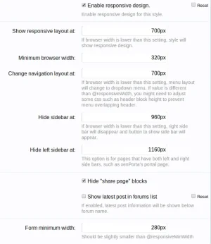
Increase "Show responsive layout at:"
Increase "Change navigation layout at:"

Both are probably at 700px (default), increase them in increments until it shows how you want on iPad.

Screenshot from 2013-02-14 22:20:29.webp
 
Turned out this was the one I had to change:

Kcr9PM.png


I had the first setting at 960px (not just to cater for the ipad), but never configured the nav layout one.

All working now. :)
 
Top Bottom