You are using an out of date browser. It may not display this or other websites correctly.
You should upgrade or use an alternative browser.
You should upgrade or use an alternative browser.
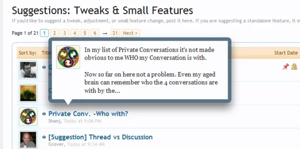
Implemented hover over topic title shows part of the first post
- Thread starter Sador
- Start date
This suggestion has been implemented. Votes are no longer accepted.
excellent suggestion. i completely agree. love the mockup of it too.
it could have the right edge lined up with the start of the replies/views column and make the preview box a fixed width if it isnt already
Then it will jump around horizontally from thread to thread, won't it?
Thats why I suggested somewhere in the middle of the title; it still allows room for people to view the other threads below it, as well as keep some consistency.
It would have been nice if you linked to the post where I suggested this in the original thread, but whatever. I can see how people wouldn't want it jumping around, and someone mentioned in the other thread that with the fixed-width style it could be pushed off the right of the screen with thread titles.
The problem with just having a horizontal offset is that it looks very weird with short thread titles, and having it move according to the length of the thread title is having it jump around again. Besides, you really need a large offset before the thread titles below become readable (in other words, with a small offset you're just going to mouse off the tooltip anyway so you can read the whole thread title).
So, what about this design?

Advantages:
The problem with just having a horizontal offset is that it looks very weird with short thread titles, and having it move according to the length of the thread title is having it jump around again. Besides, you really need a large offset before the thread titles below become readable (in other words, with a small offset you're just going to mouse off the tooltip anyway so you can read the whole thread title).
So, what about this design?

Advantages:
- Won't ever be pushed off the screen.
- Users almost always browse the forum from top to bottom. I think it is rare that they'll go back up to preview a thread they just passed over or previewed already. If they do, it will be no more difficult than it is to browse threads below with the current implementation. Having the tooltip on top of the thread keeps it in a consistent spot, while keeping the threads below (the ones the user is going to want to preview next) unobstructed.

---MAD---
Well-known member
Hmm, I find that this method is a lot slow than vB's method.. I find it actually faster to middle click all the threads and read the first post in a new table rather than wait for the first post to load up partly the way its implemented currently.
The whole point of this feature is to save a user having to load a thread up to see if hes even interested in the thread but the way its currently implemented, it doesn't save any time at all..
Anyone else feel like that? May just be me..
The whole point of this feature is to save a user having to load a thread up to see if hes even interested in the thread but the way its currently implemented, it doesn't save any time at all..
Anyone else feel like that? May just be me..
If you're running Adblock Plus for Firefox, just right-click this or any other annoying image and block itAlso, I must point out that your giant signature is quite annoying. It's almost always bigger than the post itself. I am politely asking on behalf of the community that you make the images smaller or somehow combine them so they don't take up as much vertical space.
I suggested it in another thread before you posted the mockup (Wasn't aware you had either), otherwise I would have.It would have been nice if you linked to the post where I suggested this in the original thread, but whatever. I can see how people wouldn't want it jumping around, and someone mentioned in the other thread that with the fixed-width style it could be pushed off the right of the screen with thread titles.
The problem with just having a horizontal offset is that it looks very weird with short thread titles, and having it move according to the length of the thread title is having it jump around again. Besides, you really need a large offset before the thread titles below become readable (in other words, with a small offset you're just going to mouse off the tooltip anyway so you can read the whole thread title).
So, what about this design?
View attachment 1295
Advantages:
Thoughts?
- Won't ever be pushed off the screen.
- Users almost always browse the forum from top to bottom. I think it is rare that they'll go back up to preview a thread they just passed over or previewed already. If they do, it will be no more difficult than it is to browse threads below with the current implementation. Having the tooltip on top of the thread keeps it in a consistent spot, while keeping the threads below (the ones the user is going to want to preview next) unobstructed.
I just wanted to get it changed asap, as it really slows down how I browse.
I prefer the new mockup, though I think it should be offset a bit more.
New mockup. The box is actually closer to the thread title, but I adjusted the shadow so I think it looks better. I also added a slight left to right offset.

Honestly, these are little issues that could easily be fixed by anyone on their own installation. The major thing that does need to be fixed is the usability issue of the box being right on top of the other thread titles, making browsing slow.

Honestly, these are little issues that could easily be fixed by anyone on their own installation. The major thing that does need to be fixed is the usability issue of the box being right on top of the other thread titles, making browsing slow.
Moving it from below will fix that probably; most people browse down, and not up the list.New mockup. The box is actually closer to the thread title, but I adjusted the shadow so I think it looks better. I also added a slight left to right offset.
View attachment 1296
Honestly, these are little issues that could easily be fixed by anyone on their own installation. The major thing that does need to be fixed is the usability issue of the box being right on top of the other thread titles, making browsing slow.
kmike
Member
Not just you. Apart from the coolness factor which quickly wears off, I don't like this implementation at all. You already can see the poster's avatar and the thread start time in the thread list, why duplicate it in the popup?Hmm, I find that this method is a lot slow than vB's method.. I find it actually faster to middle click all the threads and read the first post in a new table rather than wait for the first post to load up partly the way its implemented currently.
The whole point of this feature is to save a user having to load a thread up to see if hes even interested in the thread but the way its currently implemented, it doesn't save any time at all..
Anyone else feel like that? May just be me..
Really, using the browser tooltip would be enough here. It also feels snappy as it doesn't require a roundtrip to the server for the content of the first post. But yes, the coolness factor would be lost.
@kmike i feel what your saying and ultimately you have to think of all users too , a lot of people have painfully slow connections and i would have to assume that yours is quick. A user with less than a meg for connection will greatly value this change the way it is ... as a whole page load for them can take the time you can read it in. 
This is an AWESOME addition and i feel like a collaborative idea I was part of is now implemented thank you Mike , Kier and community.
edit: HAH , I'm such a spazz that i had to edit this post. I LOVE THIS ADDITION to the software - I don't care - mind made up - this is pro. Don't show on click is awesome thanks for that as well.
It also means joining to the first post and running BB code stripping on every thread; that's a fair amount of work for something that someone might not need, especially for every thread.Really, using the browser tooltip would be enough here. It also feels snappy as it doesn't require a roundtrip to the server for the content of the first post. But yes, the coolness factor would be lost.
Also, I'm not sure if this is something that's finally resolved in all browsers, but title attributes have traditionally had issues with line breaks.
I've posted a lengthy reply here:Really, using the browser tooltip would be enough here. It also feels snappy as it doesn't require a roundtrip to the server for the content of the first post. But yes, the coolness factor would be lost.
http://xenforo.com/community/threads/random-questions-answered.114/#post-42056
Excellent explanation..I can wrap my head around that, please continue with breakdowns like that for noobs like me...thank you
Would it be possible to get the placement changed: http://xenforo.com/community/threads/offset-thread-preview.2868/
Similar threads
- Suggestion
- Replies
- 2
- Views
- 571