You are using an out of date browser. It may not display this or other websites correctly.
You should upgrade or use an alternative browser.
You should upgrade or use an alternative browser.
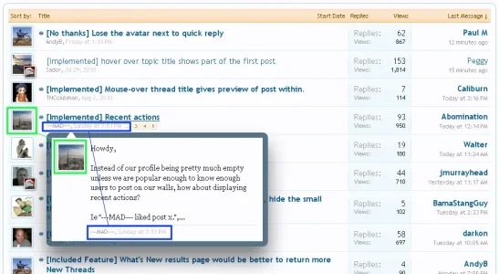
Implemented hover over topic title shows part of the first post
- Thread starter Sador
- Start date
This suggestion has been implemented. Votes are no longer accepted.
Nick
Well-known member
I am really loving this implementation, but I think the avatar and the whole bottom of the little box can be done away with; it's nothing but redundant information. See attachment.

This would help slim the box down quite a bit. The removal of the avatar would allow for a wider block of text, and the removal of the bottom information (date and username) would allow for a reduction in the height of the box.
Also, is there any chance of removing line breaks in the thread preview? IMO, this:
Should appear in the preview as:

This would help slim the box down quite a bit. The removal of the avatar would allow for a wider block of text, and the removal of the bottom information (date and username) would allow for a reduction in the height of the box.
Also, is there any chance of removing line breaks in the thread preview? IMO, this:
Hi,
I am here to tell you:
XenForo is awesome.
Should appear in the preview as:
Hi, I am here to tell you: XenForo is awesome.
edit: I changed my mind. Also I am not sure I agree with removing or changing the formatting of the words in the preview.
Actually I've changed my mind after reading the other comments in other threads. The way it is done now with the avatar really is awesome. Might want to leave that the way it is for the time being.
The timing of things seems to keep changing though. It almost seems like:
Or could that be just some side effects of the coding? Serendipity?
The timing of things seems to keep changing though. It almost seems like:
- There is a long initial wait time for the casual users
- Once that wait time is met the preview pops up
- Then it is in a 'quick preview' mode where there is no wait time when going between threads to see the other previews.
Or could that be just some side effects of the coding? Serendipity?
This is what I think it should look like:

With the pop-up off to the side it doesn't interfere with browsing other threads. The avatar is nice-looking but the date is redundant, so I removed it. What do you guys think?
Took me forever to do in Firebug. Those damn CSS "border triangles" are hard to work with.

With the pop-up off to the side it doesn't interfere with browsing other threads. The avatar is nice-looking but the date is redundant, so I removed it. What do you guys think?
Took me forever to do in Firebug. Those damn CSS "border triangles" are hard to work with.
I'm on the fixed-width style right now.I like the current implemented version better.
do not forget about the "fixed width style".
Figured I'd make a new topic for this, as it is a separate suggestion.
I love the preview (I don't really use it, but it works better then every solution I've seen so far), and I like how it works; the only thing I do not like however is that it pops right under the thread, covering up thread titles below the initial one.
When I browse, I usually speed read the title, and open up every title on the What's New page with my middle wheel; I am finding that the preview gets in the way making me have to slow down, and I can already see it getting a bit aggravating (I sometimes leave 10 pages of topics I need to go through, which would seriously get annoying, as well as be much slower).
I'd like to see the thread preview offset slight to the right, either a bit past the middle of the thread, or to the direct right of the topic title (Similar to forum descriptions).
If you like this, please like this post so they know to implement it.
Agree to disagree.for me it is just perfect as it is now.
you can always change to your likings on your own install.
Like the first post please.I think it would be better like this too.
Similar threads
- Suggestion
Lack of interest
All time statistics should start from the date of the first post
- Replies
- 0
- Views
- 327
- Question
- Replies
- 1
- Views
- 471
- Suggestion
- Replies
- 2
- Views
- 571