- Unified content discovery pages (Whats New, Watched, Tags, Widgets, etc) with advanced filters. Make it look visually appealing to readers.
- Mixed content pages with Similar Content Widgets. Make it look visually appealing to readers.
The above two are very much the same concept of mixed content pages that allow for
better content discovery and each contain multiple features.
It's really hard not to mention a better menu system. Having dozens of tabs with dozens of useless links that no-one clicks on serves no one. This thread made me realize that there is no suggestion for it yet, so here it is:
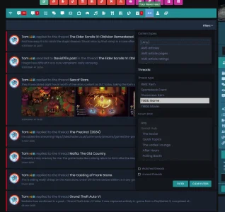
If a site has more than a few addons then the navigation menu becomes unusable. You will get a mass of hidden tabs that users need to horizontally scroll to. Each tab has its own drop down and these can easily go below the fold. As a result users get lost and leave the site. The users that stay simply do not use the addon content. The most common complaint we get is that users cant find anything.
Here is a screenshot to give an impression:

Please disregard the order of the tabs as its a screenshot of a development site.
My main suggestion is to improve the menu system so...
")
") I had a thread about this and those just stay there permanently.
I had a thread about this and those just stay there permanently.