- Affected version
- 2

The post isn't being submitted yet, so I'd have thought it would be okay to switch to the full fat composer without having to satisfy any required fields that I hadn't reached yet.
The warning also disappears quite quickly. Not sure if it's a little too quick or not? Does it need to disappear before you've filled in the field?
Or does it only fade after the field has been focussed, and seeing as in this instance it's the only field and it automatically gets focussed, then it always disappears pretty quick. Which is cool, as long as the unfocussed fields are still highlighted until the user views and focusses on them.
I've had issues on the registration form on one of my sites in the past that has a lot of information fields that need filling in. If they miss or make a mistake in 2 or more, I wouldn't want the warning tooltip to disappear too quickly.
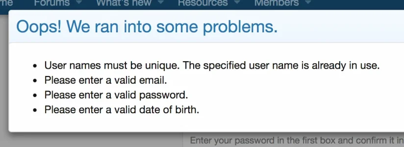
EDIT: I've just checked the registration page out and while you get a nice modal telling you everything that's wrong, there's nothing to draw focus to the exact fields that need attention once that modal is gone.

On my XF1 site, all this info from the modal is instead placed in a box above the entire registration page. At least with this way you can easily reference it to see all the issues that need actioning as you fill in the form. With a modal, once it's gone it's gone until you try to submit the form again. This old way seems better to me, and could be made better still by using the warning tooltip to draw the eye to the exact fields that need actioning. Or keep the modal, but ensure that each field still gets highlighted or receives a warning tooltip to draw the eye to the exact fields that need actioning by the user.

Also, on the quick post if you use the keyboard cmd + enter to submit, you instead get this modal, with no indicator as to which field to fill in. Not a big deal, but seems inconsistent

Sorry...this post evolved into suggestions and feedback about field validation in general and feedback on the registration form too.