• This forum has been archived. New threads and replies may not be made. All add-ons/resources that are active should be migrated to the Resource Manager. See this thread for more information.

[XFStyles.net] XenBlack pro

Status
Not open for further replies.

SonicRC

Well-known member
Version: XenBlack pro 0.4
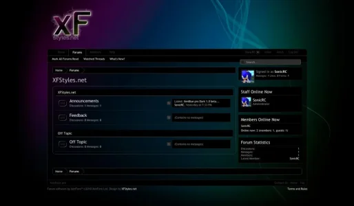
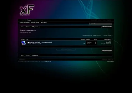
4.webp

2.webp

ZIP Contents:
-xenblack image directory
-style-XenBlack pro.xml
-Readme.txt

Changelog:
Version 0.2:
- now ready for xF Beta 2
- new design for the editor
- some CSS improvements

Version 0.3:
- now ready for xF Beta 5
- removed hard-coded colors
- added branding-free option

Version 0.4:
- updated to 1.0 stable!

If you find any bugs or need support please post in this thread and not via private message. Thank you

Note: XenBlack is a beta version. Stay tuned for further updates

Demo
 

Attachments

Not sure if you're aware, but the demo displays the 'xenblue' as default. You have to click the link and select 'xenblack' to see it.
 
Installed, looks nice.

However, some of the stuff is really hard to read. The admin bar, for example, has a black background with black text. It really doesn't go too well together. Same for the home / forum / etc tab, the stylechooser, inbox and so on. Actually, I think they all use the same color. But that text would go better in white or something, I think.

Anyway, thanks for sharing. :)

Edit; in topics everything is pretty much a blur of blackness. Like the username and avatar aren't seperated from the message itself.. I don't know if that's supposed to be like that?
 
Installed, looks nice.

However, some of the stuff is really hard to read. The admin bar, for example, has a black background with black text. It really doesn't go too well together. Same for the home / forum / etc tab, the stylechooser, inbox and so on. Actually, I think they all use the same color. But that text would go better in white or something, I think.
Anyway, thanks for sharing. :)
Edit; in topics everything is pretty much a blur of blackness. Like the username and avatar aren't seperated from the message itself.. I don't know if that's supposed to be like that?

Love the colors but in a while your eyes get tired of reading the text.
 
Thanks for the feedback. I`ll try to improve that.
In the navbar, if you can make those dark links (home, help, etc) a medium-to-light gray, then have them turn white on hover, that would look better.

This style is very nice. I couldn't use it, because dark skins make my eyes hurt, but it is very attractive.
 
Not my style type, but I'm becoming quite a fan of your work and am looking forward to more of your designs, great job again SonicRC! a credit to the xenForo styling community.

Edit: One thing I definitely would change is the "Preview Thread" pop-up, mix this with background white text, and you can barely make out the preview text.
 
Thanks!

XenBlack is now updated. I added some improvments. Hope you like it!

I also changed the font (it should be look better on a black background). If you prefer the old font you can easily switch back (Style properties -> General: Reset body and message text).

Demo
 
Looks a lot better. :) This comment is still somewhat true though:

Like the username and avatar aren't seperated from the message itself.. I don't know if that's supposed to be like that?

Small other thing, the quick reply box really stands out with it's bright white color as opposed to everything being dark. Maybe it would be better to make the quick reply box gray or something?

Anyway, I like it!
 
Another small thing, the old button can't really be read. See attachment.

old.webp

It looks like it's just a black background image, while actually it says 'old'.
 
XenBlack pro 0.2 released.

Changelog:
- now ready for xF Beta 2
- new design for the editor
- some CSS improvements
 
XenBlack pro 0.2 released.

Changelog:
- now ready for xF Beta 2
- new design for the editor
- some CSS improvements

This style is brilliant. Works well with my TV forum, gives it a Channel 5 feel.

Excellent work!
 
It's pretty cool, however the search box is showing up in the very middle, for some reason.

http://chousho.com/chat/

You should be able to select the style and see what I mean

----- edit -----
Nevermind! Apparently it was an issue with an earlier beta, and not using the current release. Thanks for the skin!
 
Appears you opted to override the OEM XF style properties with hard-coded CSS ie: adding a sidebar.css template rather than using the built-in XF system. Makes any adjustments to the template layouts frustrating since you have to track down where the code is controlled from.
 
Status
Not open for further replies.
Top Bottom