Yes, and no issues in Firefox, just Safari.no issues on Chrome
You are using an out of date browser. It may not display this or other websites correctly.
You should upgrade or use an alternative browser.
You should upgrade or use an alternative browser.
XF 2.3 feedback and comments
- Thread starter Paul B
- Start date
upgrade your ios software buddyI’m on google chrome iOS 14.6
I will when there is an untethered jailbreak.upgrade your ios software buddy
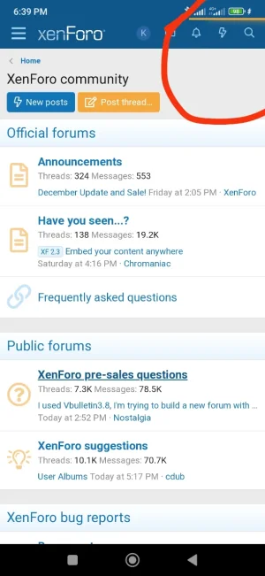
Can you confirm android version and browser info? I don't suffer from this on android 10 Chrome 119.On Android when I use hardware back button, it goes back but the top loading indicator keeps spinning forever
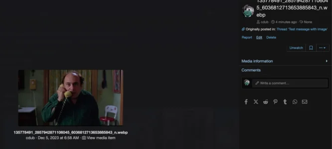
View attachment 294934
Same with Chrome 119 on Android 13 with Samsung One UI 5.1.Can you confirm android version and browser info? I don't suffer from this on android 10 Chrome 119.
Chrome 119 Android 11Can you confirm android version and browser info? I don't suffer from this on android 10 Chrome 119.
Update .. it seems to be related to PWACan you confirm android version and browser info? I don't suffer from this on android 10 Chrome 119.
Problem gone when I uninstalled PWA and returned when I reinstalled it
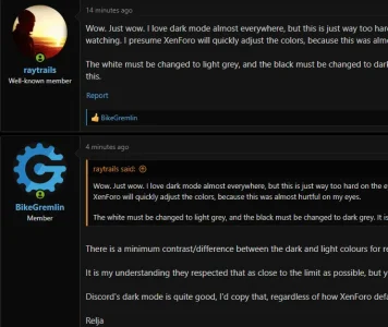
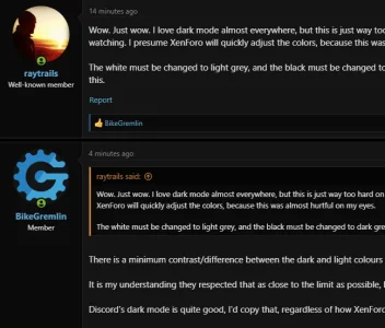
Wow. Just wow. I love dark mode almost everywhere, but this is just way too hard on the eyes. Dark mode is supposed to be soothing and easier watching. I presume XenForo will quickly adjust the colors, because this was almost hurtful on my eyes.
The white must be changed to light grey, and the black must be changed to dark grey. It is obvious they didn't consult professional designers when doing this.
The white must be changed to light grey, and the black must be changed to dark grey. It is obvious they didn't consult professional designers when doing this.
Wow. Just wow. I love dark mode almost everywhere, but this is just way too hard on the eyes. Dark mode is supposed to be soothing and easier watching. I presume XenForo will quickly adjust the colors, because this was almost hurtful on my eyes.
The white must be changed to light grey, and the black must be changed to dark grey. It is obvious they didn't consult professional designers when doing this.
There is a minimum contrast/difference between the dark and light colours for readability.
It is my understanding they respected that as close to the limit as possible, but yes, the dark mode doesn't look nice to look at, as you've described.
Discord's dark mode is quite good, I'd copy that, regardless of how XenForo default dark mode gets published eventually.
Relja
New theme?
Also between ordinary text and link text. It is very difficult to get it 100% compliant.There is a minimum contrast/difference between the dark and light colours for readability.
The color differences are very clear to me and I think the blue is nicely situated between being too washed out and too saturated but again, it could have to do with varying degrees of colorblindness, and that I've calibrated the monitor (using one of the Spyder calibration devices) as I work a lot in Photoshop and retouching/restoring photos. Too many variables, in other words--these colors, saturations, lightness levels, etc. all appear different across the many monitors and devices out there. That is one reason I purchased a Spyder--it provides me a good base to start with.Also between ordinary text and link text. It is very difficult to get it 100% compliant.
The saturation could be increased just a hair, maybe? Something we can play with once we get our hands on the first beta release.
I'm seeing a few changes in how the CSS/LESS appears in the Inspector, so there will be a little bit of a learning curve for me to begin tweaking. Some of my theme modifications use calculations for colors vs. using explicit color choices, and I see XF using different calculations than those I'm using. (Maybe there is new LESS processing going on behind the scenes...new
less.js perhaps? )The color differences are very clear to me and I think the blue is nicely situated between being too washed out and too saturated but again, it could have to do with varying degrees of colorblindness, and that I've calibrated the monitor (using one of the Spyder calibration devices) as I work a lot in Photoshop and retouching/restoring photos. Too many variables, in other words--these colors, saturations, lightness levels, etc. all appear different across the many monitors and devices out there. That is one reason I purchased a Spyder--it provides me a good base to start with.
The saturation could be increased just a hair, maybe? Something we can play with once we get our hands on the first beta release.
I'm seeing a few changes in how the CSS/LESS appears in the Inspector, so there will be a little bit of a learning curve for me to begin tweaking. Some of my theme modifications use calculations for colors vs. using explicit color choices, and I see XF using different calculations than those I'm using. (Maybe there is new LESS processing going on behind the scenes...newless.jsperhaps? )
As far as I can tell, the surrounding 100% black does make things worse (for me, IMO).
Devs say it's intended to preserve power drain of displays, but I suppose my forum will not be as "green" regardless of the default dark theme settings. LOL.
Relja
It's all personal taste.As far as I can tell, the surrounding 100% black does make things worse (for me, IMO).
Devs say it's intended to preserve power drain of displays, but I suppose my forum will not be as "green" regardless of the default dark theme settings. LOL.
Relja
I usually try to offer a handful of color variations for visitors through at least four different styles, if not more. For instance, I offer "warm" and "cool" styles that have less contrast, as well as bright- and dark-based themes for the brightest and darkest options.
My styles are in a hierarchy. I tend to use third-party styles as defaults but even if I'm offering the stock XenForo style, I do all of my modifications in the same heirarchy. I have this on one of my sites currently:
Original XF style
Copy of untouched original style
Layout/visual changes to original style
Color variation one
Color variation two
Color variation three, etc...
Third-party styleCopy of untouched third-party style
Layout/visual changes to original style
Color variation one
Color variation two
Color variation three, etc...
Only the "color variation" themes are publicly accessible, and I give them simple names like bright, dark, warm, cool, etc., or they may have named themes based on the niche of the site. My extra "copy of untouched style" is there for my own future use, and of course the original versions of the style as downloaded are never touched, which keeps upgrades hassle-free.
Videos won't load, and messages can't be deleted
Removing a reaction results in a spacing issue for remaining reactions
Move thread not working
A strange icon accompanies the forum category links when I hover over them with the mouse.
Missing language string or something??
Also is it intentional that you cannot search for members in /members on mobile? I see the usual notable members etc but no search bar to manually search. If I revert to desktop mode I see the search sidebar but not on mobile.
These have been fixed.There is another missing phrase, but I am not sure if somebody has posted it already.
This one might be fixed. There were a few oddities with drafts that could have caused various issues.@Paul B seem to have an issue on probably 1 in every 3 posts whereby once I've pressed post reply and revisit the thread (notification of a reply) that my previous reply is still drafted in the editor despite having posted it. Android 119 Chrome 10.
Similar threads
- Replies
- 1
- Views
- 84
- Suggestion
- Replies
- 10
- Views
- 197
- Locked
- Question
- Replies
- 1
- Views
- 48
- Replies
- 9
- Views
- 233
