You are using an out of date browser. It may not display this or other websites correctly.
You should upgrade or use an alternative browser.
You should upgrade or use an alternative browser.
XF 2.3 feedback and comments
- Thread starter Paul B
- Start date
I’m on google chrome iOS 14.6
likes don’t show until a browser refresh
I can’t reproduce either of these. What OS and browser versions?The insert isn’t clickable
I posted aboveI can’t reproduce either of these. What OS and browser versions?
Rebooted iOS, issues persist
Chrome mobile 113.0.5672.121
Chrome mobile 113.0.5672.121
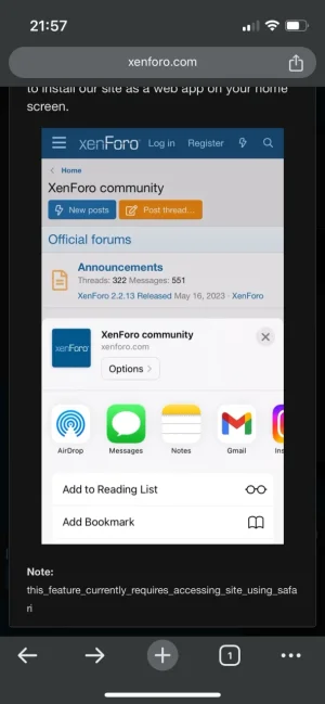
Same with the “app” version of xenforo (which is Safari)
Login and Register buttons don’t work (in Safari browser).
Login and Register buttons don’t work (in Safari browser).
That is a very common icon for dark mode.I think the style chooser could be clearer. Currently it is just a symbol next to the Cookie consent link. I think it would be better if it had the text Style or Style variation/chooser or something.
If it is necessary to have word cookies to explain what the link is, then it is also necessary for the styles. They are not obvious from the icon alone, e.g. the cookie icon looks like it could be a pizza so it needs the text. The style for light (a sun icon) could be interpreted as a cogwheel icon. And the system icon doesn't suggest anything in particular .
Hence I'm hoping we could (optionally) have a text there to explain, as with all the other links down there.
So yeah, I just renewed. Feel free to release 2.3 now. 
There are issues I think with webp that are exported. Could it be related to this:@Paul B Above post with feedback on link colour
But also it seems the WebP conversation is affecting the saturation of images? That first screenshot looked more washed out when uploaded as an attachment, I had to upload to Imgur and embed it for it to look right. Not sure if that's just a side effect of WebP or if the conversion is too aggressive.

radical colour change when exporting webp
If I export to jpg the colours stay very good, however expeorting to webp seems to cause a drastic difference (less red) even though the colour looks fine in the preview. Am I missing something? jpg webp
 forum.affinity.serif.com
(posting link as I didn't really understand the stuff bout wide gamut)
I think the style chooser could be clearer. Currently it is just a symbol next to the Cookie consent link. I think it would be better if it had the text Style or Style variation/chooser or something.
If it is necessary to have word cookies to explain what the link is, then it is also necessary for the styles. They are not obvious from the icon alone, e.g. the cookie icon looks like it could be a pizza so it needs the text. The style for light (a sun icon) could be interpreted as a cogwheel icon. And the system icon doesn't suggest anything in particular .
Hence I'm hoping we could (optionally) have a text there to explain, as with all the other links down there.
Having said all that, I think as the style dark or light is down to the preference of the user, then I would want it to be (guess where?) yes.. preferences. Very few people will find it tucked away down there.
Missed having to tag @Paul B for feedback (Note several likes for both posts)
no issues on Chrome, probably another Apples feature
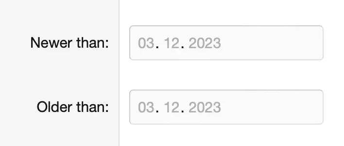
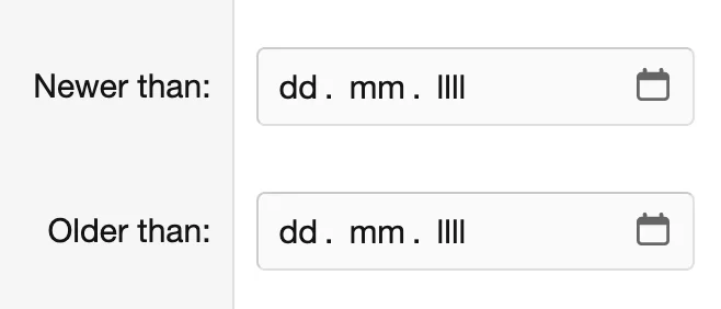
In the latest Safari on macOS Sonoma. In Firefox it's fine.
Similar threads
- Replies
- 1
- Views
- 80
- Suggestion
- Replies
- 10
- Views
- 197
- Locked
- Question
- Replies
- 1
- Views
- 48
- Replies
- 9
- Views
- 233


