You are using an out of date browser. It may not display this or other websites correctly.
You should upgrade or use an alternative browser.
You should upgrade or use an alternative browser.
Style XeroLite Style
- Thread starter John
- Start date
Matthew Hawley
Well-known member
Aren't you that kid who rips styles?...feel free to move along, now. Thanks.
I dont rip styles anymore...
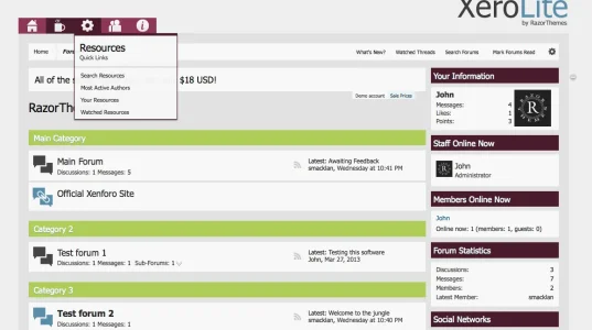
Thanks folks! My teenage, art prodigy, daughter has told me the blue "sucks" lol. We played around with some of her favorite colors and came up with this (Lisa and Shelley will like this lol):
View attachment 43704
ooooh liking the colours of sidebar, navigation. That looks sweet. I knew a couple of colour changes would transform a style (been there before). Very nice john. The green i think could do with being a tad darker but otherwise, really liking the colour changes.
Ah gotya. Look forward in seeing the finished version. Those colours look great to work with.
May I make one suggestion. The icons in the navbar, anychance you could make them a little smaller?
and... there's more
what colour service is that john? or are those colours you just picked?
Ah gotya. Look forward in seeing the finished version. Those colours look great to work with.
May I make one suggestion. The icons in the navbar, anychance you could make them a little smaller?
I'll see about that whilst I'm messing with these colors.
and... there's more
what colour service is that john? or are those colours you just picked?
It's a plugin for Photoshop from here: https://kuler.adobe.com/#themes/rating?time=30
Okay, I decided to keep on offer the blue version but also offer a "colors" version in the same package. Here is that one:
XeroLite Colors
There will be two color variations as well as fixed and fluid versions of both...so four styles for the same price!
XeroLite Colors
There will be two color variations as well as fixed and fluid versions of both...so four styles for the same price!
Okay, I decided to keep on offer the blue version but also offer a "colors" version in the same package. Here is that one:
XeroLite Colors
There will be two color variations as well as fixed and fluid versions of both...so four styles for the same price!
Really liking the redish and green John. Excellent work as always.
Same. Looks great!
One issue:-
View attachment 43728
Can see one and a half notices when you switch the sidebar off.
Yeah I reported that one further up this thread. We had this issue and had to fix the toggle or rather adapt it when th notices first came out about the time I was venting about them because they were riddled with design flaws, this was one of those flaws.
Yes.. I remember that ventYeah I reported that one further up this thread. We had this issue and had to fix the toggle or rather adapt it when th notices first came out about the time I was venting about them because they were riddled with design flaws, this was one of those flaws.http://xenforo.com/community/threads/xerolite-style.47917/#post-514466
Ahhhh, missed your post.. blame tiredness last night and not enough caffeine so far this morning LOL
Similar threads
- Replies
- 0
- Views
- 45
- Replies
- 14
- Views
- 229
- Replies
- 0
- Views
- 61

