[XenTheory] XenUnion [Paid] [Deleted]

xenTheory

Active member
Piers submitted a new resource:

[XenTheory] XenUnion - A clean, dark and responsive style for xenForo 1.2.x


XenUnion is the latest theme from XENTHEORY. It's been fully optimised for speed and includes full support for xenForo 1.2.x (1.2.1 ready).

The design is cross-browser compliant and is fully reponsive, working on computers, laptops, tablets and Android/iOS phones.

  • xenForo 1.2.1 Ready
  • Responsive Design
  • Footer copyright removal rights
  • Clean Design
  • Perfect for gaming or...

Read more about this resource...
 
I'm confused then. I was looking for your copyright that is extra to remove. I thought that was it because I didn't see any other copyright.
 
I'm confused then. I was looking for your copyright that is extra to remove. I thought that was it because I didn't see any other copyright.

I've decided to adopt an inclusive one-price sales method. All new styles come with the rights to remove the footer copyright/logo included in the price.
 
Wow I am very impressed. I bought XenLinear and regretted my purchase once I saw XenNotion and I absolutely love this one.

Kinda dumb question but is there anything that we can work out in regards to my previous purchase upgrading to this one?
 
Wow I am very impressed. I bought XenLinear and regretted my purchase once I saw XenNotion and I absolutely love this one.

Kinda dumb question but is there anything that we can work out in regards to my previous purchase upgrading to this one?

Sure we can work something out, I can't refund your cost for obvious reasons but I can offer a 25% off voucher for existing customers.
 
I'm interested in this skin... but it feels "inconsistent".

What I mean is that the element padding isn't even throughout the skin. There are some elements which look very "web 2.0"; with thick padding between the cell walls and the contents within. Then there are other elements where there is almost no padding and the text goes almost directly up to the borders of the cell. Its odd and ruins an otherwise good skin. Plus, there are a TON of negative margins.

Can you send a few screenshots over? I've been busy working on integrating 2Checkout for payment and adding more security for PayPal due to recent issues. I will update and release more styles soon, but would really appreciate feedback about what needs changing.
 
XenForo.webp

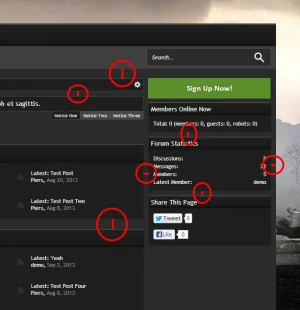
I've marked a few places with inconsistencies. All these widths/heights are different. The skin would look better if these areas were consistently spaced. This kind of issue is replicated throughout the skin in various places.

XenForo1.webp

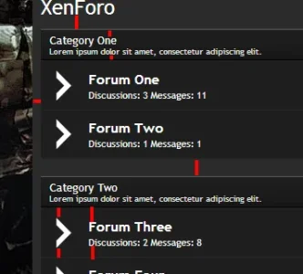
Here in this above image we can see inconsistencies in more areas than just between the blocks; but in the blocks themselves. The space between the tops of a section and the bottom need to be consistent between not only the main content areas, but also the sub headers... as well as the forum icons.

XenForo2.webp

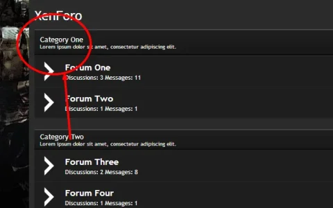
Here we can see with just a small edit I have made the padding in the sidebar heading consistent with the padding of the sidebar content. It looks nicer and less cramped. Here are some more examples of how much better it looks with thicker paddings:

XenForo3.webp
XenForo4.webp
 
View attachment 56303

I've marked a few places with inconsistencies. All these widths/heights are different. The skin would look better if these areas were consistently spaced. This kind of issue is replicated throughout the skin in various places.

View attachment 56304

Here in this above image we can see inconsistencies in more areas than just between the blocks; but in the blocks themselves. The space between the tops of a section and the bottom need to be consistent between not only the main content areas, but also the sub headers... as well as the forum icons.

View attachment 56305

Here we can see with just a small edit I have made the padding in the sidebar heading consistent with the padding of the sidebar content. It looks nicer and less cramped.

That's certainly not a problem. I have a list of updates for all styles, this is the only thing that's been mentioned for this style and I'm happy to change it. I have a new style coming out (after others are updated) called xenZeus which you might like.
 
Sorry I'm still working on the site and theme updates, but there's been another reversal from a person I'm not allowed to name on here.
 
Top Bottom