Hi, when no mood is set the image appears broken for me.
You are using an out of date browser. It may not display this or other websites correctly.
You should upgrade or use an alternative browser.
You should upgrade or use an alternative browser.
Resource icon
XenMoods 1.1.3
No permission to download
- Thread starter Dismounted
- Start date
Hi, when no mood is set the image appears broken for me.
1. Ensure you have the image uploaded to the server
2. mood path in the mood listings (admincp) is correct
3. ctrl+f5
Suggestion for you Dismounted. I'm not sure whether I've suggested already anychance we could get spritesheet support for the mood add-on for those of us that want to use/try/experiment with spritesheets? I think i may have suggested this and there was an issue with adding spritesheet support but thought I'd ask on the offchance it's doable.
This problem was caused by cloudflare. I disabled cloudfare.
I think it was something to do with the XF overlay system being really picky. It's probably changed though, I'll have a look when I get the chance.Suggestion for you Dismounted. I'm not sure whether I've suggested already anychance we could get spritesheet support for the mood add-on for those of us that want to use/try/experiment with spritesheets? I think i may have suggested this and there was an issue with adding spritesheet support but thought I'd ask on the offchance it's doable.
I think it was something to do with the XF overlay system being really picky. It's probably changed though, I'll have a look when I get the chance.
Ah I think i do remember you saying something was being picky. Eitherway, thanks for looking into this dismounted it's much appreciated.
I've always thought about it, but didnt want to limit the length of the moods. I'll probably add a change to get rows of 4 in the next release (whenever that is!). I do like the nearly-perfect selection border around moods in rows of 5's though!
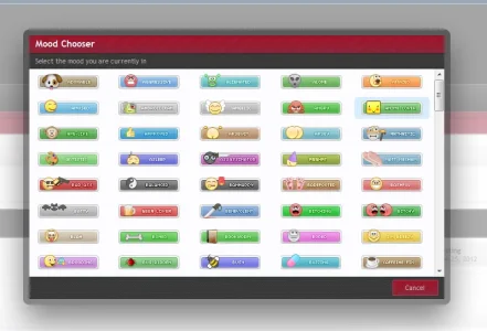
So I've been thinking more on the amount of rows dismounted and wasn't sure whether 5 was too much. After much thought and tinkering with the moodchooser overlay I really think when you have time and make the update you set it to 5 on each row. It just looks alot neater, tidier and results in less scrolling. I set the the percentages as the following not sure if there's any adverse affects using point but it centralises the mood.
.chooserColumns.threeColumns li {
width: 19.4%;
}
.moodChooser li {
width: 19.4% ;
}
I'd also suggest upping the height of the .moodChooser ol as the following and I have to say with these settings it just feel so much better, more organised. I know I mentioned it before but after working with the mood icons about to make an update the more i use the following settings the better i think this is so hopefully we can see the above and below settings as default.
.moodChooser ol
{
height: 340px ;
}
Judge for yourself see what you think. thoughts?(screenshot below)
Looks good like that - I'll change the amount of columns in the next release.
.sidebar .userMood a
{
display: block;
margin-left: 110px;
}
That hard-coded 110px seems to be the culprit. Is there any nice way to center it? margin-left/right auto didn't seem to do it.
Depending if the mood passes the avatar for everyone as the following would look odd if the mood isn't displaying after the bottom part of the avatar you could try the following:
Code:
.sidebar .userMood a {
    margin-left: 70px !important;
}
I'm assuming you wanted to center it like the following. if not and you wanted to center it with the text above just adjust the margin-left as above to your preference not forgetting to add the !important
Thanks. I'd already set it to 70px which looks about right. I just wondered if an auto margin would be better and how to do it.
I haven't tested this but you could try the following:
Code:
.userMood img {
    margin: 0 auto;
}
.sidebar .userMood a {
    margin-left: 0 !important;
}Hey again Dismounted.
I know this may seem like an odd request but it would be a life saver for me if this could be added as an option in the style properties.
The option to place the mood in the .userText area under .usertitle. I'm not sure it's even possible but thought I'd try and request this since it's a styling thing for me wanting to place the mood on a light background as the border on the moods wern't catered for dark backgrounds as you can see in the screenshot.
I was thinking of disabling the hook and re-arrange the placement but I think the file edit and template edit that would be required would be overkill on my part.
View attachment 24084
Is this possible with the newest version?
Auto margins did not work predictably in all browsers. XenForo uses a container within a container, and the Chrome (IIRC) DOM positions it differently. That is why it has been hard-coded.Thanks. I'd already set it to 70px which looks about right. I just wondered if an auto margin would be better and how to do it.
Shelley, could you please guide as to how I could enable 5 columns.So I've been thinking more on the amount of rows dismounted and wasn't sure whether 5 was too much. After much thought and tinkering with the moodchooser overlay I really think when you have time and make the update you set it to 5 on each row. It just looks alot neater, tidier and results in less scrolling. I set the the percentages as the following not sure if there's any adverse affects using point but it centralises the mood.
.chooserColumns.threeColumns li {
width: 19.4%;
}
.moodChooser li {
width: 19.4% ;
}
I'd also suggest upping the height of the .moodChooser ol as the following and I have to say with these settings it just feel so much better, more organised. I know I mentioned it before but after working with the mood icons about to make an update the more i use the following settings the better i think this is so hopefully we can see the above and below settings as default.
.moodChooser ol
{
height: 340px ;
}
Judge for yourself see what you think. thoughts?(screenshot below)
My mood_chooser.css template is currently as follows:
Code:
.moodChooser ol
{
    height: 250px;
    overflow: auto;
}

.moodChooser li
{
    display: -moz-inline-stack;
    display: inline-block;
    zoom: 1;
    *display: inline;
    float: none !important;
    width: 32% !important;
}

.moodChooser li img
{
    display: block;
    margin-left: auto;
    margin-right: auto;
}

.moodChooser .currentMood a
{
    background-color: @primaryLighterStill;
    text-decoration: none;
}Shelley, could you please guide as to how I could enable 5 columns.
My mood_chooser.css template is currently as follows:
Code:<snip>
This is what I have with regards to the moods in my extra.css template
Code:
.chooserColumns.threeColumns li {
    width: 19.4% !important;
}

.moodChooser li {
    width: 19.4% !important;
}
.moodChooser ol {
    height: 340px !important;
}Every day I learn how powerful the use of extra.css is.This is what I have with regards to the moods in my extra.css template
Code:.chooserColumns.threeColumns li { width: 19.4% !important; } .moodChooser li { width: 19.4% !important; } .moodChooser ol { height: 340px !important; }
Thank you very much, Shelley. Works like a charm!
Shelley, were you ever able to figure out how to place the mood in the .userText area under .usertitle ?
Yeah, if you click the link to the guide in the first post of this thread you'll see how to remove disable the hook and insert the xenmood code anywhere you want within the messageuserinfo area. http://xenforo.com/community/threads/xenmood-guide.9773/
Similar threads
- Replies
- 0
- Views
- 25
- Replies
- 0
- Views
- 37


