xenFracture Light by RazorThemes [Paid] [Deleted]

RazorThemes

Member
RazorThemes submitted a new resource:

xenFracture Light - xenFracture Light is a meticulously created design with beautiful colors and soft, muted features.

xenFracture Light is a meticulously created design based on our best selling dark version with beautiful colors and soft, muted features. Destined to become a classic!

Fixed width style at 955px
Fluid width style
Compatible with Xenforo version 1.3
Compatible with the Xenforo Resource Manager 1.1.2
One Year support and access to upgraded versions
Purchase price includes both fixed and fluid versions shown in the...

Read more about this resource...
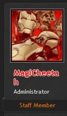
 
@RazorThemes I've just installed the skin for the first time. How do I fix the usernames. In all my other styles they are normal, but in this skin, they don't fit and wrap.
upload_2014-4-28_20-44-31.webp
 
@Hornstar - By default, the usernames are designed to wrap if they are greater than 90px in width. But xenFracture's style properties give you several options adjust it.

The easiest solution is to simply reduce the username font size or turn off bold. You can change this under Style Properties > Message Elements > Author Username. I'd suggest trying 10pt Bold, but feel free to try several different things and decide what works best for you.

The more complex option is to increase the width of the User Info Container under Style Properties > Message Layout > User Info Container. Then you'll also want to increase the Left Margin by the same amount under Style Properties > Message Layout > Content Container. That will prevent the user info container from overlapping the content container.
Thanks, I changed it to 10px and that is much better now. Will I need to apply that after each style update?
 
Top Bottom