• This forum has been archived. New threads and replies may not be made. All add-ons/resources that are active should be migrated to the Resource Manager. See this thread for more information.

"XenBusiness" Style

projectego

Active member
Hi folks,

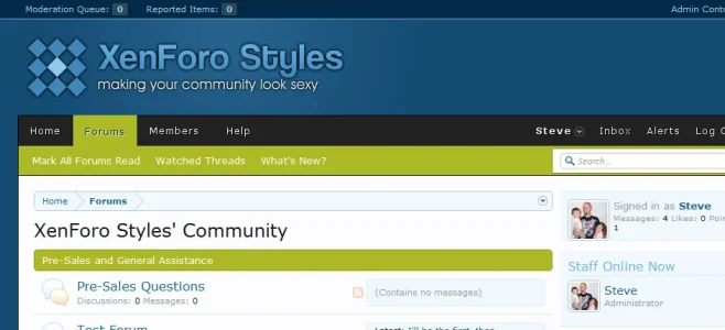
I'm having an absolute blast learning about the incredible flexibility behind the superb XenForo styling system. I thought I'd release this "casual-business"-type style which hopefully some of you might find useful. I've released it as a freebie for the time-being, but I'm very eager to further develop it and enhance it even more, before releasing it as a premium style.

There's a demo available here and I'd love for any feedback you might be willing to share.

I've included the logo .psd, too, in case you fancy changing the header text.

Edit: In fact, if you can request it before the wife notices what time it is - hehe - then please feel free to quote your desired forum title text and slogan text and I'll upload a revised logo graphic for you. :)

Well, that's that. Hopefully one or two of you might find use for it. Cheers!
 

Attachments

RastaLulz: Excellent! I'm glad you like it and please do link me up if you do definitely decide to install it.

Sagar: Thank you very much for your feedback!
 
Thanks Robert. I really appreciate all the feedback so far, chaps! I've added an extra to my original post; I'll happily tweak the logo text in order to match your forum's title and slogan, if you like, and upload the graphic as an attachment if any of you should request it before I hit the sack.

I truly appreciate the feedback. :)

Edit: Thanks lazer!
 
Thanks sharing it for free projectego. It looks good. But I'd prefer more Web 2.0 shapes and colors maybe you throw in there a litle bit next time? :) But again, great job.
 
Crikey! Thanks Peggy! :D

laztrix: Thank you and I totally agree. I'll be working on custom status graphics and icons next, and implementing them as soon as possible.
 
Sir nick: I agree - green would definitely make for a much better fit. I have amended this and it will be among the alterations included in the next release.

Do please keep that feedback coming, ladies and gents!
 
Any idea on the next release?

Also another idea make the sidebar round corners
I've updated the style quite a bit and I'm confident enough to say that I believe I've made some substantial improvements - most notably, I've added much better support for XenForo's "Colour Palette" system, so users will have a much easier time swapping out colours and what-not. I was using hard-coded CSS colours before, but now I have a much better understanding of the styling engine powering XenForo.

One thing worth noting: I've basically thrown out the old design that was previously released and created a new one from scratch which I feel looks much better. I've added it as a premium product on my website, but I'll be re-updating this thread again in future with a free version (nothing will be cut and it will be essentially the same version that I'll have for sale - the option to "buy" it will just be there for those of you whom might wish to donate).

I'm really appreciating the support so far, guys. Thanks a bunch!
 
lookin good , im liking that allot of people are creating unique ideas, im sure within 3 months when premium skins are up that they will be outstanding.
 
Great style. However, it's far too narrow for me. I significantly increased its width. But when I did so, the sub-nav bar didn't change w/ the rest of the board. How do I resolve that? See attached.

xenbiznav.webp
 
Thing are really looking good.
Cheers mate. :)

lookin good , im liking that allot of people are creating unique ideas, im sure within 3 months when premium skins are up that they will be outstanding.
Wow, thanks! And I totally agree - there's some superb styles being showcased here and I really like John's xenPowa style; his and the xenForce style are among my current favourites.

I've pretty much spent the past few days just really studying the styling system and trying to adapt my normal routine of designing around it. I'm so used to designing WordPress themes that, while the XF styling engine is superb, I do miss being able to just open up a text editor and just get to work. My newest theme "XenGamer" is my most ambitious XF design yet and I'm looking forward to further improving it.

Great style. However, it's far too narrow for me. I significantly increased its width. But when I did so, the sub-nav bar didn't change w/ the rest of the board. How do I resolve that? See attached.
I'd recommend not attempting to widen the style anymore - I designed it originally as a fixed-width style but also to accommodate users whom are still using older, lower resolution monitors. I'd highly advise reverting back to the original width as, judging by the dramatic increase in width, I'd say that users browsing your website with a resolution of 1024x768 or below will be greeted with a very unattractive horizontal scrollbar and will only have about 70% of the style visible. Do please consider reverting back.
 
Top Bottom