Style XenBlock

Dad.

Well-known member
Hey everyone,

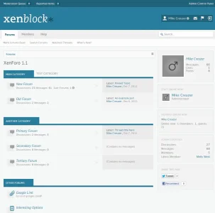
We have a new theme ready for release soon, and we wanted to let you preview it quick to see if you had any suggestions. This was a theme we started awhile back, but we recoded from scratch with the return of one of our top designers, Jorge Lainfiesta.

A few things we are thinking about adding:

--Smooth scroll-to-top button
--AD Styler (to allow users to be able to change the color of the theme and set presets)
--Dynamic width changer button
--Text-based logo option

Any feedback is helpful! :)

Thanks!
 

Attachments

  • xenblock_preview.webp
    xenblock_preview.webp
    44.9 KB · Views: 83
Not for me but should be a great hit :) looks to be easily customized for a variety of sites, admins, general talk, business and much more. Great job (y)
 
Mike theme looks great. One thing I've noticed that with the Class theme many addons uses extra info in message_user template when added, it doesn't look so well. I would suggest putting a little more work into that.
 
Mike theme looks great. One thing I've noticed that with the Class theme many addons uses extra info in message_user template when added, it doesn't look so well. I would suggest putting a little more work into that.
Yeh, I left it default since I knew it was a heavily modded area. Would you mind showing me some of the issues with that, I'll fix it in the next release of Class. No one reported it yet, though I vaguely remember you mentioning some issues, but I mighta let is slip my mind.
 
Yeh, I left it default since I knew it was a heavily modded area. Would you mind showing me some of the issues with that, I'll fix it in the next release of Class. No one reported it yet, though I vaguely remember you mentioning some issues, but I mighta let is slip my mind.

I had created a ticket regarding it, some of the design issues you kindly adressed for me. But the messageuserinfo was left behind. It was something like this:

Unbenannt.webp

As you can see there are some visual problems, it looks really uneven with every extra info added.
 
I think this theme should have all rounded corners removed. The rounded quotes really look out of place in there.
 
Looks great to me. I think maybe there should be more padding between the username and the dropdown arrow though and the quotes obviously need changing (unless, of course, you mean for them to look like that?) Also, the category description thingy would likely look better if it was vertically aligned in the middle rather than at the top I reckon.
 
Looks great to me. I think maybe there should be more padding between the username and the dropdown arrow though and the quotes obviously need changing (unless, of course, you mean for them to look like that?) Also, the category description thingy would likely look better if it was vertically aligned in the middle rather than at the top I reckon.

Agreed, and yeh we just didn't design the quotes. Going to make them match the skin more. And the description thing will be fixed, noticed it right after I made the screen :P
 
Ah, I thought you would have noticed them. Can't wait to see how it turns out though I know I'm keeping my money for a certain other xF design one of your designers is working on :P
 
That's a really nice looking design. The only suggestion I could make on it would be the text next to the category nodes on the forum index, where you have "test Test test Test..." might look nice right aligned.
 
That's a really nice looking design. The only suggestion I could make on it would be the text next to the category nodes on the forum index, where you have "test Test test Test..." might look nice right aligned.
I agree, that would look nice. :)
 
I got caught up with a big job. Sorry for the delay! Itll be out soon, we are making changes to our Styler too so I want to wait for that to be done. All good news though!
 
Top Bottom