You are using an out of date browser. It may not display this or other websites correctly.
You should upgrade or use an alternative browser.
You should upgrade or use an alternative browser.
XF 2.2 Why does this internal unfurl link appear different?
- Thread starter bzcomputers
- Start date
This week, we're delighted to introduce a new feature in XenForo 2.3 that enhances the way you can share content on your forum. Plus, we'll show you how easy it is to share any content from your forum to other platforms using our new content embedding feature.
Rich previews for content
If you're already familiar with URL unfurling, content embedding works similarly. In XenForo 2.2, when you post a link to content on your forum, we perform an HTTP request, download a portion of the content, and extract metadata such as the page title, description, and a logo. If you need a refresher...- Chris D
- Replies: 112
- Forum: Have you seen...?
Thanks.
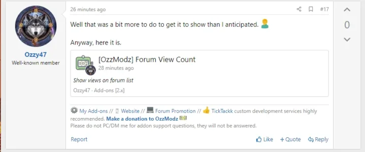
Seems at least a background color change would improve the appearance and make it a more obvious link. Maybe it's just me, but I see some room for improvement on the visual side for these rich previews.
Seems at least a background color change would improve the appearance and make it a more obvious link. Maybe it's just me, but I see some room for improvement on the visual side for these rich previews.
I think the same.Seems at least a background color change would improve the appearance and make it a more obvious link. Maybe it's just me, but I see some room for improvement on the visual side for these rich previews.
Also, how can I turn the rounded corners into normal corners? URL unfurling and quotes don't have rounded corners either. I would like the display to be consistent.
I don't want to go back to the old unfurl. It makes total sense to grab the post itself instead of the metadata from the thread.it goes back to the old unfurl.
It's just the styling of the preview I don't like. The border should have normal corners instead of rounded ones. Than it would be more consistent. How can I change that?
Add to template extra.lessI don't want to go back to the old unfurl. It makes total sense to grab the post itself instead of the metadata from the thread.
It's just the styling of the preview I don't like. The border should have normal corners instead of rounded ones. Than it would be more consistent. How can I change that?
CSS:
.embed
{
   border-radius:0px;
}
EDIT: To also change background:
CSS:
.embed
{
   border-radius:0px;
   background-color:@xf-contentHighlightBg;
}
Last edited:
