You are using an out of date browser. It may not display this or other websites correctly.
You should upgrade or use an alternative browser.
You should upgrade or use an alternative browser.
Website design feedback
- Thread starter alternadiv
- Start date
Everything is horizontal and full screen width.
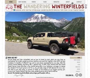
Top nav
Logo
Slogan
Pic
You need a nice logo that does not look like an advertising banner and a better layout.
The colors are pretty good for vehicle adventures.
Maybe with the logo you can play with the two Ws somehow.
What is the purpose of the navigation widget bottom right?
It should have a homemade/personal feel to some degree, and it does. But clean it up with a nice logo and don't stretch everything full page.
It's actually not full screen width, I think it's 980 pixels -- I just cropped that screenshot:Everything is horizontal and full screen width.
Top nav
Logo
Slogan
Pic
You need a nice logo that does not look like an advertising banner and a better layout.
The colors are pretty good for vehicle adventures.
Maybe with the logo you can play with the two Ws somehow.
What is the purpose of the navigation widget bottom right?
It should have a homemade/personal feel to some degree, and it does. But clean it up with a nice logo and don't stretch everything full page.
I agree that the name at the top doesn't look very professional. The little red logo truck is supposed to be extremely basic as part of the style. But I'd like to change "The Wandering Winterfields" part and maybe incorporate them into the two WW's, like you said.
Bottom nav is just because I see most other sites have one, and because the pages will end up being longer than this one is, so maybe it will have some use after a visitor reads through a page?
Random thought... maybe make the dogs the focus (eg: "The Wandering Pugs" with yourselves as their companions), might get some additional attention to your travels.  ... "Pugs Across America" The theme song of course should be "Me and you and a dog named Boo" by Lobo.
 ")
... "Pugs Across America" The theme song of course should be "Me and you and a dog named Boo" by Lobo. The top is very busy, yeah. Hmm.Even if not full page still horizontal and long. How many logos and slogans do you see across the whole top of the site?
Here's some layout inspiration, with also a "wordy" site name, but clean/small logo.

 www.gonewiththewynns.com
Gone With The Wynns
A couple of explorers, modern-day documentarians, and cultivators of curiosity.
www.gonewiththewynns.com
That’s way better. Thanks for showing it.Here's some layout inspiration, with also a "wordy" site name, but clean/small logo.
Gone With The Wynns
A couple of explorers, modern-day documentarians, and cultivators of curiosity.
Blog
Outdoor, camping, hiking and van life blog featuring adventurous US destinations, travel tips, and outdoor gear.
 bearfoottheory.com

Beyond The Tent - Camping Blog - Beyond The Tent
Best Camping CoolersBest Camping GiftsBest Camping HammocksRechargeable LanternsPortable Solar PanelsBest Camping GrillBest RV HeaterBest Glamping Tents
Outlines

JackarooCaravans.com is for sale | HugeDomains
Find a domain name today. We make it easy.
jackaroocaravans.com
Thank you very much for putting in the effort to help me. I’ll be checking these out.Blog
Outdoor, camping, hiking and van life blog featuring adventurous US destinations, travel tips, and outdoor gear.Beyond The Tent - Camping Blog - Beyond The Tent
Best Camping CoolersBest Camping GiftsBest Camping HammocksRechargeable LanternsPortable Solar PanelsBest Camping GrillBest RV HeaterBest Glamping Tentswww.beyondthetent.com
Outlines
outlines.pt
JackarooCaravans.com is for sale | HugeDomains
Find a domain name today. We make it easy.jackaroocaravans.com
Someone elsewhere suggested I add more padding/white space to everything to make it look more modern. I’m going to try that as well.
Also, thank you for showing me ones that are in my niche. How do you find them?Blog
Outdoor, camping, hiking and van life blog featuring adventurous US destinations, travel tips, and outdoor gear.Beyond The Tent - Camping Blog - Beyond The Tent
Best Camping CoolersBest Camping GiftsBest Camping HammocksRechargeable LanternsPortable Solar PanelsBest Camping GrillBest RV HeaterBest Glamping TentsOutlines
JackarooCaravans.com is for sale | HugeDomains
Find a domain name today. We make it easy.jackaroocaravans.com
It's got potential, and some nice character already.
I think it feels dated because it's so cramped and in a fixed width boxy format.
If you declutter it a bit, make the header and footer 100% width and adjust the layout and spacing, I think you can make the design feel a lot more modern and easy to reads, but still retain the feel you've created.
I think the sktetchy logo is cool, and fine in concept. But you've got a very busy logo type already what with the custom font and custom colours within the font, in which case that could probably stand on it's own for the header as a logo type, even if you still want to use the actual logo elsewhere.
Here's a little remix for you:
I see the two stinky pugs in the pic but it's hard to see them. Crop that pic and show them off. Just show a bit of the cab of the truck. That's more important than seeing the entire vehicle. It adds some lightheartedness to your starkness.
Last edited:
Wow, that’s a huge improvement, thank you! I’m definitely going to add all that extra space.It's got potential, and some nice character already.
I think it feels dated because it's so cramped and in a fixed width boxy format.
If you declutter it a bit, make the header and footer 100% width and adjust the layout and spacing, I think you can make the design feel a lot more modern and easy to reads, but still retain the feel you've created.
I think the sktetchy logo is cool, and fine in concept. But you've got a very busy logo type already what with the custom font and custom colours within the font, in which case that could probably stand on it's own for the header as a logo type, even if you still want to use the actual logo elsewhere.
Here's a little remix for you:
View attachment 219458
I see what you mean about the extra logo, too. Maybe I can put it somewhere else real small, like next to the who are we text.
@beerForo - that’s a great point that I never would’ve thought of. My YouTube banner already looks like that. For the site I can probably crop the bottom like this but allow the mountain to still show.
Wow, that’s a huge improvement, thank you! I’m definitely going to add all that extra space.
I see what you mean about the extra logo, too. Maybe I can put it somewhere else real small, like next to the who are we text.
Glad you like it
")
You could photoshop it onto your truck if you want to use that as a hero image?
You could get a magnetic logo printed up and whack it on there and then it will be in all your tacoma pics
You could have the picture logo on the door, and the domain url text on the side of the bed before the TRD text
That’s so cool! You guys have been really helpful. I have no idea how you were able to move around my mock-up and still have it look like the background didn’t get messed with, lol.Glad you like it
You could photoshop it onto your truck if you want to use that as a hero image?
You could get a magnetic logo printed up and whack it on there and then it will be in all your tacoma pics
You could have the picture logo on the door, and the domain url text on the side of the bed before the TRD text
View attachment 219462
Similar threads
- Poll
- Replies
- 15
- Views
- 2K
- Replies
- 25
- Views
- 11K
- Replies
- 6
- Views
- 944
- Replies
- 15
- Views
- 2K
- Replies
- 1
- Views
- 563