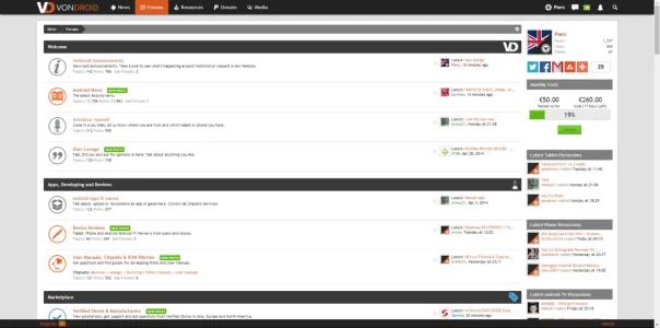
VonDroid - critique welcome!

It's the category image that I previously had, it was on the right hand side. Here's a screenshot:


View attachment 43811

This is the code I used for it which should work unless I've missed something.

Code:
.catImage117
{
    background: url(http://vondroid.com/site-img/vnodes/tablet.png) !important;
    float: right !important;
    width: 120px !important;
    height: 47px !important;
    margin-top:-16px !important;
        margin-right:-14px !important;
}

oh I see. Are you editing templates to do this as I notice that is a custom class? because you can actually do that via css only there's some code somewhere that might help and save you on editing templates.
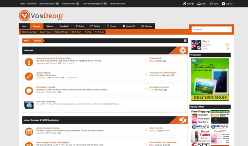
 
I'm new to Xenforo and this is my first forum, I've been doing design work for a while and have added quite a few addons as well as customisations.

What do you think?

http://www.vondroid.com
I was honestly expecting something dark and flashy popping up at me, kind of put me down a bit on that. I don't like your color scheme at all but I love everything else. Other than your color scheme, great job with the forum.
 
I was honestly expecting something dark and flashy popping up at me, kind of put me down a bit on that. I don't like your color scheme at all but I love everything else. Other than your color scheme, great job with the forum.

It's not to everyones liking but it's unique and, from the feedback users have given, makes it stand out from other forums. Appreciate the critique :)
 
VonDroid is now using xF1.2 with a new style but based on the old one. It's not yet finished but it's getting there. Further critique is welcome :)
 
VonDroid is now using xF1.2 with a new style but based on the old one. It's not yet finished but it's getting there. Further critique is welcome :)

Congrats on upgrading to 1.2. My review is still the same you've done an exceptional job on the style and it is still look great. Nice work @Piers :thumbsup:
 
It looks very nice. Did you design the style yourself?

Thank you, yes I did design the style myself :) I'm still working on creating my first community design, but not quite there yet.

Congrats on upgrading to 1.2. My review is still the same you've done an exceptional job on the style and it is still look great. Nice work @Piers (y)

Thank you Shelley :D There are a few unfinished areas but it's getting there. Although I have no idea how to fix what I appear to have done to the responsive menu :P
 
OK, I did eventually decide that, after a year, I was no longer angry at XenForo's mediocre support...

So I've started on a new design for VonDroid, here's a preview of the header.

Features:
  • Fixed header
  • "Retina" ready (graphics looks clearly defined when zoomed 200% on a 4k display in Chrome).
  • Search - This slides to the left 300px as the user hovers over it, there is no such button - pressing 'enter/return' enables the default XenForo search function.
  • A nice colour scheme, far less harsh than the present orange and black combination.
Parts not completed in the below screenshot:
  • ~70% of image colours
  • Hiding the notification/alert box (red) when responsive, it seems to linger... tips are welcome
  • Fixing the horrible blue box/arrow combination for the Sub-forums text.
  • Avatars - although I've added a blur, you can still see them. CSS first, images later.
  • Find out if people who paid for XenPorta 1.6 copyright removal are required to pay for the new version.


5bca80687e73642a558538c3f6db22ec.png

Direct image link (1920x600)

And here's second screenshot showing the 300px search box when active
52acedddb8d1474e5783927c55930ca9.png

Direct image link (1920x600)

And here's a third image showing the 'News' page, this is done with XenPorta and RSS feeds.

ebe089f377285e4b9bb03e47bf7dcb26.png

Direct image link (1920x600)

The design is not yet public. What does anyone think?

Cheers,

Piers
 
Last edited:
Looks fantastic, I like the new look for sure.
One thing I wonder is if your main forum page has too many categories/nodes? I too am struggling how to be thorough but still be concise.

Question: How did you replace the node icons with company logos? This is exactly what I have been trying to do.

upload_2015-12-29_16-0-9.webp
 
Back
Top Bottom