XF 2.2 usergroup banner size

interforo

Active member
what is wrong with my code below?
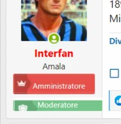
the size of my usergroup banners don't look right
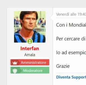
1669280561254.webp


Code:
.moderator
{
background-image: url("/immagini/mod.jpg");
    color:white;
     width: 100% !important;
    margin: 0 auto !important;
    padding-left: 25px;
    padding-top: 6px;
}

Code:
.admin
{
background-image: url("/immagini/admin.jpg");
    color:white;
     width: 100% !important;
    height: 100% !important;
    margin: 0 auto !important;
    padding-left: 29px;
    padding-top: 6px;
}

cc @djbaxter
 
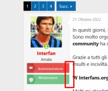
If I'm seeing what your issue is I would say that you're missing some padding from the bottom. Add around 6/8px at the bottom and see if that sorts out the issue.
 
If I'm seeing what your issue is I would say that you're missing some padding from the bottom. Add around 6/8px at the bottom and see if that sorts out the issue.
should I give the banner a fixed width and height? the banners get blurry and with a white margin on top which is not needed
 
It really depends on how you have created the banners - if the banners are individual images, rather than on a sprite sheet, they need to be designed to the maximum width they will be exposed to; if they are smaller then that could account for the blurring. The white margin on the top could mean that your top margin needs to be a negative number to pull the image up - in this instance no padding at the bottom should be needed. If you provide a link to your site it would be easier to view the issue and determine what's needed to put it right :)
 
It really depends on how you have created the banners - if the banners are individual images, rather than on a sprite sheet, they need to be designed to the maximum width they will be exposed to; if they are smaller then that could account for the blurring. The white margin on the top could mean that your top margin needs to be a negative number to pull the image up - in this instance no padding at the bottom should be needed. If you provide a link to your site it would be easier to view the issue and determine what's needed to put it right :)
link to forum https://interfans.org/forum/threads/serie-tv.9670/post-7845927
link to image: https://interfans.org/immagini/admin.jpg
 
First part addressed:

Code:
.message-userBanner.userBanner {
    display: block;
    margin-top: 3px;
    margin-bottom: 5px;
    height: 30px;
}

Second part is getting the text right:

Code:
.userBanner strong {
    font-weight: inherit;
    line-height: 30px;
    padding-left: 10px;
}

That should be all you need to do - add the above to your extra.less template. Let me know if it works for you :)
now it looks like this

1669362817512.webp

Code:
{
background-image: url("/immagini/admin.jpg");
 display: block;
    margin-top: 3px;
    margin-bottom: 5px;
    height: 30px;
}

.admin strong {
    font-weight: inherit;
    line-height: 30px;
    padding-left: 15px;
    color: white;
}

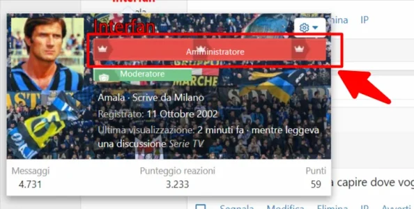
and if I click on the user name

1669362892839.webp
 
CSS:
.admin {
    background-image: url(/immagini/admin.jpeg);
    background-repeat: no-repeat;
}
Remove from the code height: 30px;, display: block; and margin-bottom: 5px;.
 
OK missed a line:

Change to this:
Code:
.admin {
    background-image: url(/immagini/admin.jpg);
    color: white;
    display: block;
    margin-top: 3px;
    margin-bottom: 5px;
    height: 30px;
    width: 130px;
}

.moderator {
    background-image: url(/immagini/mod.jpg);
    color: white;
    display: block;
    margin-top: 3px;
    margin-bottom: 5px;
    height: 30px;
    width: 130px;
}

.admin strong {
    font-weight: inherit;
    line-height: 30px;
    padding-left: 15px;
    color: white;
}

Use the same code in .admin strong for moderator strong - it basically determines the line height to ensure that your text is aligned correctly. The width of the banner is important too in order to maintain consistency across the board. Any more issues let me know and I'll take another look, just make sure that the code above is in place so I can see where any adjustments need to be made. If you have any other code in your extra.less template that is the same as the above either remove it or comment it out so they don't contradict.
1669367421319.webp


should I have 'admin' and 'moderator' added in the image itself and not hard coded?
 
It would make things a lot less complicated if the text was incorporated into the image as you would need less CSS to give the same effect. That was the way I used to do it when using banners that I wanted unique and not system generated. It can also get a bit messy with lots of CSS when using different browsers as they don't always play by the same exact rules lol. It should be an exact science, but it isn't. Add the text to the image and see how it plays out.
 
It would make things a lot less complicated if the text was incorporated into the image as you would need less CSS to give the same effect. That was the way I used to do it when using banners that I wanted unique and not system generated. It can also get a bit messy with lots of CSS when using different browsers as they don't always play by the same exact rules lol. It should be an exact science, but it isn't. Add the text to the image and see how it plays out.
ok I will add text into images, however

1669367958551.webp
 
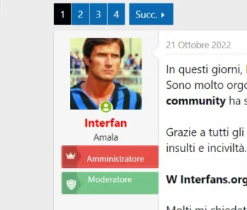
You can make something more simple, that's just banners...

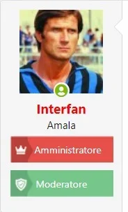
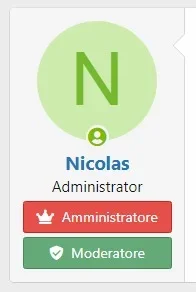
banner text admin : <i class="fas fa-crown"></i>&nbsp;&nbsp;Amministratore
banner text mod : <i class="fas fa-shield-check"></i>&nbsp;&nbsp;Moderatore

CSS:
.admin {
    padding: 4px 6px;
    background: #E64F4A;
    border: 1px solid #ca211c;
    color: white;
}

.mod {
    padding: 4px 6px;
    background: #64AA78;
    border: 1px solid #488459;
    color: white;
}

Capture web_25-11-2022_1752_localhost.jpeg
 
You can make something more simple, that's just banners...

banner text admin : <i class="fas fa-crown"></i>&nbsp;&nbsp;Amministratore
banner text mod : <i class="fas fa-shield-check"></i>&nbsp;&nbsp;Moderatore

CSS:
.admin {
    padding: 4px 6px;
    background: #E64F4A;
    border: 1px solid #ca211c;
    color: white;
}

.mod {
    padding: 4px 6px;
    background: #64AA78;
    border: 1px solid #488459;
    color: white;
}

View attachment 277057
ok buddy many thanks.
That works fine for admins and moderators.
I also have:

 
Top Bottom