I altered the code a bit to get the HTML5/CSS3 feel with semantic code and some nice animation. I hope @Waindigo likes the result and conciders some of the changes for future update.
waindigo_trophy_progress_trophyprogress:
waindigo_trophy_progress_trophyprogress.css:
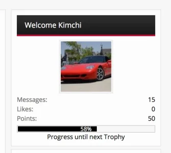
Here's the final result:

One can adjust the colours to their needs.
waindigo_trophy_progress_trophyprogress:
Code:
<xen:if is="{$xenOptions.waindigo_trophyProgress_showInSidebar} && {$visitor.user_id}">
    <xen:require css="waindigo_trophy_progress_trophyprogress.css" />

    <xen:require js="js/waindigo/trophyprogress/progress_bar.js" />

    <div class='section'>
        <div class='secondaryContent clearfix'>
            <h3>{$currentTrophyTitle}</h3>
            <div class='footnote'>{xen:phrase waindigo_progress_to_next_level_trophyprogress} {$nextTrophyTitle}:</div>
            <div class='TrophyProgressMeter'>
                <span class='TrophyProgressGraphic' role='progressbar' aria-valuenow='{$levelProgress}' aria-valuemin='0' aria-valuemax='100' style='width:{$levelProgress}%'>
                    <span class='TrophyProgressCounter'>{$levelProgress}%</span>
                </span>
            </div>
            <a id='levelUp' href='help/trophies'>{xen:phrase how_to_levelup}</a>
        </div>
    </div>
</xen:if>
waindigo_trophy_progress_trophyprogress.css:
Code:
.TrophyProgressMeter
{
    height: 26px;
    margin-top: 4px;
    padding: 2px;
    background: @content.background-color;
    border: 1px solid @primaryLighter;
    border-radius: 6px
}

.TrophyProgressGraphic
{
    display: block;
    height: 26px;
    background: -webkit-linear-gradient(-45deg, #5fbb1f 25%, #56aa1c 25%, #56aa1c 50%, #5fbb1f 50%, #5fbb1f 75%, #56aa1c 75%, #56aa1c);
    background: linear-gradient(-45deg, #5fbb1f 25%, #56aa1c 25%, #56aa1c 50%, #5fbb1f 50%, #5fbb1f 75%, #56aa1c 75%, #56aa1c);
    background-size: 40px 40px;
    -webkit-animation: progress 3s linear infinite;
    animation: progress 3s linear infinite;
    border-radius: 4px;
    text-align: right;
}

.TrophyProgressCounter
{
    padding: 0 10px;
    color:#fff;
    font-size:18px;
    line-height:27px
}

#levelUp
{
    float:right;
    margin-top:3px;
    cursor:help
}

@-webkit-keyframes progress {
    from {background-position: 0 0}
    to {background-position: 40px 0}
}
@keyframes progress {
    from {background-position: 0 0}
    to {background-position: 40px 0}
}
Here's the final result:
One can adjust the colours to their needs.


") I know a lot of people really wanted the Widget Framework functionality.
I know a lot of people really wanted the Widget Framework functionality.
