I've actually been running this since December 2011, but we've come a long way since then... and yet, I've never showcased it on here once. So I thought I'd finally give it a go and see what people think of it compared to other forums.
We're a community based in the UK, but we seem to have received small audiences in the US, Australia, as well as other members of the Commonwealth. We've got a fairly niche audience, for those who are fans of the My Little Pony franchise as well as the Friendship is Magic series, the latter of which was the motivation to start the community originally. Yes, you might know some of them as Bronies, but we have members who do and do not associate with that identity.
Design
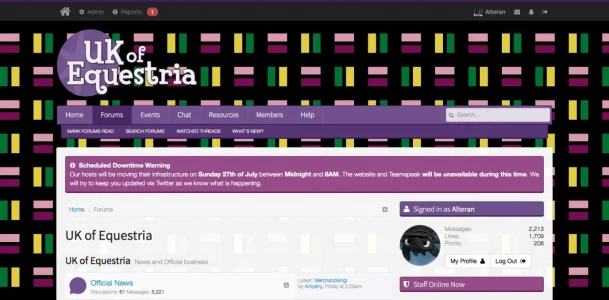
This is one of the first things that people comment about when joining. They appreciate how clean and simple the site design is - and that it doesn't look like other websites. Back when we started, we had a re-coloured version of the default xF design for a while, and have evolved a few times since then, using Flexile for a significant part of our time.
This is where we are now:
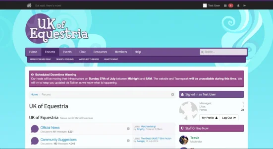
We also rock a handful of different designs that users can switch between:
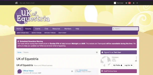
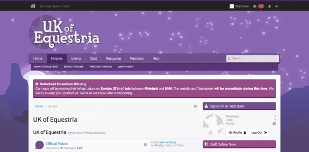

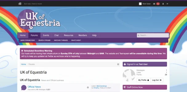
Oh, and credit if any of you out there can work out what this hidden style is a reference to:
Postbit Design
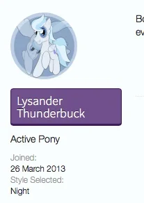
This is another one of those specific features. Ever since the latest iteration of our style, we gave circular avatars a try and they've just sort-of stuck.
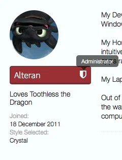
The named section changes colour for privileged accounts - and also shows an icon with an included tooltip.
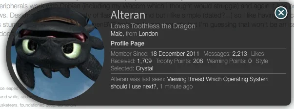
These circle avatars have encouraged a few members to get rather creative, using the circular effect to their advantage (as demonstrated by Lysander in the first postbit). We have also tweaked the member card to go along with the circular thing:
...and I think those are the key bits for now. We've done a few more of our own things, such as a bespoke Event Registration system, but I'll leave those for those who are interested enough to click on through and explore for themselves.
Major kudos to one of our community's own members, Becca, for the majority of what you see here - Becca is our principal Front-End Designer. I'm responsible for Software Development and Back-End Design.
Constructive Criticism and Feedback is more than welcome - we're very passionate about what we do and we'd love any suggestions you might have to make it better.
...and yes. We use Font Awesome.
