You are using an out of date browser. It may not display this or other websites correctly.
You should upgrade or use an alternative browser.
You should upgrade or use an alternative browser.
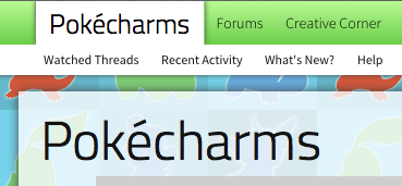
Top Left Menu Logo Like Facebook, Twitter, Digg, Reddit?
- Thread starter DRE
- Start date
x_Stricken_x
Active member
I don't mind it, though I don't prefer it. Your login/sign up link isn't visible though (iPhone 5, iOS 6, Google Chrome)
DRE
Well-known member
Don't need it.I don't mind it, though I don't prefer it. Your login/sign up link isn't visible though (iPhone 5, iOS 6, Google Chrome)
Brandon Sheley
Well-known member
I don't care for it at all, might as well just remove the logo if you're going to make it that small in my opinion. ")
DRE
Well-known member
Thanks. I started doing this in March cause I wanted to save space lol @ us coming to the same space-saving conclusion. Huge headers feel like a waste of space when I'm viewing the site from my phone.I quite like the idea, although I've done it on my (not yet live) site for months now:
I personally did it to save space - the top navigation is much smaller for having the text-based logo as a home tab instead
Teapot
Well-known member
It's a bit of a faff as there's a few things you need to change. Basically:How did you make your subnavigation menu shorter?
Reduce the line height on .navTabs .navTab.selected .tabLinks a first - keep track of the number you reduced it by. After that, reduce the line height in .navTabs .navTab.selected .tabLinks by the same number, and do the same thing for #navigation .pageContent's height. Lastly, reduce #headerMover #headerProxy's height by the same number to pull the rest of the page up.
I can't remember whether all of these are part of style properties or templates, probably a mixture of both. Your homework is to find them.

x_Stricken_x
Active member
The same can be done in Chrome by hitting F12, or FN+F12FWIW, if you use the inspector tool in Firefox, you'll find the div names and whatnot faster.
Teapot
Well-known member
Mine's just a modification of the XenPorta tab - my CSS just looks like this:I'm trying to duplicate this with the portal home tab of Xenporta and I can't get it to work. This is driving me nuts!
Code:
.navTabs .publicTabs .portal .navLink {

font-family: "MyFont",Helvetica,Arial,serif;
font-size: 24px !important;
font-weight: 200 !important;
padding: 0px 12px;

}")
OSS 117
Well-known member
Yes, but the Chrome version is quite poor in usability. The only element highlighting Chrome will ever do when hovering over the source in the inspector panel is the body container.The same can be done in Chrome by hitting F12, or FN+F12
x_Stricken_x
Active member
I was just saying it is possible if someone wanted to do it.Yes, but the Chrome version is quite poor in usability. The only element highlighting Chrome will ever do when hovering over the source in the inspector panel is the body container.
