Too little contrast in the thread / post time stamp field

karll

Well-known member
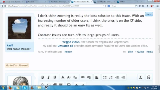
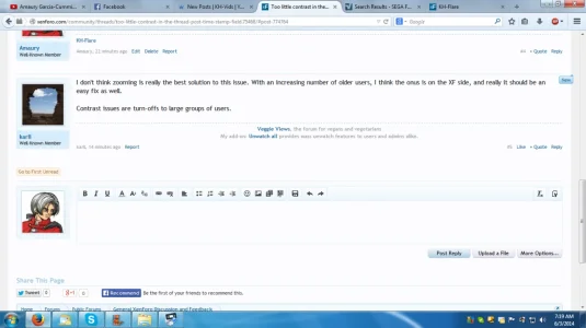
I sometimes struggle to read the time field of the threads here on xenforo.com, so I hereby propose the contrast be increased. Maybe people with younger eyes don't have so much of a problem? Well, I think there are plenty slightly older members, so could potentially affect a lot of people.

The problem is present in all the styles.
 
The simple solution here is for those with bad eyes to increase the zoom on their browser.
 
The simple solution here is for those with bad eyes to increase the zoom on their browser.
The zoom will have nothing to do with the contrast. Some people (especially as they get older) have a harder time focusing on colors that are light on white backgrounds.
 
The zoom will have nothing to do with the contrast. Some people (especially as they get older) have a harder time focusing on colors that are light on white backgrounds.

The bigger it is, though, the more it stands out. Like, even though it's not actually darker or bold, text will actually appear darker and bold at bigger sizes.
 
I don't think zooming is really the best solution to this issue. With an increasing number of older users, I think the onus is on the XF side, and really it should be an easy fix as well.

Contrast issues are turn-offs to large groups of users.
 
I don't think zooming is really the best solution to this issue. With an increasing number of older users, I think the onus is on the XF side, and really it should be an easy fix as well.

Contrast issues are turn-offs to large groups of users.

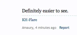
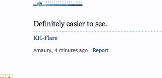
14 minutes ago - 100%:
upload_2014-6-3_7-19-9.webp

14 minutes ago - 200%:
upload_2014-6-3_7-19-48.webp

Definitely easier to see.
 
I don't necessarily contest the claim that it's easier to read when zoomed vs. not zoomed. I would just prefer that a real solution was implemented on the XF side, especially since that should involve little work and potentially help a lot of people.

Anyway, I suppose it's up to other members to like my post (the OP) so it gets noticed by the XF team. Come on, oldskoolers ....!
 
Hi karll,

Increasing the font size and or color might make those with poor vision have an easier time, but the other group with good vision would end up complaining.

The low contrast of the date and post number is by design. The idea is to emphasize the message content and draw less attention to these other items.

The other factor which also plays into issue is the hardware one is using. For example, how the page looks between a desktop, tablet and mobile devise factor into the choice of font size and contrast.

I have found that a quality computer display allows my old eyes (age 54) to see things much better because the fonts will have better contrast and resolution. I also use the browsers Zoom function when my eyes are tired.
 
Increasing the font size and or color might make those with poor vision have an easier time, but the other group with good vision would end up complaining.
Even with my poor(er) eyesight I can see the font size just fine... but it helps that I'm on a 32" monitor. :D
The low contrast of the date and post number is by design. The idea is to emphasize the message content and draw less attention to these other items.
And as in all designs, they can be changed. You can emphasize it by having a lower contrast as it is but then the smaller font size comes into play. Or you can increase the contrast of it and leave it at the smaller font size (which in itself de-emphasizes that information).

The other factor which also plays into issue is the hardware one is using. For example, how the page looks between a desktop, tablet and mobile devise factor into the choice of font size and contrast.

I have found that a quality computer display allows my old eyes (age 54) to see things much better because the fonts will have better contrast and resolution. I also use the browsers Zoom function when my eyes are tired.
I think that the Mac probably has some the best design for displaying web related text (especially compared to Windows)... and my LG monitor is plenty crisp. The problem is that (especially when you've been staring at a computer for the last 8 hours) the lower contrast can cause eye strain when you are trying to focus on it. I honestly don't pay much attention to those fields myself so it doesn't really bother me.
 
Size alone will not help for those who have less than perfect eyesight. In my style, Vision (link), I simply changed

@dimmedTextColor

@mutedTextColor

@faintTextColor

#000000

This made all the original light gray text readable for everyone.
 
Top Bottom