The Chill Out - General Discussion Forum

Bamboo

New member


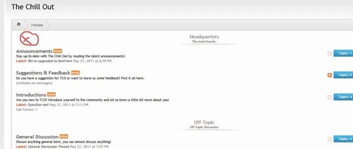
The Chill Out is a new general discussion forum where you can talk about pretty much everything! We plan on being a very relaxed forum community where people from everywhere can come and chill out. We're very relaxed on our rules as it's not fun having too follow a huge list of rules, so we only have a few what you will receive in a PM upon registration! :). We plan on having forum competitions every other week so you can win free subscription(Elite Rank) and some other nifty forum things! We're hosted on my VPS Reseller on a dedicate IP so you should witness no lag and the website should load really fast, making the enjoyment on the forum even more fun! :D

So what are you waiting for? Join today!

 
Are you looking for feedback :O ? On my wide screen, I was looking at X and thought you didn't catagorized your forum at first. Not until later that I noticed your headers are floating in the middle.
 

Attachments

  • Untitled-1.webp
    Untitled-1.webp
    31 KB · Views: 16
Hmm I have to say am not a fan of that skin.. the forum layout just looks wrong, and the forum Cats look lost like that (sorry) I normaly love all skins :/
 
Ah I see you purchased John's iXen skin. I love it!!!

I like the category titles floating center, and the lack of status icons is... different.
I really like the postbit.

John did a good job. :)

Now let's see what you do with your forum. ;)
 
It's how the theme is designed. :p
Fail.
For folks with widescreen displays who have their browsers set to the width of the screen the center floating titles are offputting at best. I'd ask the designer to fix that, or at least provide you with an option to fix it if they don't want to fix it in the actual design they sell.

Other than that, general discussion forums are ... difficult to grow. What's the incentive for me to join considering I am already a member of approximately 320,831 other forums that do the same thing? There needs to be something that makes me want to join, and frankly general discussion forums lack that something by design. Good luck with it but it will be tough for sure.
 
Fail.
For folks with widescreen displays who have their browsers set to the width of the screen the center floating titles are offputting at best. I'd ask the designer to fix that, or at least provide you with an option to fix it if they don't want to fix it in the actual design they sell.
Opinions are subjective at best. I think it looks fine and general consensus has been the same so I won't be changing it. Thanks for playing, however :rolleyes:
 
Opinions are subjective at best. I think it looks fine and general consensus has been the same so I won't be changing it. Thanks for playing, however :rolleyes:
I agree that it looks fine on a small monitor but look here..

hmmm.webp

Looks silly as hell on a big one. imo
 
I agree that it looks fine on a small monitor but look here..

....

Looks silly as hell on a big one. imo

What resolution is that screenshot? Looks extremely large...

iXen looks absolutely fine on all of my monitors (1680 x 1050 & 1920 x 1200). I like what John has done with the category titles myself and really, not all styles are made to appease everyone.

Edit: Sorry to the OP for the straying off course, good luck with your site and you picked a nice style. ;)
Same resolution as you tryed and bigger ..

Chill all it was my opinion the OP liked it...so...
This is a "critique" forum.
 
I personally don't think it looks fine at 1920x1200 if your browser is using the full width of the display, but I will agree that it's subjective.

Here's what the Internet has to say about screen resolutions:
Gamer market segment, most popular resolution is 1920x1200, source: Steam Hardware & Software Survey: April 2011
For folks who go to w3schools.com to check for something it's 1280x???, source: w3schools browser statistics, January 2011
Stat Counter for North America says it's 1280x800, source: StatCounter Global Stats for NA for the past year

So I think it is fair to say that most users are not running at 1920 wide or wider. This was actually surprising to me given how cheap 1920 screens are at least in the U.S. now. For lower resolutions or browsers which are not maximized at 1920+ resolutions the style is fine.
 
I have great respect for john and his work but I have to agree with vod, on high resolutions (I'm using dual x 2 1920 by 1200) and the whitespace on the high resolutions does show off to much space. I'm not knocking the style (so any hotheads can take a run and jump if you want to jump down my throat). I (to the OP) would personally give a fixed width option where I think this style will show off it's beauty more than it does at higher resolutions.

Another note, I think john was brave moving away from the standard design so good job there john not alot of people realise that breaking from tradition often gets overlooked.

Have to disagree with you, thinking broad user base is what's important.
 
Back
Top Bottom