You are using an out of date browser. It may not display this or other websites correctly.
You should upgrade or use an alternative browser.
You should upgrade or use an alternative browser.
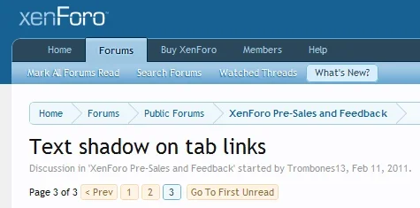
Text shadow on tab links
- Thread starter Trombones13
- Start date
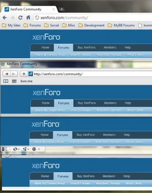
I like the way it looks in Firefox better.Here are some reference screenshots on Windows 7.
Firefox 4:
View attachment 11278
Chrome 9:
View attachment 11279
It looks very readable for me in both, the shadow makes a great impact.
krstep
Active member
That would be DirectWrite and Direct2D. It looks that way in IE9 too.I like the way it looks in Firefox better.
No gradient helps
Not to endlessly chew it over, but obviously the fact that the background on the links has a gradient also play a part in the readability of those white coloured text links.
See the difference:


... which actually doesn't look bad at all. In fact, I think I might prefer a non-gradient not only because of the benefits of the readability of the links, but it also improves the look&feel of XF a little bit I think (for me). I feel the colour-sheme of the gradient and for example the background colour of the Members Online Now block makes XF (those areas) somehow look a little bit 'cheapish'. But it might be my monitor settings, so I am gonna experiment with that and obviously we have the Style Properties as well.
What I totally loved about for example vBulletin 3.8 was it's default style (apart from the remarkable out-of-place buttons that is). I never had the need to change it, because it looked and felt solid, strong, perfectly balanced. Very suitable for a corporate professional website, out of the box.
Not to endlessly chew it over, but obviously the fact that the background on the links has a gradient also play a part in the readability of those white coloured text links.
See the difference:


... which actually doesn't look bad at all. In fact, I think I might prefer a non-gradient not only because of the benefits of the readability of the links, but it also improves the look&feel of XF a little bit I think (for me). I feel the colour-sheme of the gradient and for example the background colour of the Members Online Now block makes XF (those areas) somehow look a little bit 'cheapish'. But it might be my monitor settings, so I am gonna experiment with that and obviously we have the Style Properties as well.
What I totally loved about for example vBulletin 3.8 was it's default style (apart from the remarkable out-of-place buttons that is). I never had the need to change it, because it looked and felt solid, strong, perfectly balanced. Very suitable for a corporate professional website, out of the box.
I like the way it looks in Firefox better.
Absolutely.
Ok I tried getting used to them, it just isn't happening. I think the effect takes away some of the cleanliness and simplicity of the former no-shadow navigation. I think Grover has a point: for more readability, increase contrast. I'll definitely use the style system to change this.
Instructions to remove: http://xenforo.com/community/threads/mini-mod-remove-text-shadow-on-tablinks.12697/
Instructions to remove: http://xenforo.com/community/threads/mini-mod-remove-text-shadow-on-tablinks.12697/
There's a thread about it here: http://xenforo.com/community/threads/text-shadow-on-tab-links.12029/
So I'll merge your thread with that one to keep discussion to it in one place.
For your own forum you can remove it by following the instructions in this thread: http://xenforo.com/community/threads/mini-mod-remove-text-shadow-on-tablinks.12697/
So I'll merge your thread with that one to keep discussion to it in one place.
For your own forum you can remove it by following the instructions in this thread: http://xenforo.com/community/threads/mini-mod-remove-text-shadow-on-tablinks.12697/
Similar threads
- Replies
- 4
- Views
- 2K


