You are using an out of date browser. It may not display this or other websites correctly.
You should upgrade or use an alternative browser.
You should upgrade or use an alternative browser.
Lack of interest [Suggestion] Navbar dropdowns
- Thread starter KURTZ
- Start date
This suggestion has been closed automatically because it did not receive enough votes over an extended period of time. If you wish to see this, please search for an open suggestion and, if you don't find any, post a new one.
This suggestion has been closed. Votes are no longer accepted.
F
Floris
Guest
I don't understand what you are suggesting.
KURTZ
Well-known member
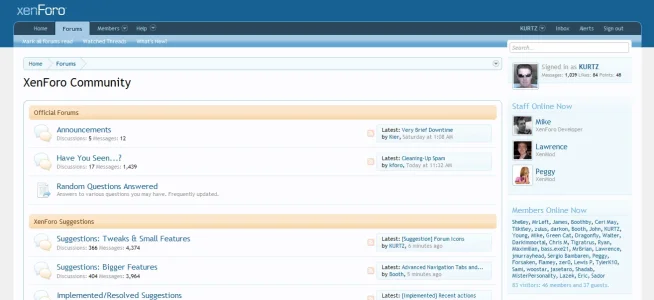
have you checked the pic? you can see it there ...I don't understand what you are suggesting.
F
Floris
Guest
But then why not arrow on inbox and alert too?
KURTZ
Well-known member
But then why not arrow on inbox and alert too?
because they are different than the others, they haven't a 'subnav' ...
But then why not arrow on inbox and alert too?
Simple. Because those are not menus (that are opening up) and thus have a different function and do not need such an arrow.
F
Floris
Guest
It's the same for me. Hover over forum/members/help and you get a dropdown, submenu. Just like personal account box and inbox/other one.
Indicators for dropdowns, is what the icon is for in my book. Sorry that we see it differently.
Indicators for dropdowns, is what the icon is for in my book. Sorry that we see it differently.
It's the same for me. Hover over forum/members/help and you get a dropdown, submenu. Just like personal account box and inbox/other one.
Indicators for dropdowns, is what the icon is for in my book. Sorry that we see it differently.
No need to say sorry
Also in addition to my previous explanation, realize that [Forums] [Members] [Help] are part of, in fact are XenForo's sophisticated menu system. Those arrows there have a specific function. And when you realize that both Alerts and Inbox are simply not part of this clever menu system, then... the arrows are not needed. This is the other reason they are not included.
KURTZ
Well-known member
No need to say sorry.
Also in addition to my previous explanation, realize that [Forums] [Members] [Help] are part of, in fact are XenForo's sophisticated menu system. Those arrows there have a specific function. And when you realize that both Alerts and Inbox are simply not part of this clever menu system, then... the arrows are not needed. This is the other reason they are not included.
a perfect explanation ...
To further build on this suggestion - can we perhaps increase the "dropdown target" for Forums, Members, and Help? Right now, in order to view those dropdown menu's, you've got to hover over the arrow on the right...You can't hover over the text of the tab. That arrow is a pretty small target, and it's almost easier for me to just click on the tab to avoid the dropdown all together. I've got my mouse sensitivity pretty high which means I sacrifice accuracy for speed.
The "Account" dropdown has an arrow and triggers the dropdown while hovering anywhere over the link - the rest of the dropdowns should do the same, imo.
Oh, and I am in favor of the arrow as well
The "Account" dropdown has an arrow and triggers the dropdown while hovering anywhere over the link - the rest of the dropdowns should do the same, imo.
Oh, and I am in favor of the arrow as well
Are you referring to the dropdown in the main navigation? You say "breadcrumb", which is technically Home > Forums > General Discussions > XenForo Bug Reports...I have a feeling you're referring to the main navigation in the upper left.
If so, I made a similar request previously but never got any feedback on it.
I'm all for consistency
If so, I made a similar request previously but never got any feedback on it.
I'm all for consistency
I believe Mez is referring to:

Name drop-down -> Brings up Quick Links
Quick Nav drop-down -> Brings up Overlay
yup
I don't know that there is any meaningful difference between a pulldown menu and an overlay menu or any compelling reason to distinguish between the two in terms of user interface. The little triangle in a circle simply means "click here for a menu of some sort".
Yes.I believe that is by design. The dropdowns towards the left are supposed to be less intrusive, and people can navigate without using them.
The drop down near name does not work that way.
One other comment. If you are looking for consistency, here it is. The "down" triangle is the same in the tab menus, member menu, and quick nav menu. The difference is that the latter two have a circle around the triangle. This is consistent-- when the triangle is only visible on mouseover, there is no circle. When the triangle is always visible, it has a circle.
It made me automatically move my mouse down - but there was no menu there.I don't know that there is any meaningful difference between a pulldown menu and an overlay menu or any compelling reason to distinguish between the two in terms of user interface. The little triangle in a circle simply means "click here for a menu of some sort".
Similar threads
- Replies
- 0
- Views
- 2K
- Replies
- 5
- Views
- 4K
- Question
- Replies
- 6
- Views
- 864
- Replies
- 6
- Views
- 2K
