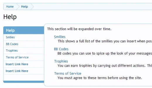
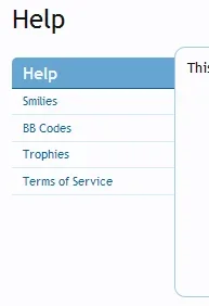
I was looking at the help page and noticed that there's borders missing on the left hand side of the navigation menu. I did a mockup suggestion some consistency and visual improvement I feel. Here's the page http://xenforo.com/community/help/ the mockup (below) in attachment. Not sure whether this is a bug or intentionally style this way.
If the devs/community like this suggestion applies to all pages that inherit the help page. Gives it more of a focus point in my opinion whilst still keeping the help topics to the right focusable also.
If the devs/community like this suggestion applies to all pages that inherit the help page. Gives it more of a focus point in my opinion whilst still keeping the help topics to the right focusable also.


")