XF 1.1 Styling notices

AndreaMarucci

Well-known member
I would like to make a "Merry Christmas" banner appear at december 25th and I've made some tests. The only problem I'm facing is that my banner always appear inside the blue box. How can I make it disappear so only the image is shown?

Screenshot 12-2455905 alle 11.53.03.webp
 
This works almost perfect apart from this double border:

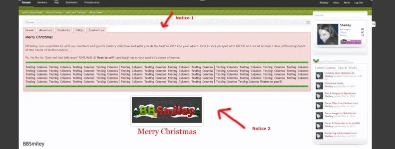
View attachment 22600

You can see it here live: http://plexineu.com/index.php

Any ideas what might be causing this? I have looked into Style Properties.

try doing the following:

Code:
#Notices .panel .noticeContent {
    padding: 5px;
}

Then adjust or remove

Code:
.notice_1 {
    margin-bottom: 0px;

I'd personally remove the margin-bottom entirely
 
try doing the following:

Code:
#Notices .panel .noticeContent {
    padding: 5px;
}

Then adjust or remove

Code:
.notice_1 {
    margin-bottom: 0px;

I'd personally remove the margin-bottom entirely
Hello Shelley, appreciate your effort!

I just removed the padding all together, because if I was following your suggestion it would be still having a double line around the notice.
 
Hello Shelley, appreciate your effort!

I just removed the padding all together, because if I was following your suggestion it would be still having a double line around the notice.

Yeah I went on the assumption you wanted the double border with spacing inbetween. Looks better now.
 
This answers the problem, and it is really a design improvement so that individual notices can be completely styled.

Right now, you can only change the global status of a notice, which removes the true ability to really individually style them, which is what Andrea wants, and I can also see a lot of advantage with.

XF just have to move the notice class as an outer div, instead of inner notice class. Then, you can pick out one notice and strip it to bare plain, without affecting global notices.

I think this is his problem it's because he hasn't globally removed the styling that he's having trouble styling individual notices. Then again, he may have some issues with the scrolling horizontal layout. I've globally removed all styling and each notice comes with it's own style. Below is two notices I worked on today and i don't foresee any issues styling unique notices with this method.

to be frank, I prefer the notices in xenforo 1.1.1 it's a vast improvement and now I can heavily style the notices how I want them to be where the old previous to 1.1.1 i wouldn't touch the notice system. hated it infact, It's now something I will use.
 

Attachments

  • xmassssssnotice.webp
    xmassssssnotice.webp
    62.6 KB · Views: 32
Yes, you had to "globally" change the styling all in order to change "one" notice look.

That is not feasible to custom style only "one" notice. Mike answered the question in the above link... which I updated whilst you were posting reply to original quote.

You must disable scrollable notices and make them stackable, to "not" change global notice styling... yet be left with the ability to style them uniquely without affecting other notice styles OR having to style every notice uniquely.

Why anyone wouldn't want full control of their notices is beyond me. All I know without the stacked solution you do not have full control, the flexibility to really style your notices. I can state a host of other reasons why the alternative layout basically blows chunks but I'm happy with the stacked solution.

Tabs simply don't work under notices nor does scrolling it's riddles the user with too many restrictions when you want to heavily styles your notices even more so if you want multiple notices displayed in the same location.
 
Create a new notice Andrea and add the following into the code area: This should remove the border, background from that specific notice you can then add in the logo html to display your xmas image. You will also have to uncheck "add default notice text styling". hopefully this will work for you and you can then take it from there by applying the image.
Code:
<style type="text/css">
    <!--
 
.PanelScroller .panel {
    background: none repeat scroll 0 0 transparent;
 
.PanelScroller .scrollContainer {
    background-color: transparent;
    border: 0 solid #A5CAE4;
}
 
-->
</style>
 
<html code goes here>

Hello there, Shelley. I am using this to remove the default styling, while the Board Closed notice for instance still having the default style. What I used yesterday along with the Style Properties did work, but it caused the default notices to loose it's desing.

I have a very minor thing here, but I would like to remove the blue color (as seen in the screen shot below). :) Could you assist please on what to add to the css above?
15-12-2011 15-25-53.webp

As said before, my forum URL is http://plexineu.com/
 
Hello there, Shelley. I am using this to remove the default styling, while the Board Closed notice for instance still having the default style. What I used yesterday along with the Style Properties did work, but it caused the default notices to loose it's desing.

I have a very minor thing here, but I would like to remove the blue color (as seen in the screen shot below). :) Could you assist please on what to add to the css above?
View attachment 22640

As said before, my forum URL is http://plexineu.com/

Try ading the following into your notice area. I'm quite sure andrea had a similiar problem that we couldn't work around unless he disabled global styling. This might not work but worth a try:

Code:
.PanelScroller .scrollContainer, .PanelScrollerOff .panel {
    border: 0 solid #A5CAE4;
}
 
Try ading the following into your notice area. I'm quite sure andrea had a similiar problem that we couldn't work around unless he disabled global styling. This might not work but worth a try:

Code:
.PanelScroller .scrollContainer, .PanelScrollerOff .panel {
    border: 0 solid #A5CAE4;
}
That sadly didn't work. This is my code:
Code:
<style type="text/css">
.PanelScroller .panel {
    background: none repeat scroll 0 0 transparent;
 
.PanelScroller .scrollContainer {
    background-color: transparent;
    border: 0 solid #A5CAE4;
 
.PanelScroller .scrollContainer, .PanelScrollerOff .panel {
    border: 0 solid #A5CAE4;
}
</style>

Yeah, i tried everything yesterday but I think your best bet is to remove the style property styling and simply create your own classes and style each one (notice) so it's uniquely styled. That said, your probably going to have to deploy other fixes when you have to deal with the tabs. I'd suggest looking at disabling the style property styling and switch to stacked notices it'll give you full control and you won't have to worry about styling it.

perhaps Paul or jake can step in and help resolve this as I can't think of another way to fix this issue for you without suggesting you go into the style properties and remove the styling.
 
Yeah, i tried everything yesterday but I think your best bet is to remove the style property styling and simply create your own classes and style each one (notice) so it's uniquely styled. That said, your probably going to have to deploy other fixes when you have to deal with the tabs. I'd suggest looking at disabling the style property styling and switch to stacked notices it'll give you full control and you won't have to worry about styling it.

I am already using Stacked Notices, fortunately. :) Okay, thank you.
 
The only feasible way you could achieve individual styling of notices, with the ability to style a specific notice and use scrolling, based on the current method, is to copy the default styling for the outer containers, remove it all via the style properties, then reapply it to the inner most container that the same class resides for each notice.

That way, you could then use !important to override default styling, as all styling is then located on the inner most tag.

This would avoid having to disable scrolling and stacking notices. Not sure... of the affect, untested.

I think you'll still have problems with tabs sitting correctly as this will cause gapping in between notices and tabs depending on the sizes (height of the notices) if you happen to have them in the same location. Because your still going to have an outer container whether it's your custom container or not your still going to have to account and style for the tabs on the chance you have and/or will use/apply multiple notices.The issues you may find are documented here

I (before the stacked solution) I really went to town with the notice system and how restrictive it is to control and style, it was quite frankly, terrible. I still think it has some way to go to make it flexible to stylers whom want to heavily style notices but the stacked solution was a step forward for me so I guess with time we can see much improvements with the notice system.

I was thinking to cure the gapping whether it would be better to sit the tabs above the notice to solve this gapping when applying scrolling + multiple notices but then I did read somewhere someone suggesting having a navigation previous/next highlighted within the notice which could potentially solve this. Still not sold on that method but it is potentially a solution.

Either way, from day 1 I seen and experienced every issue imaginable when it came to styling notices and the lack of flexibility that came with notices but since improvements are being made and it's cured many issues for me in the latest update (1.1.1) I can't grumble at a feature I can now use and work with and am much happier using it.
 
That sounds like a solid solution Shelley, being maybe a forward / back button on either side within the notice confines.

They could even limit the width of the notice to say 80% or so, then use the rest of have a stacked list display of the notices! Probably not as attractive though as a simple forward / backward option.
 
I've removed the default notices styling, and now my notice looks like this:

message.webp

(i.e. padding and all other styling has been naturally removed.)

The contents of my notice so far, are this:

panels.webp


Now I'm looking to restore the regular settings such as padding, margins, etc. Can someone suggest what class to add e.g. the padding property to? Adding to .PanelScroller .scrollContainer didn't work.
 
Top Bottom