Implemented Smilies under type box

Shelley

Well-known member
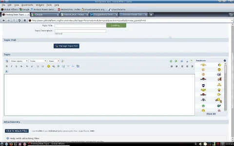
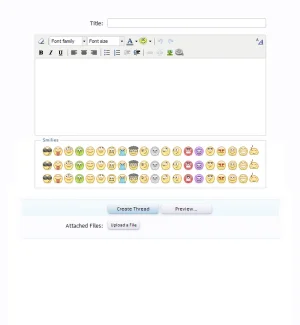
Dunno if this one will be accepted and welcomed but I would love (as default) to be able to select smilies from under the type box (like princetons hack). For my own preference I like smilies i use to be on view rather than selecting them via a dropdown. Maybe it can be an option to enable or disable? useful for people with large amount of smilies. Yes, you guessed it another Mockup. :D (Mockup Below)

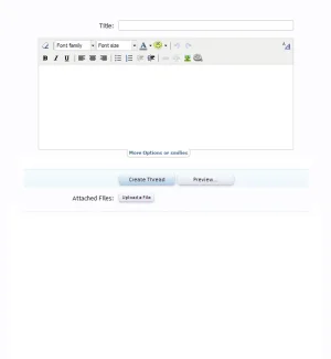
Or maybe what you did in the thread display with the hide options feature. A tab. would be hidden and can be opened at will (added a mockup for this like in thread display)
 

Attachments

  • smilies-under-post.webp
    smilies-under-post.webp
    26.3 KB · Views: 175
  • smilies-more-options.webp
    smilies-more-options.webp
    9.1 KB · Views: 347
Upvote 18
This suggestion has been implemented. Votes are no longer accepted.
I hate to do this as it's from a vB site but this is how the editor looks on AVForums.

editor-png.415


Now I'm not for one minute suggesting you implement anything like that but they use TinyMCE (or at least what looks like TinyMCE) and seem to have been able to customise it for their needs.

Clicking on (More) opens a pop up window with tons more smilies.
It's pedantic, but that's not TinyMCE... That's not even a WYSIWYG editor in the particular view you're using.
 
Something that has to be considered is that people often use smilies of widely varying sizes. But I do like the look of the tab. I want to turn the smilie menu into more of a grid, though I think I'd have to fight with TinyMCE to do it.

Yay for Mike! :D
 
I hate to do this as it's from a vB site but this is how the editor looks on AVForums.

editor-png.415


Now I'm not for one minute suggesting you implement anything like that but they use TinyMCE (or at least what looks like TinyMCE) and seem to have been able to customise it for their needs.

Clicking on (More) opens a pop up window with tons more smilies.

Hopefully the placement isn't going (pending it's happening) put to the right. For people such as myself, and I've seen this on many other sites that it expands the box out of the page resulting in unneeded scrolling because the whole page expanded.
 
Personally, I don't mind where the smilies are, but I really don't like how they currently aren't displayed anywhere in QR or even the full editor. IMO, they need to be out and visible somewhere; not hidden in the little drop-down on the toolbar.
 
Something that has to be considered is that people often use smilies of widely varying sizes. But I do like the look of the tab. I want to turn the smilie menu into more of a grid, though I think I'd have to fight with TinyMCE to do it.
The tab does look nice. Clicking the tab and then having a slidedown area for the smilies below the editor (like the login slide action) would be slick though.
 
It's pedantic, but that's not TinyMCE... That's not even a WYSIWYG editor in the particular view you're using.
Fair enough, I did say "or at least what looks like TinyMCE".

It was the fact it that it has many similar elements which made me think it was related in some way.

I'm not used to these fancy editors so it's all new to me :D
 
I like the smile as they are now, but I'd like to see 'more smiles' under the editor post as in the second attached image in the first post of this thread.
+1
 
Thinking more about this. the tab option in my mind would not only make both parties happy but retain an innovative/creative edge XenForo is applying in areas. Sure this could be an addon, but I feel having this in as a core feature would definitely set this option apart from other platforms. It's a solution I feel that gives the people who use tons of smilies that option to view all and those that don't the option to have the minimalistic view. Not to mention, right handed boxes (with tons of smilies on view) always break/expand pages. This is a good solution imo, not to mention I would really love to see mockup2 in the first post implemented. It def set this area apart from other platforms. I'd love you devs forever if this somehow happened. :P
 
Thinking more about this. the tab option in my mind would not only make both parties happy but retain an innovative/creative edge XenForo is applying in areas. Sure this could be an addon, but I feel having this in as a core feature would definitely set this option apart from other platforms. It's a solution I feel that gives the people who use tons of smilies that option to view all and those that don't the option to have the minimalistic view. Not to mention, right handed boxes (with tons of smilies on view) always break/expand pages. This is a good solution imo, not to mention I would really love to see mockup2 in the first post implemented. It def set this area apart from other platforms. I'd love you devs forever if this somehow happened. :p

edit: Reason I don't/wouldn't like to see this as an addon is because it's an innovative feature I think XenForo should take credit for. Yes, I'm fighting for this one. :p (hmmmm, mean't to edit my previous post)
 
I like the minimalist approach (the current way it is) .. keeps the forum cleaner and more professional :)
Having them all over the screen is a little too kitschy.. maybe a use pref toggle for each mini or maxi
 
I dislike having to scroll up and down between a smiley list and what I'm typing. I'd prefer something similar to what IPB does with theirs and put it to the right of the text input area.
 

Attachments

  • smileybox.webp
    smileybox.webp
    55.9 KB · Views: 32
Top Bottom