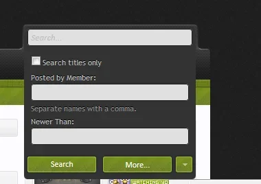
Lack of interest Search Threads & Posts "+ -" needs spacing...

This suggestion has been closed automatically because it did not receive enough votes over an extended period of time. If you wish to see this, please search for an open suggestion and, if you don't find any, post a new one.
This suggestion has been closed. Votes are no longer accepted.
Everywhere a "spinbox" is used is like that. It's been that way since day one and this is the first comment I've seen about it.
 
I'm aware its minor, Mike. It just looks awful to me. For consistency, since the face styling is exactly the same as other buttons ("Post Reply Upload a File More Options..." etc.), I would think the spacing between those should also be identical? Why does that have different spacing in search, quick search, and a couple of places in the admincp that have + - ?

There have been lots of miniature adjustments like this that are old and been fixed that carried over many versions or years (such as some vertical text alignment issues on the search page in 1.2). I don't see whether or not something has been reported before as particularly helpful? If anything, I would have thought this would have been moved to a suggestion.

I've always gone out of my way to promote XF (with no gap in doing so as some have done), and only hold love for you guys. I'm only trying to help whenever I can. ;)
 
I just meant that it was a design decision -- there are plenty of things that are just decisions that have to be made one way or the other. Here, it's to strongly relate it to the text box like other styles of spinbox implementations -- the 3 parts really form one unit, unlike other action buttons. Aesthetically it looks fine to me as well, but I've been staring at it for a while obviously.

The point regarding not seeing any other comments actually partially relates to why I didn't move it to suggestions. I was taking the lack of comment to mean that most of people aren't interested. As you've made it clear that's what you're after, then I'll move it to suggestions. Note that things that are reported as bugs stay as bugs in about 99% of cases, even if it's possible it could be flipped into a suggestion. Often, the way bug reports and suggestions are presented is different as they target different people and needs.
 
Thank you for the clarification(s), Mike. In a way though, the quick reply buttons form one unit (as all 3 relate to your reply of a post).

I just see some gorgeous styles, and some of the better ones fix the quick search spacing but never seem to fix the + - as well, was always curious as to what the cause of that was. I'll assume there is a point that designers leave some default behavior instead of making an override for every little thing. You have to move on to new styles at some point.

I guess if no one cares, that's fine... Hit the first post with a like if these little pests bother you as much as me! :ROFLMAO:

They always bothered me and I am almost sure i threw up a suggestion regarding this. Anyhow I always make a point in adding spacing to those buttons (picture of my previous style) they seem to have broke in my latest style or atleast one of them did.

+1 for the suggestion @Alien Screenshot_4.webp

Edit:

Code:
#QuickSearch .submitUnit .button, #QuickSearch input.button.primary { width: 95px;}
 
Last edited:
Top Bottom