Resource icon

Scaling standard-sized ads in a responsive environment

wcbryant

Active member
wcbryant submitted a new resource:

Scaling Universal Ad Package (IAB) ads in a responsive environment - For ad partners lacking responsive code, when loading smaller ad sizes isn't an option.

First, this is a work in progress, and a function of necessity (my migration is in two days). I only use UAP standard ad sizes (leaderboard/728x90, widesky/160x600, and 300x250 boxes (which is an RMG size, not UAP, but let's not split hairs).

Loading smaller ad sizes wasn't an option for me. I needed my ads, but I wasn't willing to sacrifice responsive design. So we approached the problems in terms of how to display the ads as they are now, on my vB 3.8.7pl3 site, which is obviously not...

Read more about this resource...
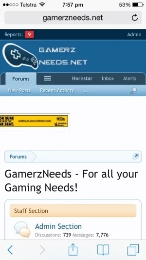
 
@Hornstar - I've updated it with some very minor (mostly cosmetic) tweaks. What you see there now has been live on my production site for a year. I've been mostly happy with it; rare cases of ad code defeating the scaling, but there's not much to be done about that -- it's pretty unusual anyway. For the vast majority of my experience, this has been the best solution for those who only use standard ads.
 
Thanks so much @wcbryant
I will give this a go tonight.

Also what did you mean by "has had no issue with it, but YMMV"

Sorry, meant "your mileage may vary." I actually tend to avoid that sort of abbreviation, not sure why I did it there. Essentially I meant that I can imagine some ad partner somewhere getting their drawers twisted about scaling ads like this -- if they see it as manipulation of their code rather than what it is, which is really more like an exception from responsive design. My ad partner is completely comfortable with it, I expect most will be (and if they're not then they better offer a viable alternative); I just wanted to make the point that your own experience may not mirror my own when it comes to how they feel about it. That is, if they even notice. On most PC/Mac screens ads will be full sized. On mobile devices the ads will still appear to be full sized against the reduced width of the smaller screen.

Anyway, good luck with it. Hope it's of some use to you.
 
image.webp

@wcbryant I've installed this now. I have a couple of questions.

Have I installed it correctly?
I copied the code in both code boxes under extra.css into my extra.CSS and then created a HTML file with my 728 ad code in it and uploaded it to my server and then used code you gave and changed insert your target to the URL of the HTML file I created.

My site http://www.gamerzneeds.net/forums

Do things look correct to you? It just looks like it is resizing extra small.
 
When I load your site on an iPad, it looks correct to me (albeit a bit different than it looks in your screengrab insofar as it's properly justified, and not partially offscreen left). I would need to load it on a PC later (or you should do the same), the best way to check is just grab the right border of the browser and just move the width of the browser down and up to make sure the leaderboard changes sizes on the fly.

It is going to look smaller than it apparently needs to be on some screens. For example, on an iPad mini in 'upright' position it will seem like it could be half again as big, that's because the scaling ranges fit into the XF defined categories and at that screen width you're using the same scaling that one also would on a window window. Hope that makes sense, long night and only half awake this morning.

Anyway, yes, appears to be properly installed. Check with a browser on a computer where you can change the width substantially. If you see it going from a full sized leaderboard all the way down to a tiny one at roughly cellphone browser width, then it's working fine.

Also, you can adjust some of the values in the EXTRA.css code if you want it bigger at some screen sizes. Just remember you have to take into account all the different phones and tablets out there (at least the majors) and think about which XF range they fall into.
 
A much nicer implementation of this would adjust per pixel as a browser gets smaller, and not using the pre-defined XF responsive thresholds. I don't know if that's technically possible (I suspect it would have to be), but it's far more complicated and beyond the scope of this solution (or at least myself).
 
@Hornstar -- Just checked in a browser, and yours is exhibiting different behavior than mine. There are points as I reduce the width of the browser where your ad disappears off the left side of the screen (I had my site up at the same time and it didn't do the same). You might want to check your responsive settings and see where those are defined. I'll paste mine below. You can compare, and then if you don't want to change those, you can just adjust the values in EXTRA.css accordingly to fit your own thresholds.

So yes -- you have it installed properly; but on your site it still needs a little bit of tweaking.

Note, under Style Properties: Responsive Design, I'm configured as follows. If yours is different, you may have to adjust some of the values in the EXTRA.css code.
Max Responsive Width (Wide): 800px
Max Responsive Width (Medium): 610px
Max Responsive Width (Narrow): 480px
Non-Responsive Minimum Width: 976px

You seem to be having problems with the left justification between 801-920px and then again (to a less clearly defined degree) 800 and below, mostly from around 765px down.

Almost has to be that we have differences in our style properties as above.
 
Last edited:
@wcbryant that could be it. I have 4 styles. 3 of them are all the same as those values. But my main style has 853px set for non-responsive minimum width. Although saying that when testing out the other styles, I still get the exact same thing happen as in the screen shot (and that screen shot was on the xf style). I've noticed on my main style that having large banners won't ruin the style, so I probably can just keep it normal, but with my other styles, this is helping stop them scroll which is great.
 
@Hornstar -- Just checked in a browser, and yours is exhibiting different behavior than mine. There are points as I reduce the width of the browser where your ad disappears off the left side of the screen (I had my site up at the same time and it didn't do the same). You might want to check your responsive settings and see where those are defined. I'll paste mine below. You can compare, and then if you don't want to change those, you can just adjust the values in EXTRA.css accordingly to fit your own thresholds.

So yes -- you have it installed properly; but on your site it still needs a little bit of tweaking.


You seem to be having problems with the left justification between 801-920px and then again (to a less clearly defined degree) 800 and below, mostly from around 765px down.

Almost has to be that we have differences in our style properties as above.

I have the same style properties that you do and this is the result on my laptop.

ad.webp
 
Check the HTML file you're pulling into the iFrame for blank spaces and returns. Alternatively you could add some simple code to top and left justify that page content.

I don't use as much, but it could be that particular remnant provider is doing something unusual with their serving.
 
Check the HTML file you're pulling into the iFrame for blank spaces and returns. Alternatively you could add some simple code to top and left justify that page content.

I don't use as much, but it could be that particular remnant provider is doing something unusual with their serving.

No spaces or returns in the file.

I added left: -10px;
and top: -10px;

which works on my laptop, but when you resize the browser it gets out of line again...weird
 
Try putting a static leader in there (just the image) and see if it still happens. If not, it almost has to be something on the provider end. Which doesn't help you, of course, but at least then you know.

Also, is it happening in different browsers? Or just IE/Chrome/Firefox?
 
Top Bottom