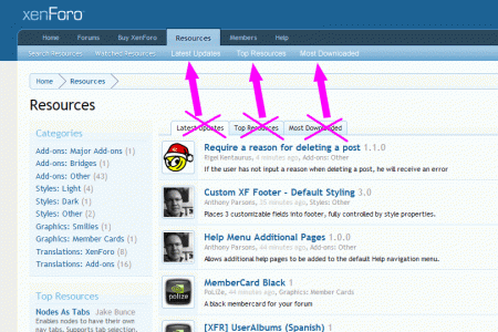
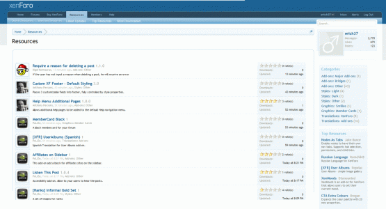
Sorry to say, but I think the interface of the RM is quite confusing.
sidebar at the left:
http://xenforo.com/community/resources/
sidebar at the right:
http://xenforo.com/community/resources/digital-point-thread-post-bbcode.87/
I would suggest for the "Resource Manager" to also use the same logic, simple and sexy page-layout and interface for which XenForo is known and famous for:
Suggestions:
1)
Put the Tabs into the Nav-Bar.
2)
Put the "Categories", "Top Resources" and "Most Active Authors" into the sidebar at the right.
See suggestions as per screenshots:


Upvote
2