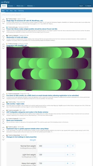
I was looking over this old suggestion and thought about how competition for forums has changed over the years. As a consumer, I used to browse forums every day. Now, I almost never browse forums; instead, I use Reddit to do the same.
This can increase traffic and retention of users. A lot of big forums already have similar features through custom add-on's, but it's not nearly as streamlined as Reddit. This can bring that advantage to every forum.
There are 3 fundamental things that one does on Reddit. 1. watch a feed about topics that you are interested in (homepage feeds) 2. read about or find information on a topic, and 3. ask a question on a topic or provide commentary or an answer.
The broad suggestion is to update the layout to mimic those three aspects of reddit. The changes in 2.2 were a step in the right direction, but were only centered around the last item. This suggestion is probably closer to what the devs were envisioning.
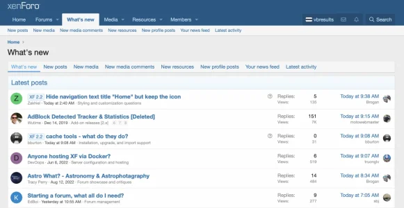
This is what the old "What's new" page looks like (and I almost never used it on any forum):
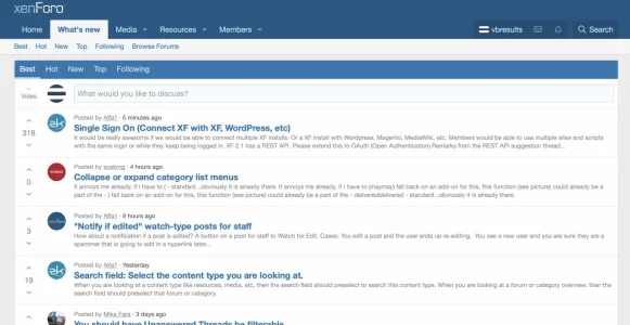
This is what the new "What's new" page (and forum homepage) looks like:
The actionable suggestions are to:
1. Replace "What's new" as shown above, and make it the default homepage instead of the forum list ("Browse Forums" is there for people who want that) and allow upvoting/downvoting on the OP (but minimum of 0 display value like Reddit).
This would have media support (like attachments, external links, images and videos), but the admin decides what post types are allowed on a per-forum basis, and then when posting, the user would select the post type.
These feeds would also have RSS links to the original posts (but not comments, only updating the timestamp on a reply so people come back), and add developer hooks and an interface so custom feed types can be added.
2. Make efficient use of space and do away with showing extraneous information like views (the latter is superseded by votes); on desktop, make efficient use of space on the screen and also use sidebars the way reddit does (subforum description, rules, moderators, etc.)
3. Implement a threaded comment structure like Reddit where after X replies to a comment, you have to click on a link to load the rest; as part of this, the post box would need to be streamlined and likes hidden in favor of votes
4. Allow admins to set a background photo, font, and text colors per subforum as subreddits do; less extreme than a theme shift per-forum
5. On install/upgrade, let admins choose a layout: "Reddit-like" (default for installs), "Quora-like", or "Classic forum" (d. for upgrades). Some websites have specific use-cases or don't want to change it, that's their choice
Reddit is great, but it has its weaknesses being highly centralized, larping, anonymous unaccountable mods, etc. I can develop these features privately for clients like I did with the older suggestion, but I know this could be a godsend for admins at large.
This can increase traffic and retention of users. A lot of big forums already have similar features through custom add-on's, but it's not nearly as streamlined as Reddit. This can bring that advantage to every forum.
There are 3 fundamental things that one does on Reddit. 1. watch a feed about topics that you are interested in (homepage feeds) 2. read about or find information on a topic, and 3. ask a question on a topic or provide commentary or an answer.
The broad suggestion is to update the layout to mimic those three aspects of reddit. The changes in 2.2 were a step in the right direction, but were only centered around the last item. This suggestion is probably closer to what the devs were envisioning.
This is what the old "What's new" page looks like (and I almost never used it on any forum):

This is what the new "What's new" page (and forum homepage) looks like:

The actionable suggestions are to:
1. Replace "What's new" as shown above, and make it the default homepage instead of the forum list ("Browse Forums" is there for people who want that) and allow upvoting/downvoting on the OP (but minimum of 0 display value like Reddit).
This would have media support (like attachments, external links, images and videos), but the admin decides what post types are allowed on a per-forum basis, and then when posting, the user would select the post type.
These feeds would also have RSS links to the original posts (but not comments, only updating the timestamp on a reply so people come back), and add developer hooks and an interface so custom feed types can be added.
2. Make efficient use of space and do away with showing extraneous information like views (the latter is superseded by votes); on desktop, make efficient use of space on the screen and also use sidebars the way reddit does (subforum description, rules, moderators, etc.)
3. Implement a threaded comment structure like Reddit where after X replies to a comment, you have to click on a link to load the rest; as part of this, the post box would need to be streamlined and likes hidden in favor of votes
4. Allow admins to set a background photo, font, and text colors per subforum as subreddits do; less extreme than a theme shift per-forum
5. On install/upgrade, let admins choose a layout: "Reddit-like" (default for installs), "Quora-like", or "Classic forum" (d. for upgrades). Some websites have specific use-cases or don't want to change it, that's their choice
Reddit is great, but it has its weaknesses being highly centralized, larping, anonymous unaccountable mods, etc. I can develop these features privately for clients like I did with the older suggestion, but I know this could be a godsend for admins at large.
Last edited:
Upvote
56
